Introduction
G1G is your trusted one stop shop for all your travel insurance needs. Whether that means picking the right plan, finding the best hospital or doctor in your area, or helping you file a claim, we are there for you every step of the way so you may travel worry free.
Knowing that every journey is unique in its own way, G1G is constantly exploring new ways to connect our diverse customer base of world travelers, immigrants, green card holders, international students, foreign nationals and expats, with custom-tailored plans to their specific travel needs.
My Role
As a senior UI/UX designer in Convo, I played the role of lead designer for G1G travel Insurance. I collaborated with Product Director Usman Javaid, Product Manager Abdul Munem, Product Analyst Raja Nofil and humble CEO of G1G Travel Insurance, Zubair Jeewanjee
The task was to design a mobile app for their services which would be entertaining to use, allowing user to purchase insurance policies and edit them on the go. More over the application would also act as center for any sort of emergencies for quick actions for the client.
Problem
In this case study, we're going to explore some interesting issues we came across during our UI and UX study of G1G's existing web platform. G1G's internal team was actually working on a brand-new web-based application at the same time. They approached us with a request to take their fresh design as a wireframe and give it a visual and performance boost.
Bulky Design
The design aesthetics lack of consistency, resulting in a visual experience that felt disconnected and overpowering. This introduced inconsistencies and hindered the user experience when navigating between screens and following the flow.
Confusing Flows
The lack of navigation paths made it difficult for customers to locate the desired options they were seeking. The absence of clear signposts and logical progression hindered users' ability to make informed choices. Consequently, customers often found themselves lost within the application.
Scalablility
G1G current and past design clearly identified lack of a design system. The absence of a well-defined component and design system discourages users from adopting new updates.
Identifying and defining these problems sets the stage, and now it's my turn to take action and find effective solutions.
Goal
A delightful, consistent consumer experience
To ensure a proper design system is in place to reduce technical debt, and give our consumers a better, consistent experience.
Defined journeys
The design must exhibit exceptional clarity, enabling users to seamlessly navigate through different flows easily.
Operational efficiency
To optimize internal operations, we will build custom design components, which will help G1G overall services and features feel consistent
Travelers safety
This whole purpose of this application is to provide users safety and claims with easy at their fingertips.
Process
Design Sprints
We conducted design sprints to facilitate collaboration cross-departments. Product Designers, Product Managers and Creatives contributed their fresh ideas in this sprint. The purpose of these sprints is to align everyone on the same goal—To improve our consumer experience by solving our user's problems today.
User flows
We mapped each archetype to their user journey on the app, with their respective success metrics. (coming soon)
Early designs
The client wanted us to work on both the design and development of the mobile application at the same time. So, we divided the application into different parts, like building blocks.
Each part went through a simple step-by-step process:
UX Research
Wireframing
Drafting
Refining
Finalizing
Once we finished designing one part, we handed it over to the development team to bring it to life. This way, we ensured a smooth and organized workflow between design and development teams.
We started by fixing and enhancing the design of the current website. At the beginning, I worked on improving their existing design to establish consistency in the website's visual elements and components.
Design System
In the initial stages of the design process, it became evident that unlocking G1G's true potential would necessitate a complete overhaul of the existing design system. From minute details to comprehensive user flows, a fresh start was required to fully realize the desired outcome.
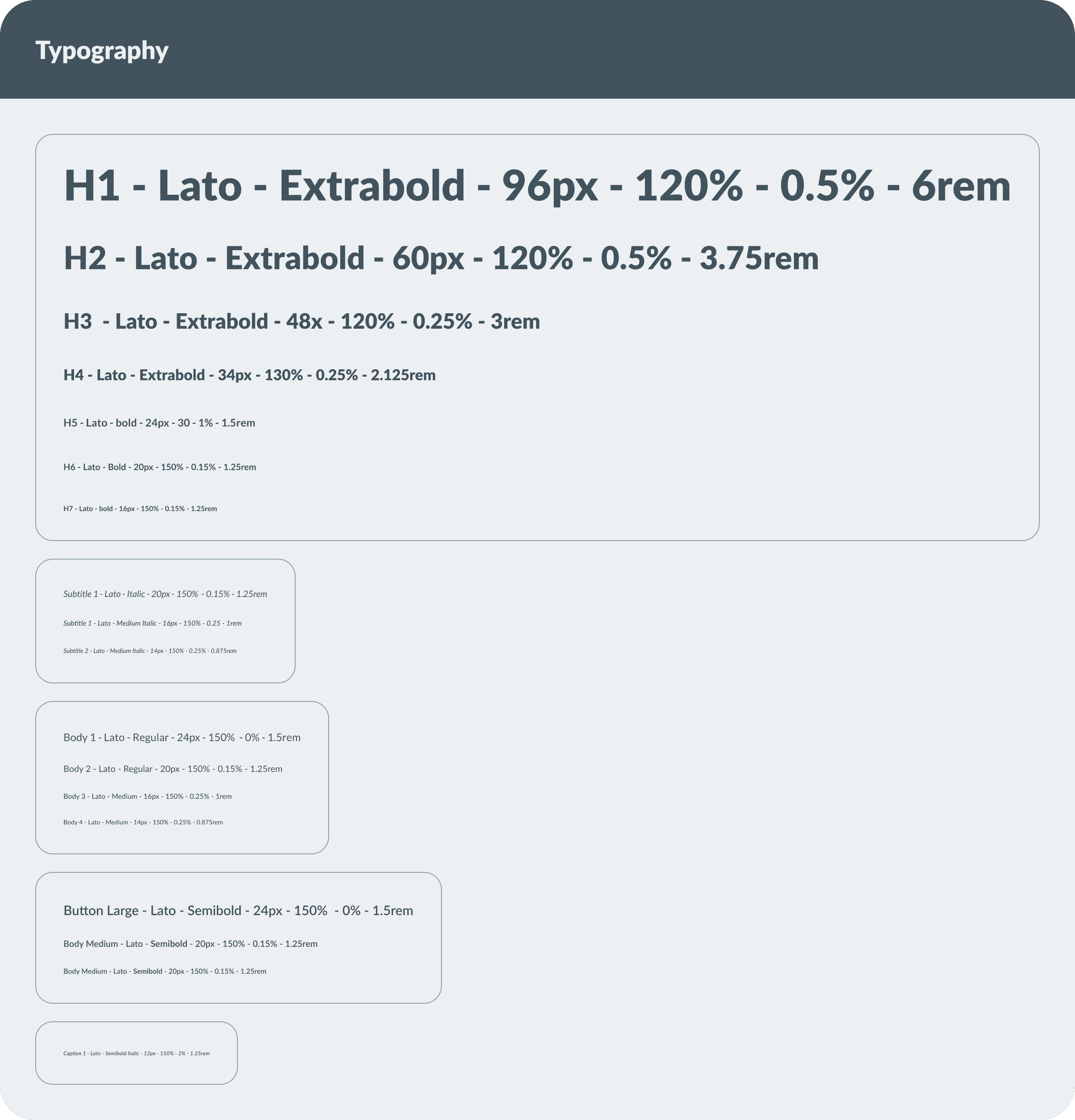
Typography
We carefully selected the Lato font for our UI/UX app project based on several key considerations.
Firstly, Lato offers excellent legibility, making it easy for users to read and comprehend the content displayed in the application. Its balanced letterforms and open spacing contribute to a clean and modern aesthetic, aligning well with the overall design direction. Additionally, Lato provides a wide range of font weights and styles, offering versatility and flexibility to accommodate various interface elements and hierarchical text structures. The font's extensive character set ensures excellent language support, catering to a diverse user base.
Overall, Lato's combination of readability, visual appeal, and versatility made it the ideal choice to enhance the user experience and create a visually pleasing interface for our app project.
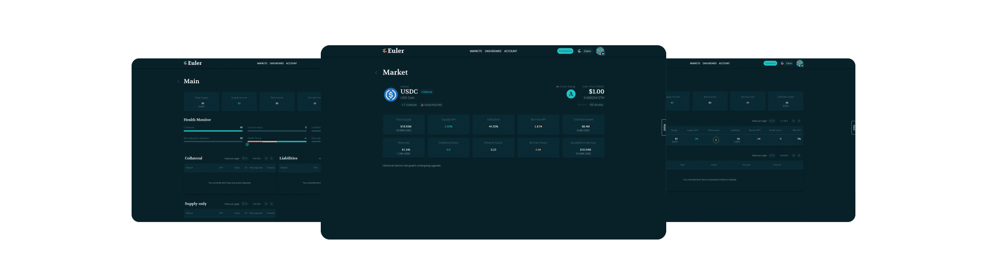
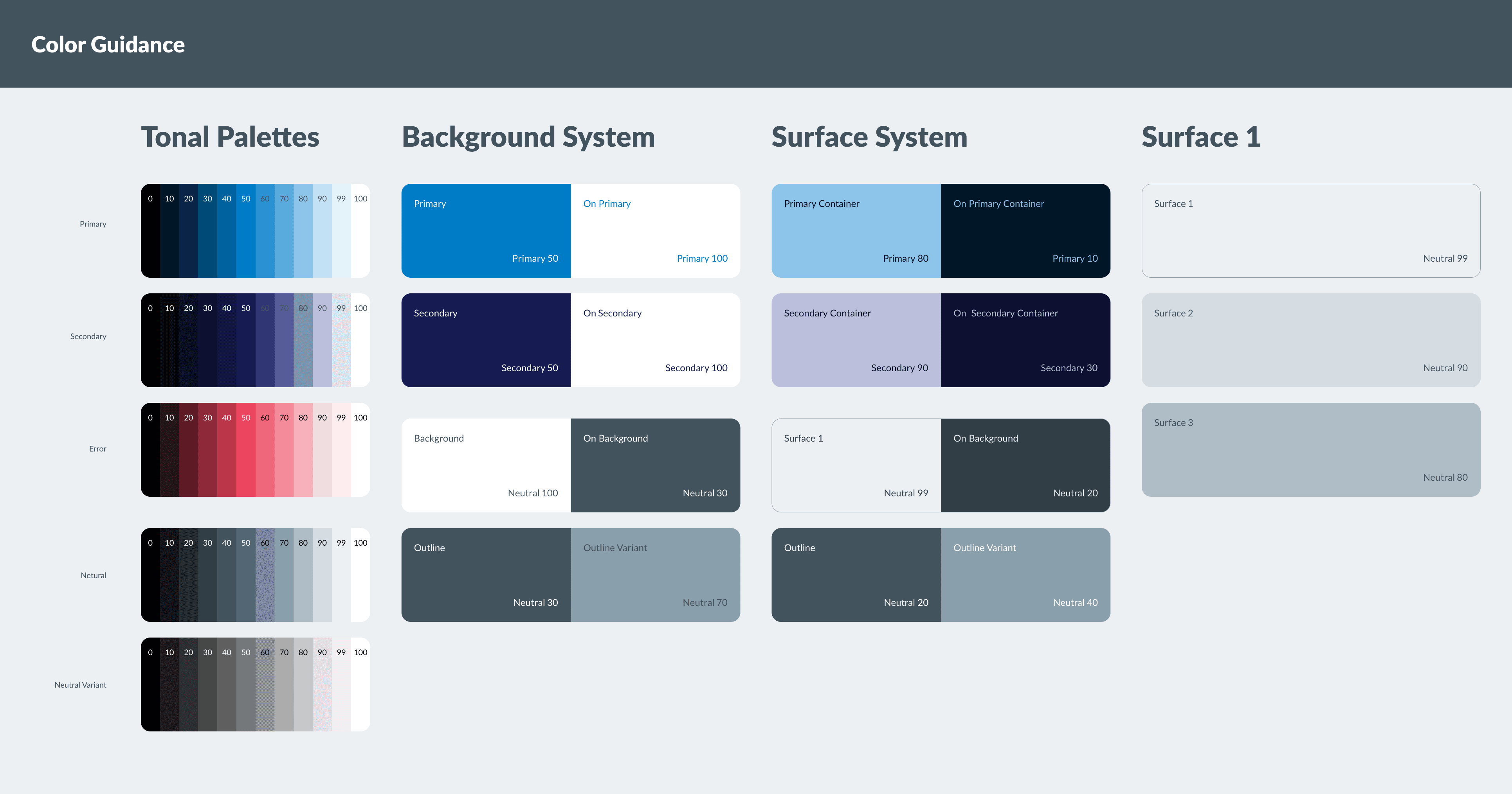
Color Guide
The previous color choice in our brand's visual identity was overly saturated, which inadvertently created an overall feeling of immaturity. Recognizing the need for a change, we embarked on a thorough reassessment of our brand's core essence. The aim was to develop a visual identity that truly reflected the values and aspirations of Euler Finance.
As part of the Euler Finance visual identity redesign, the color palette underwent a significant transformation. While our objective was to adopt a more professional appearance, we also wanted to preserve the vibrant and dynamic essence synonymous with the world of cryptocurrencies.
Components
Scalable design system that saves time, reduces technical debt over time. It solves the problem of inconsistent components and user experience.
With 200+ components with properly defined typography styles, icons and illustrations. Everything in the app is made up of these modular components—this gives a unified, consistent, robust UI.
The design system is never final. It evolves as we go along.
Final Design
Here's a detailed walkthrough of the revamped Euler Finance DAPP
All new look and feel
Prior to the revamp, the application appeared disorganized and failed to emphasize G1G's primary offerings. With the updated design, G1G now boasts a contemporary aesthetic and an enhanced user experience. In order to elevate our brand and product image, we have incorporated new, adaptable elements, reimagined micro-interactions, and restructured the product placement.
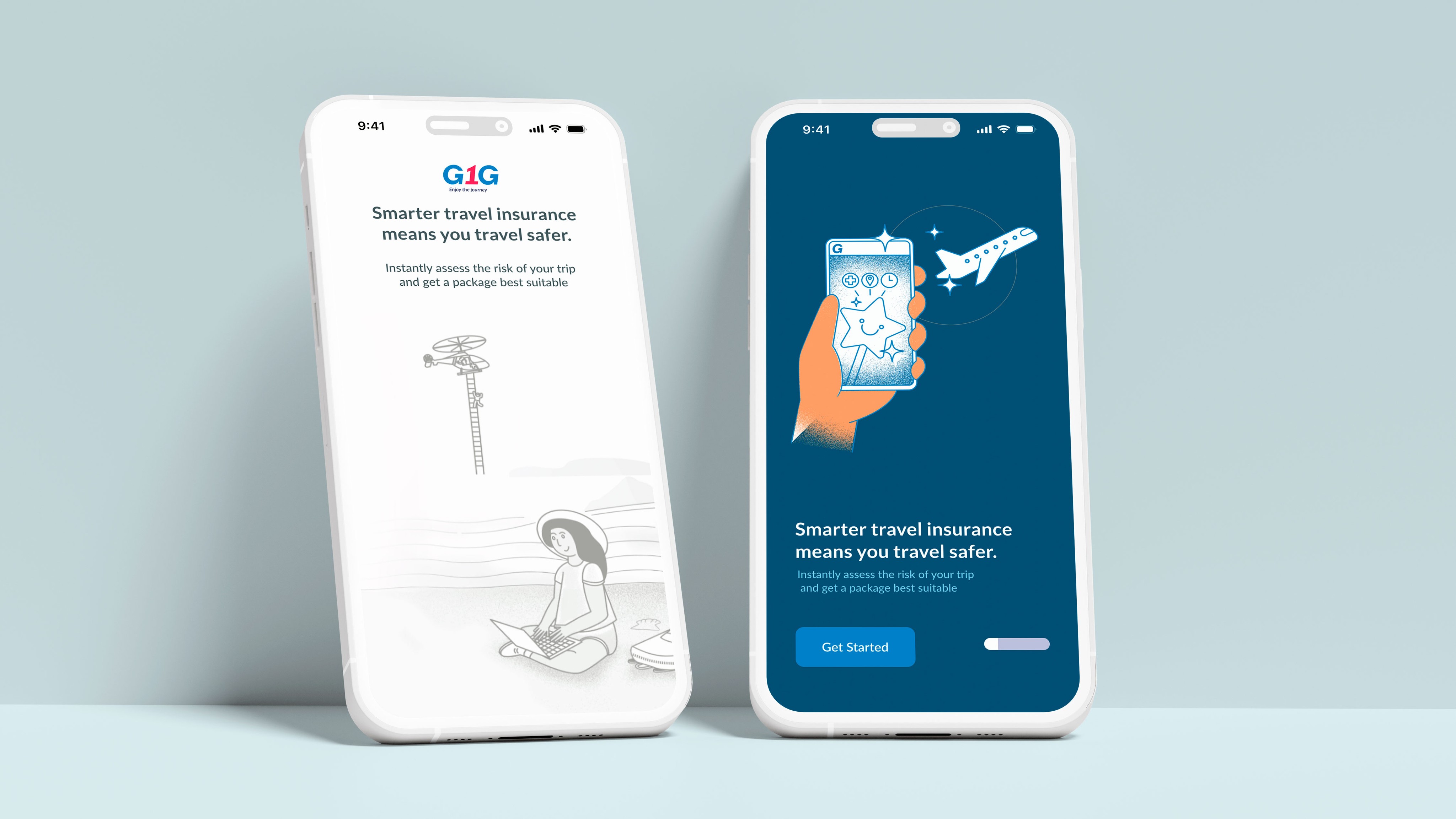
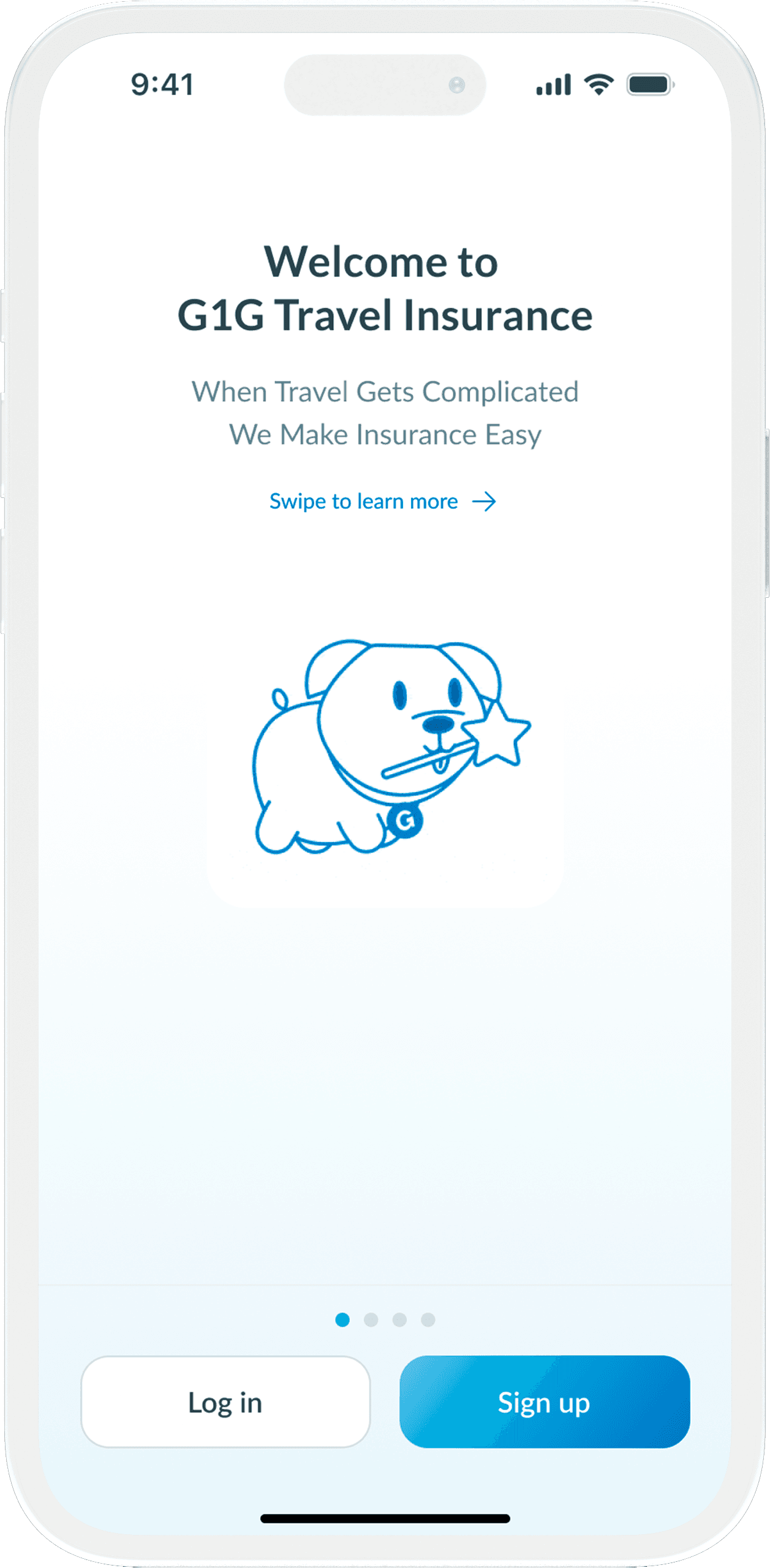
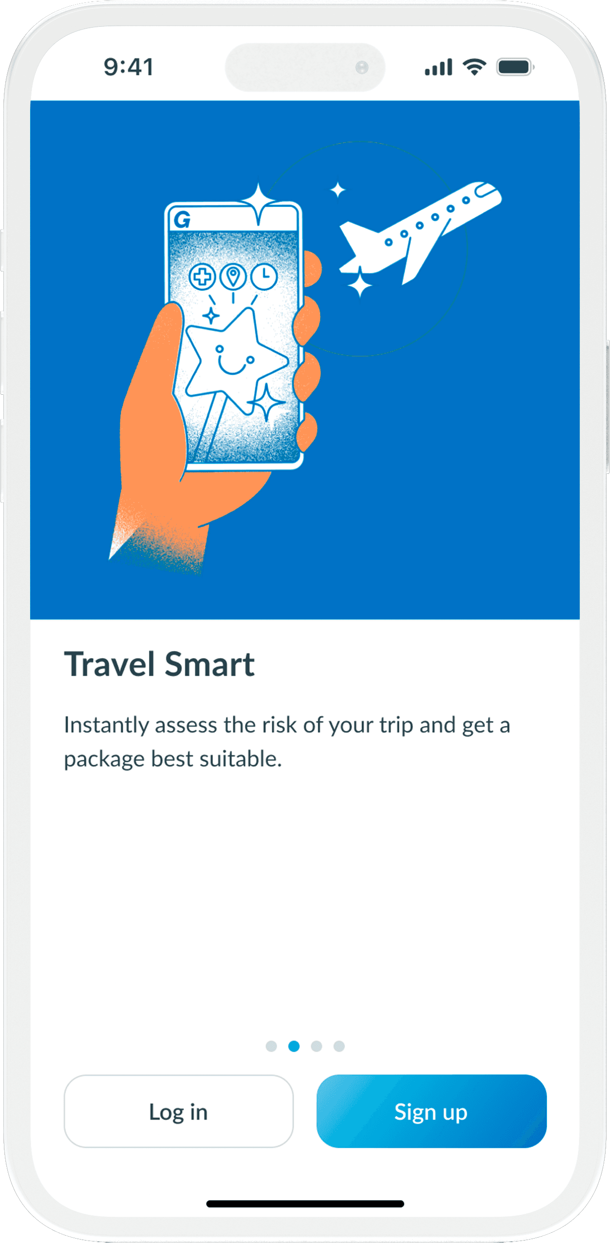
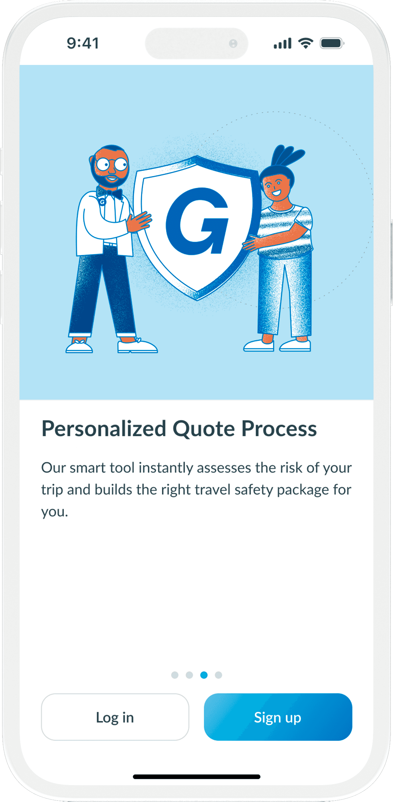
Onboarding
We embraced a modern and stylish approach to the onboarding experience. The entire concept revolved around transforming onboarding into a narrative where, with each scroll, users become captivated by G1G. Of course, we needed to maintain brevity so that users can swiftly transition into the application.
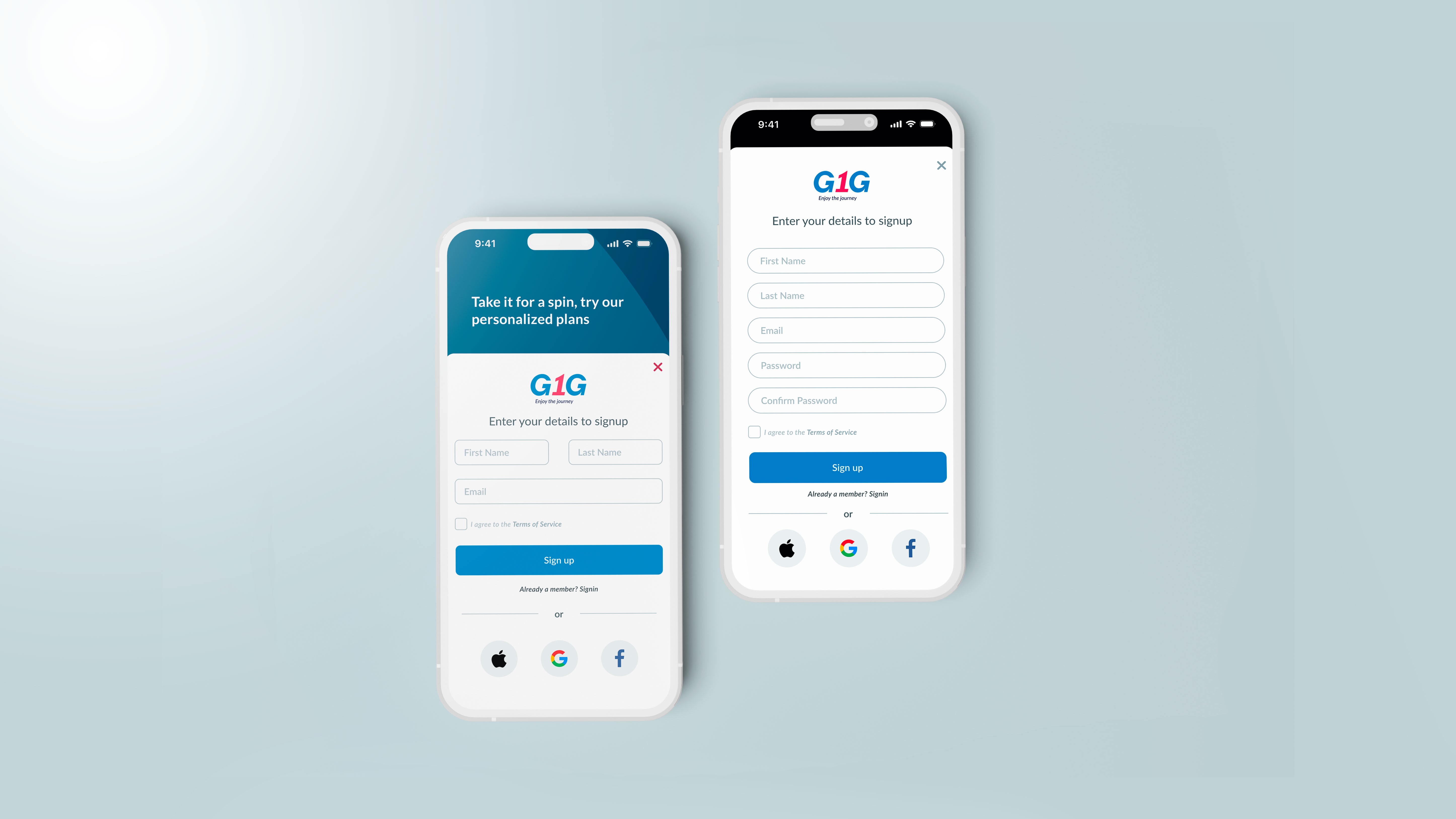
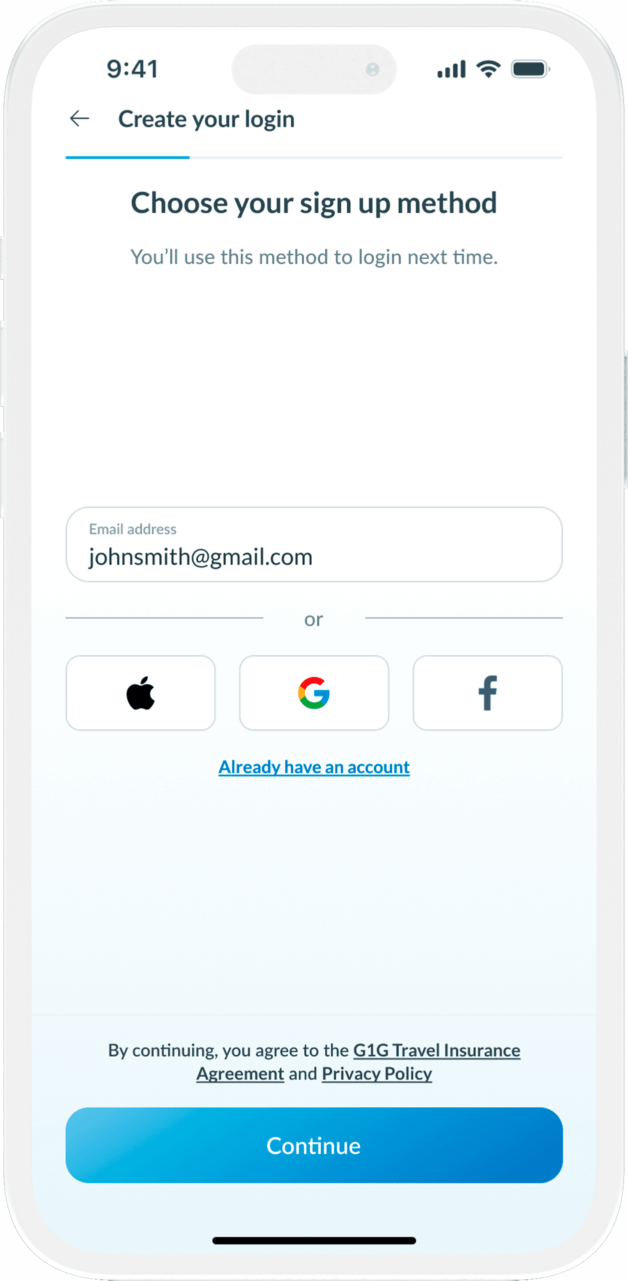
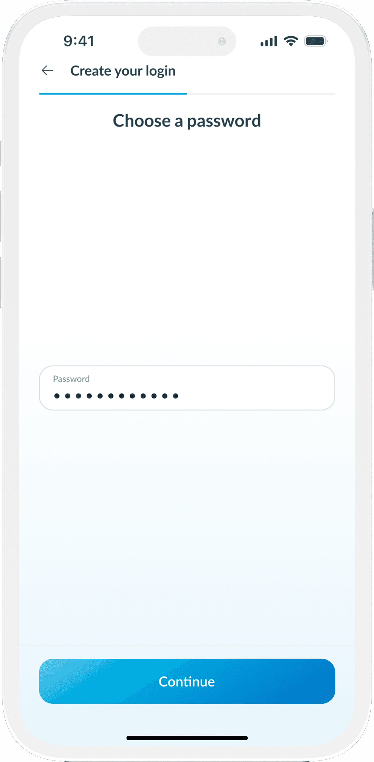
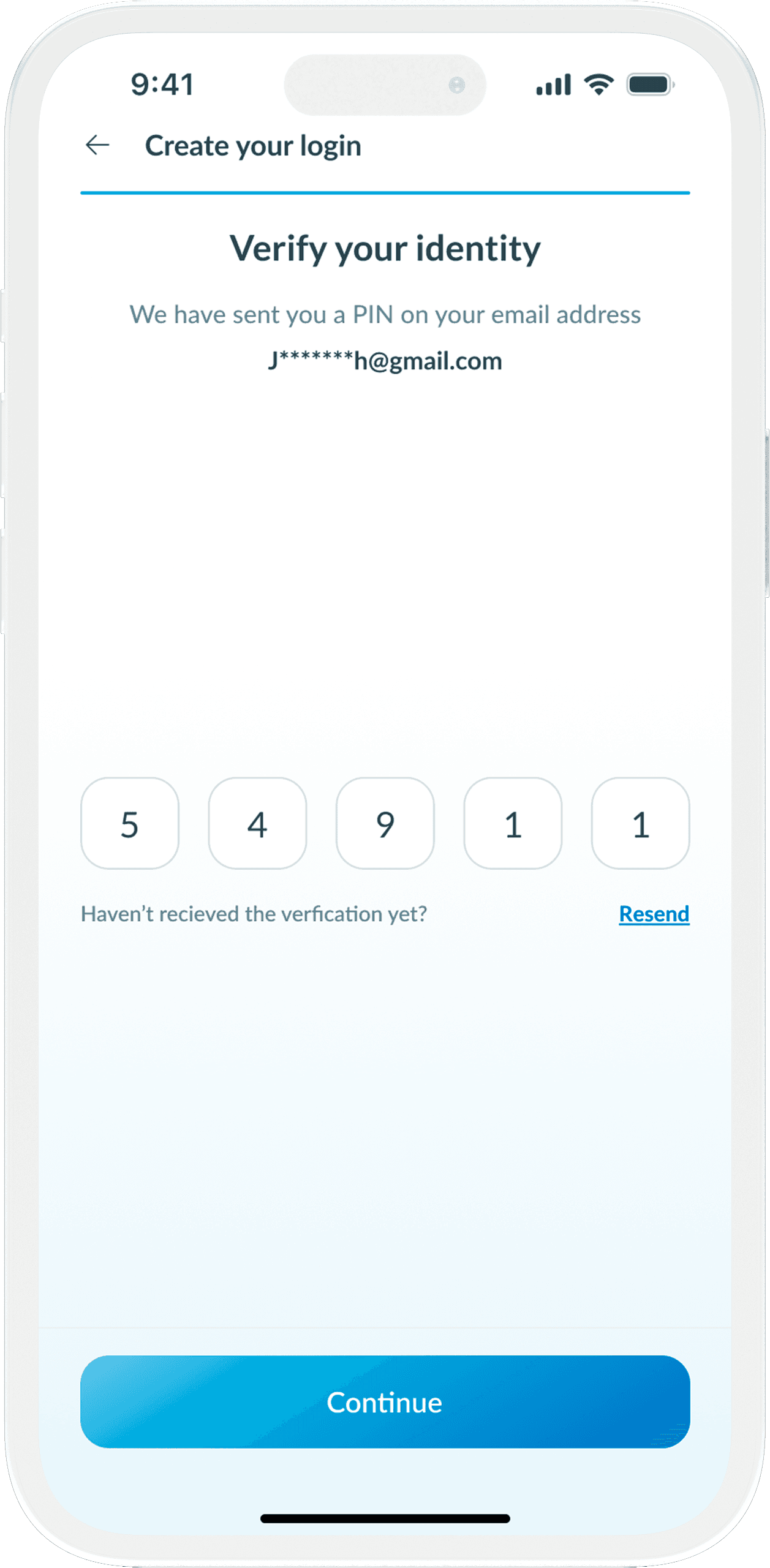
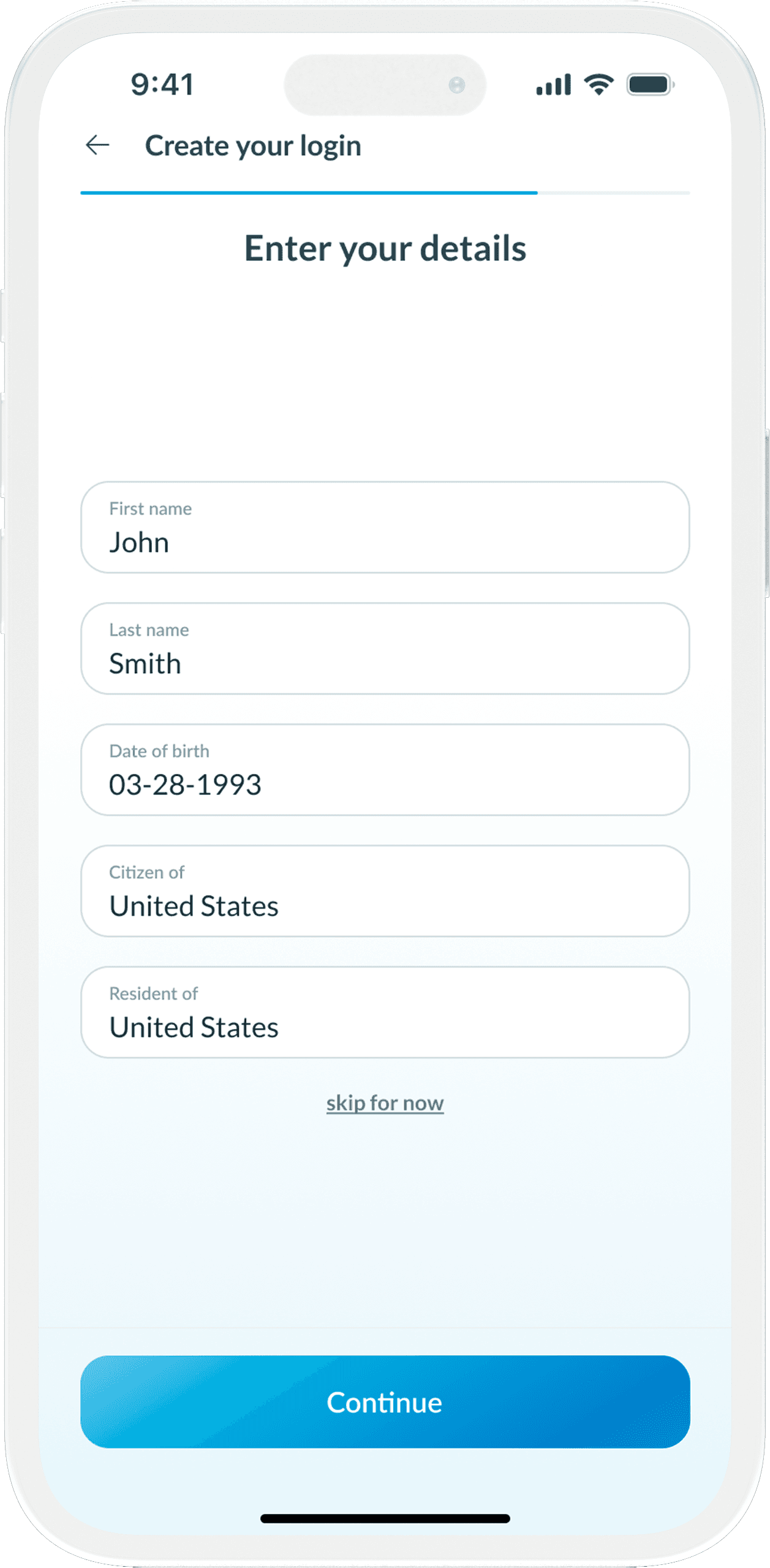
Login & Signup
We've made the sign-up and login procedures extremely brief to allow users to swiftly access the app without losing valuable time.
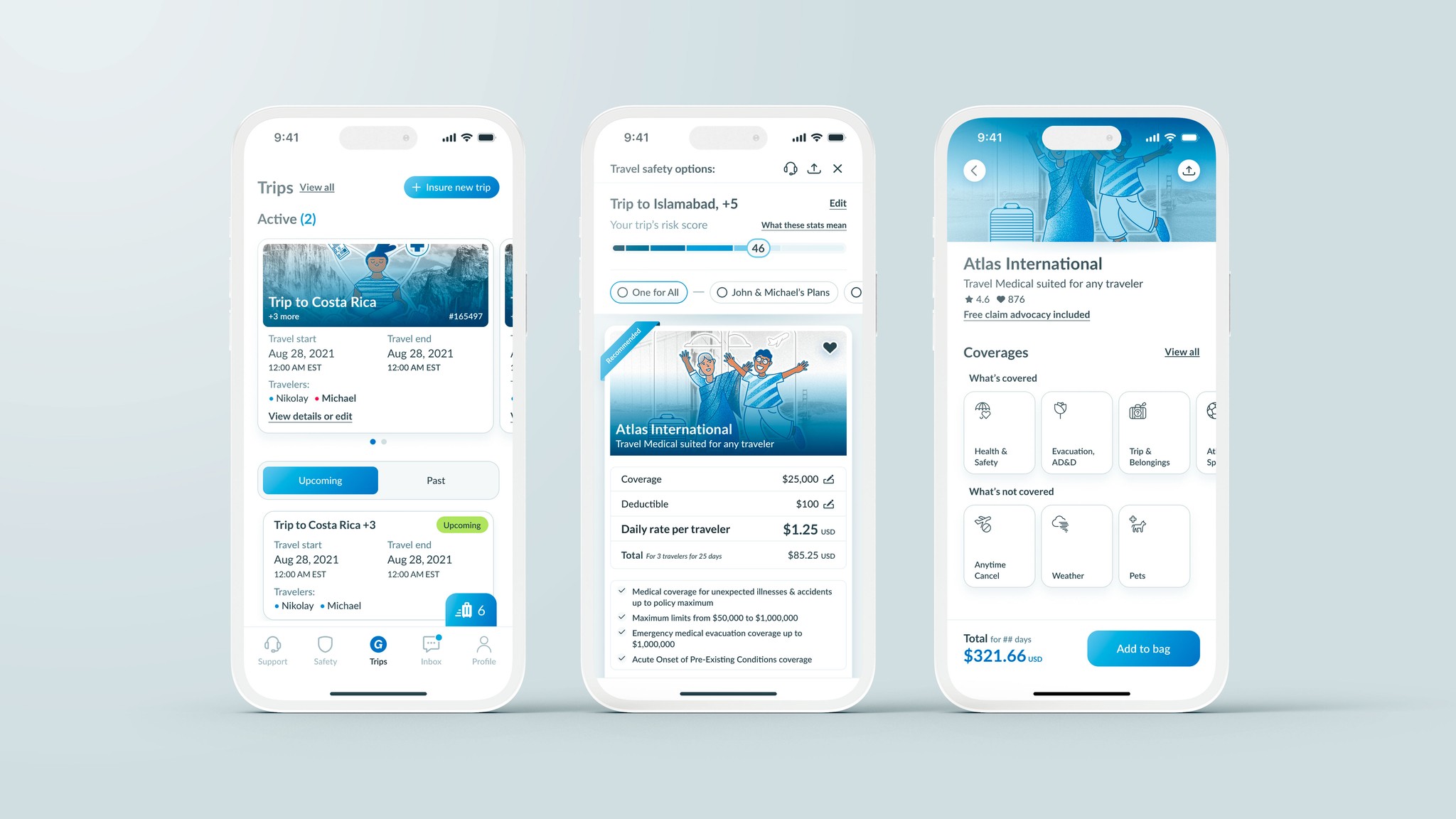
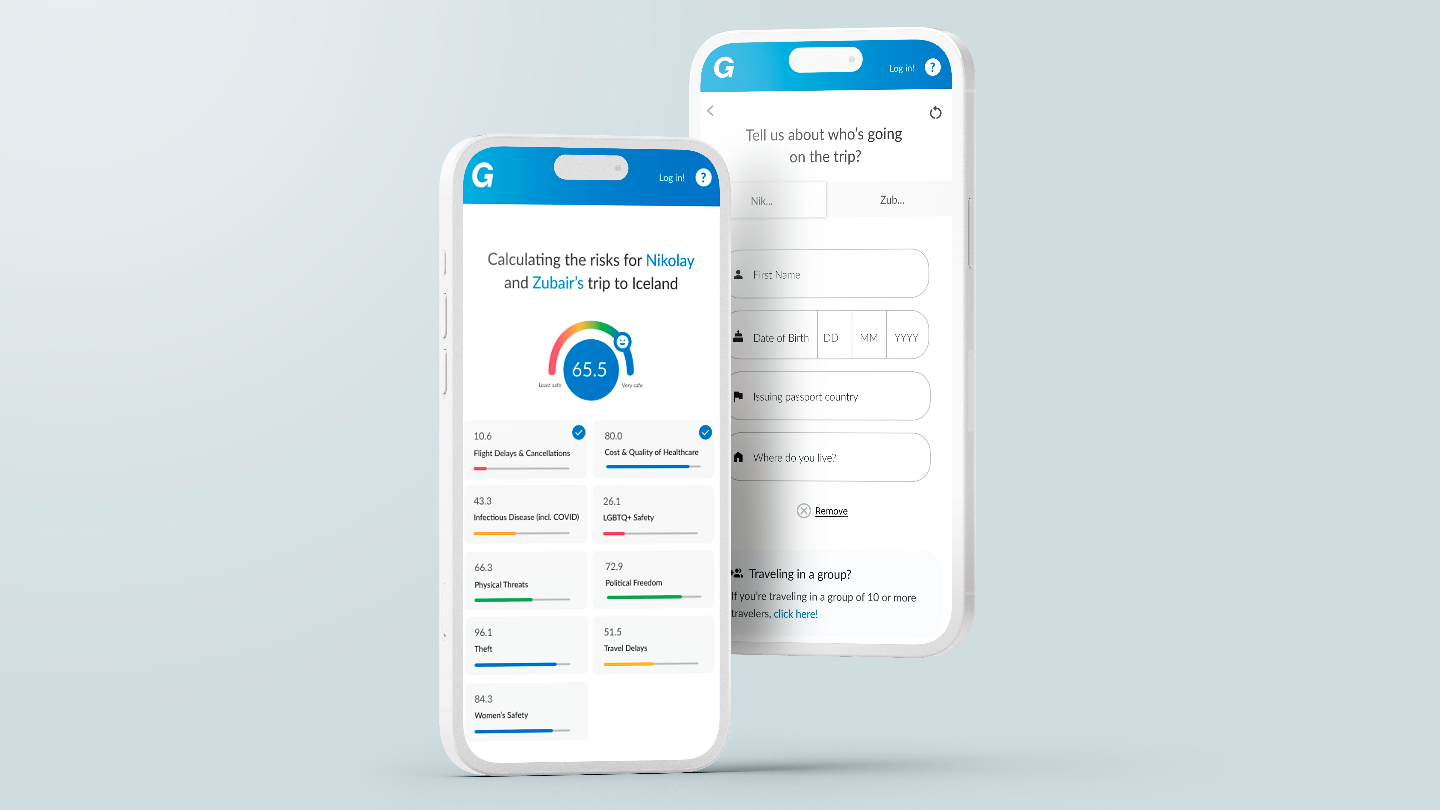
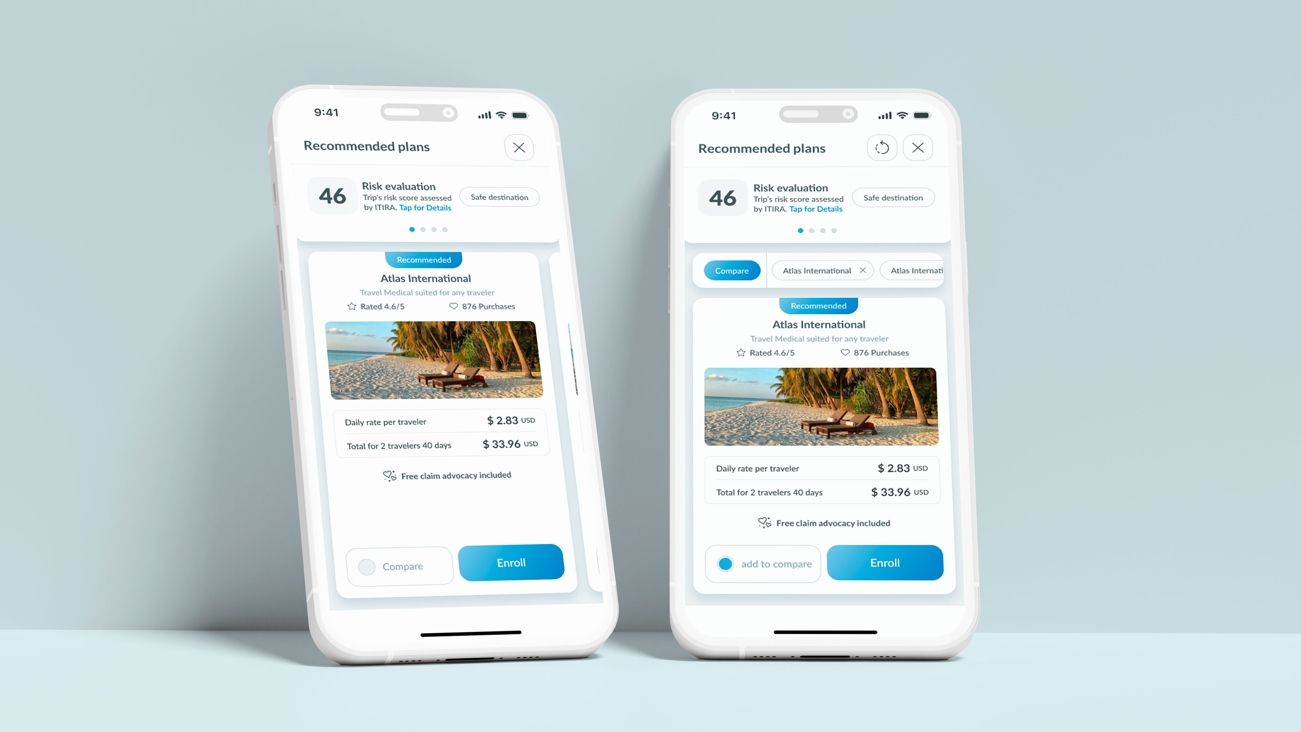
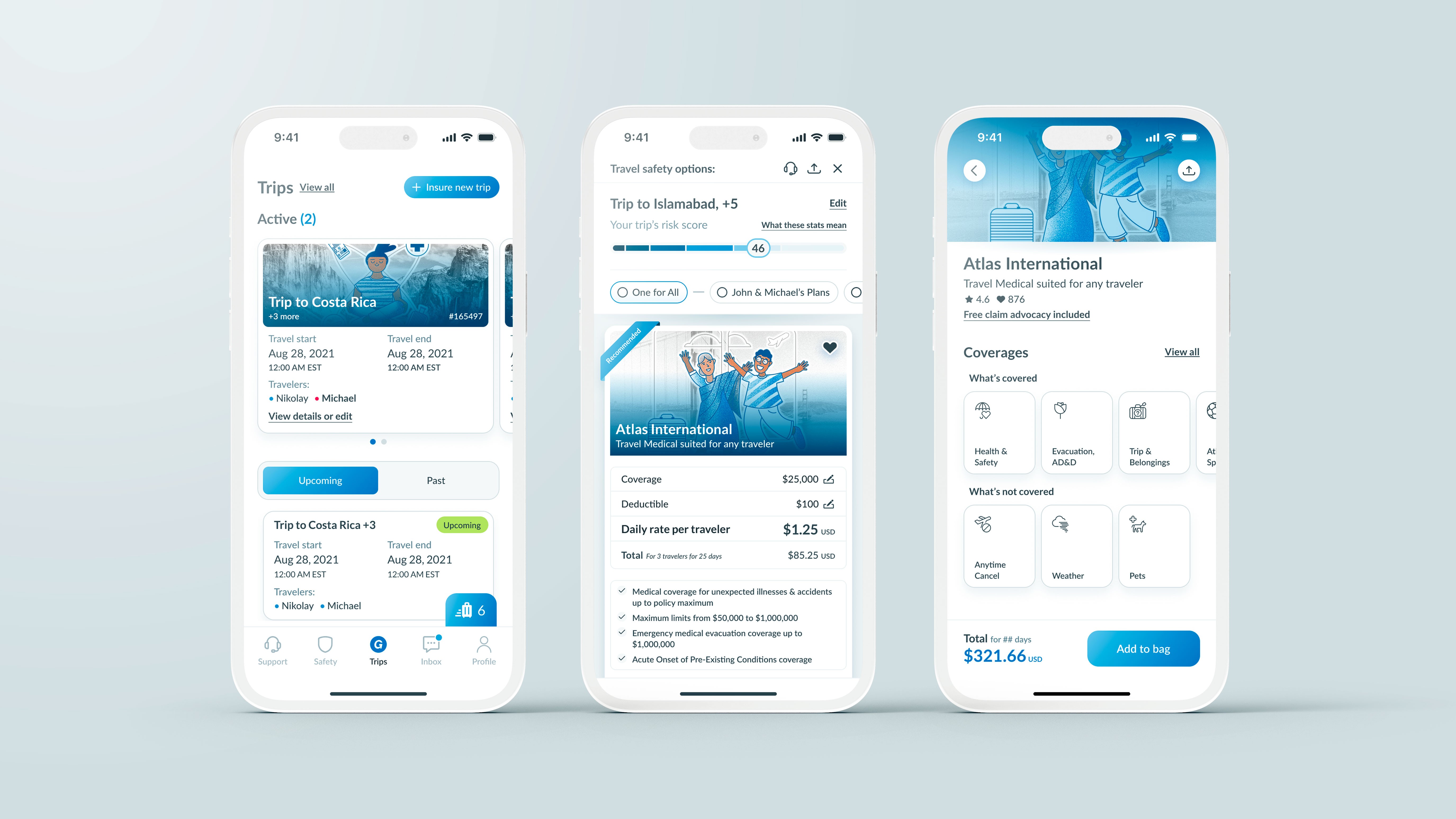
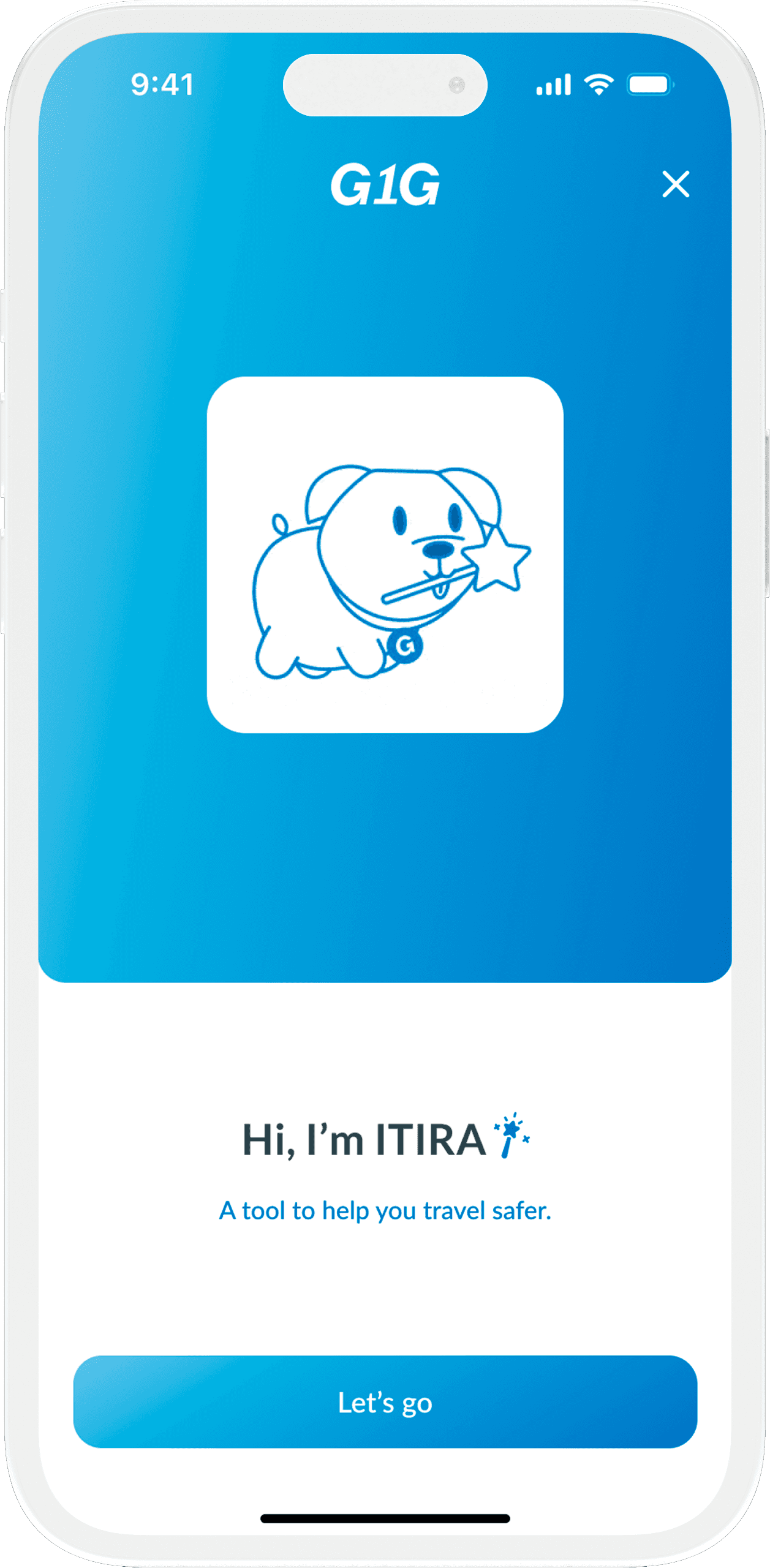
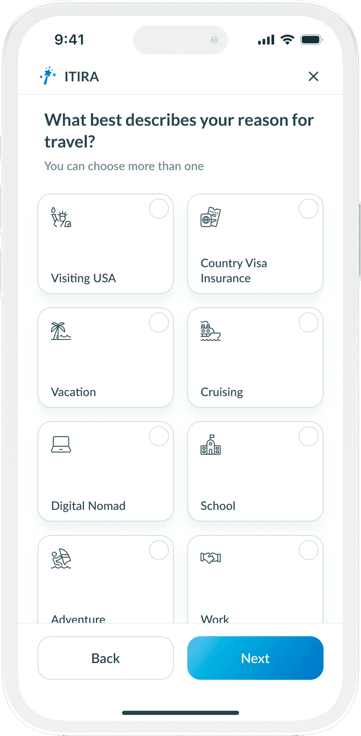
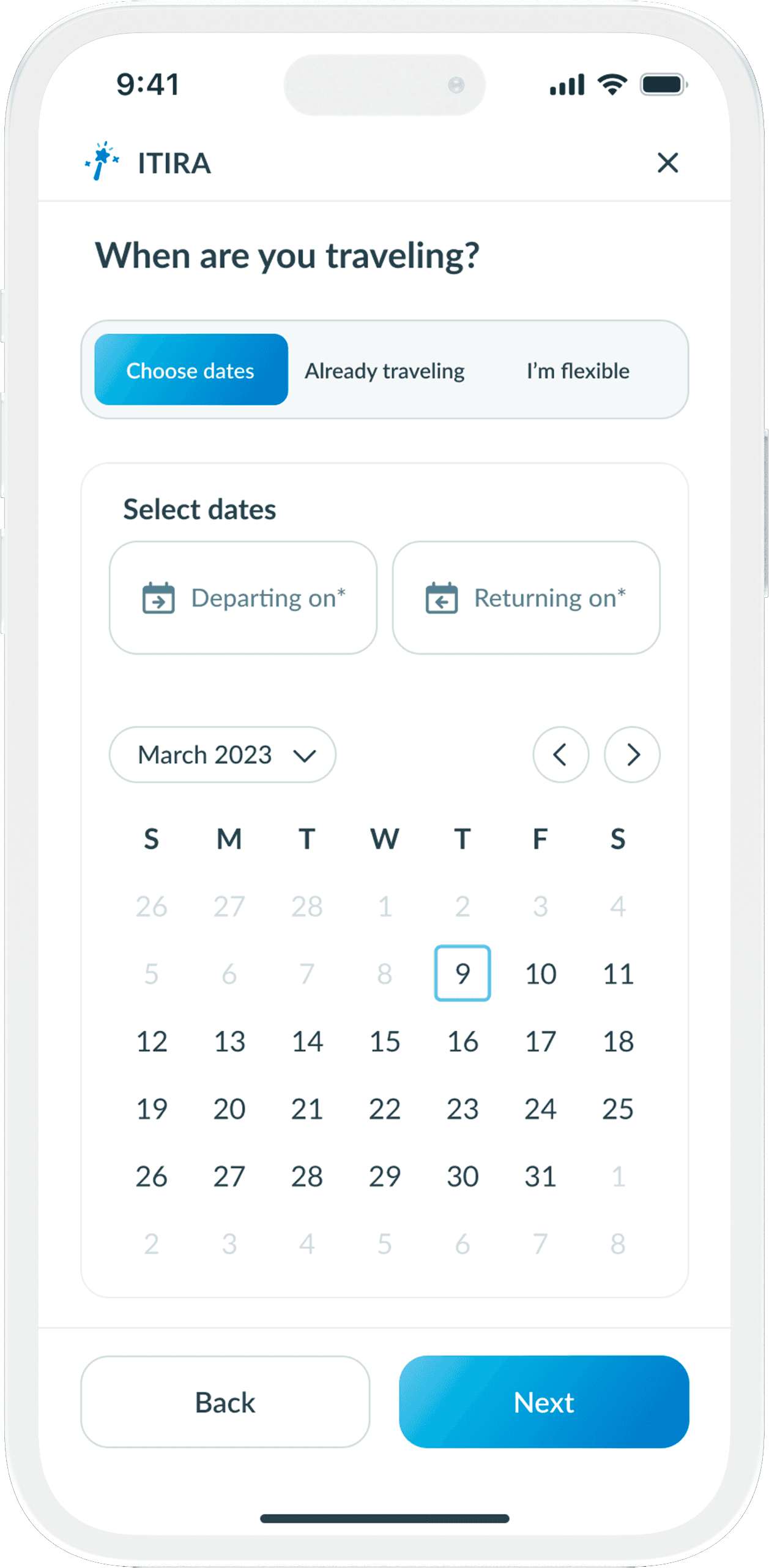
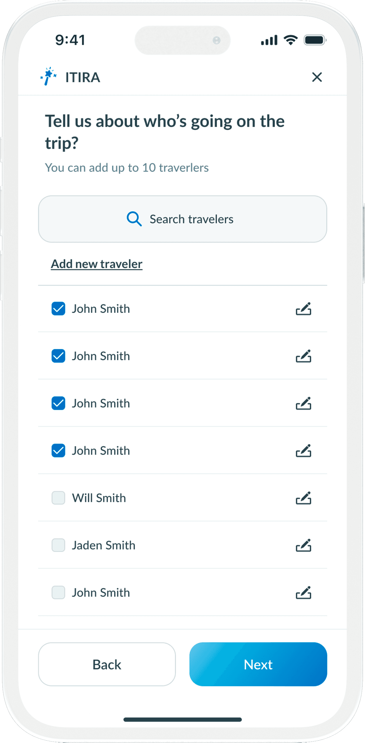
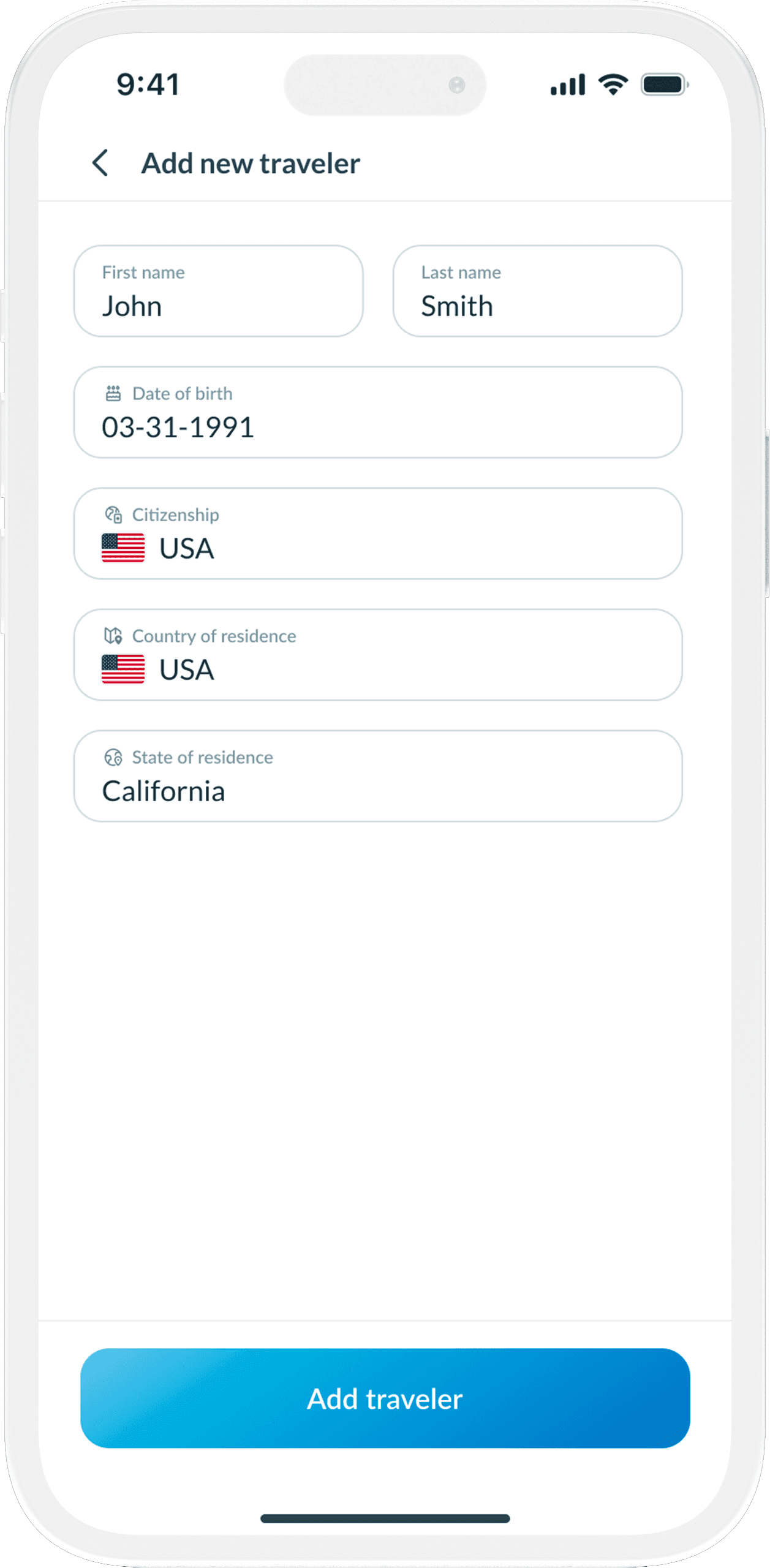
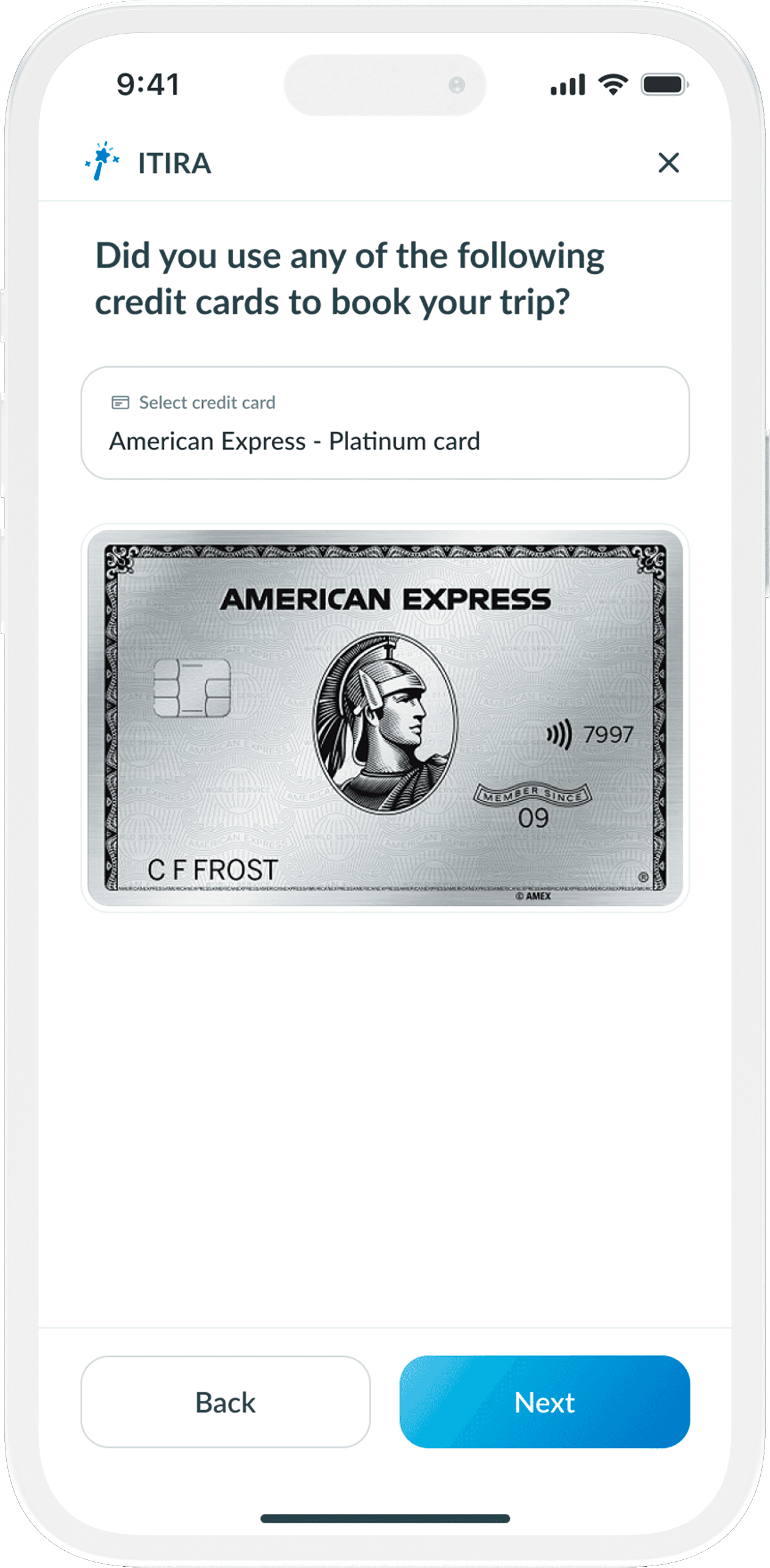
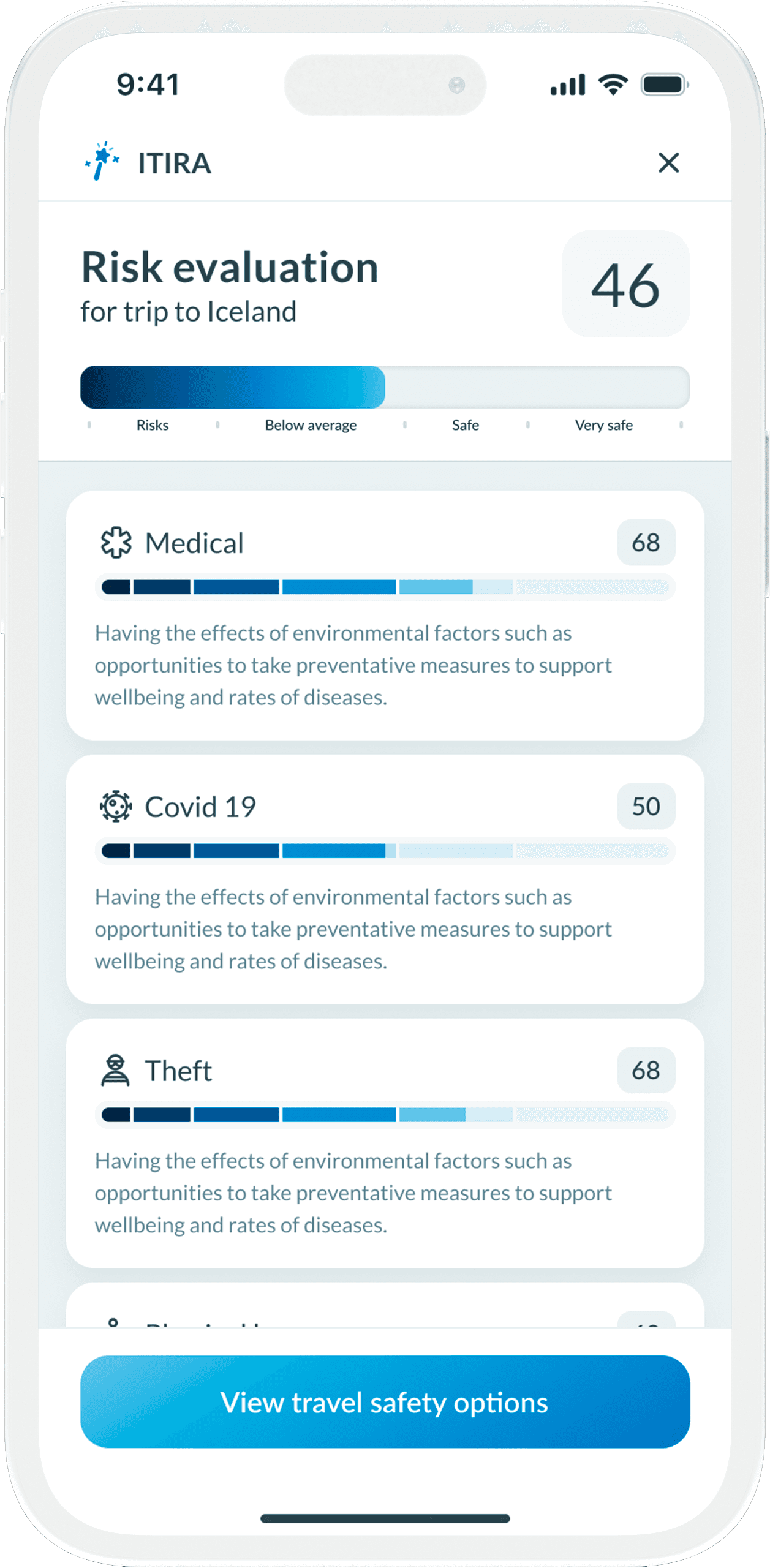
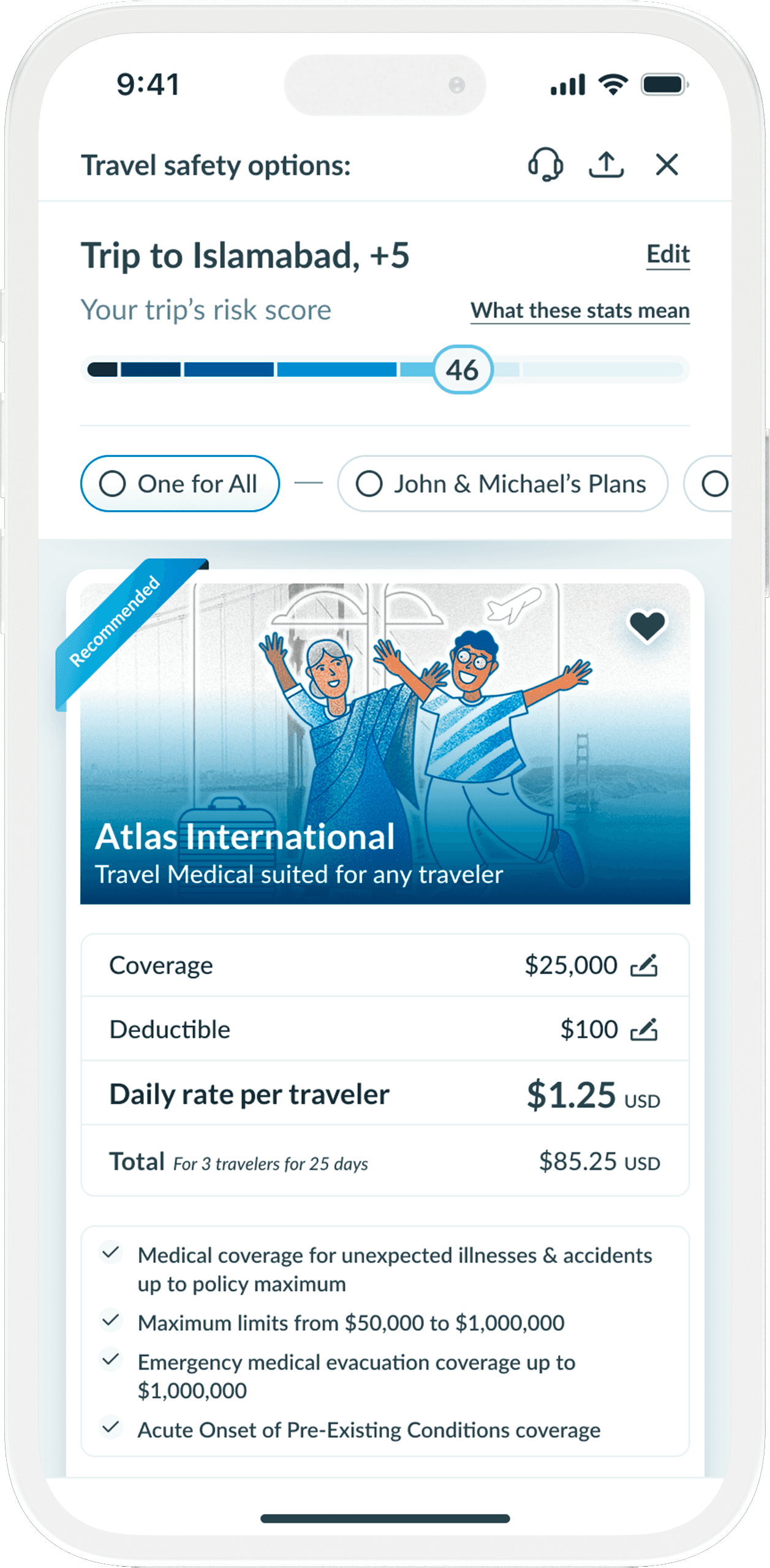
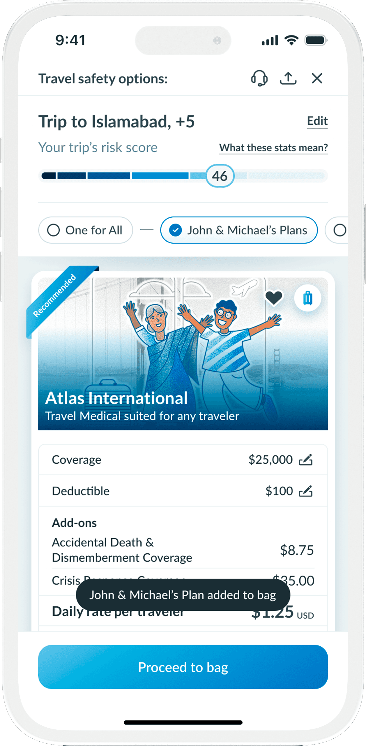
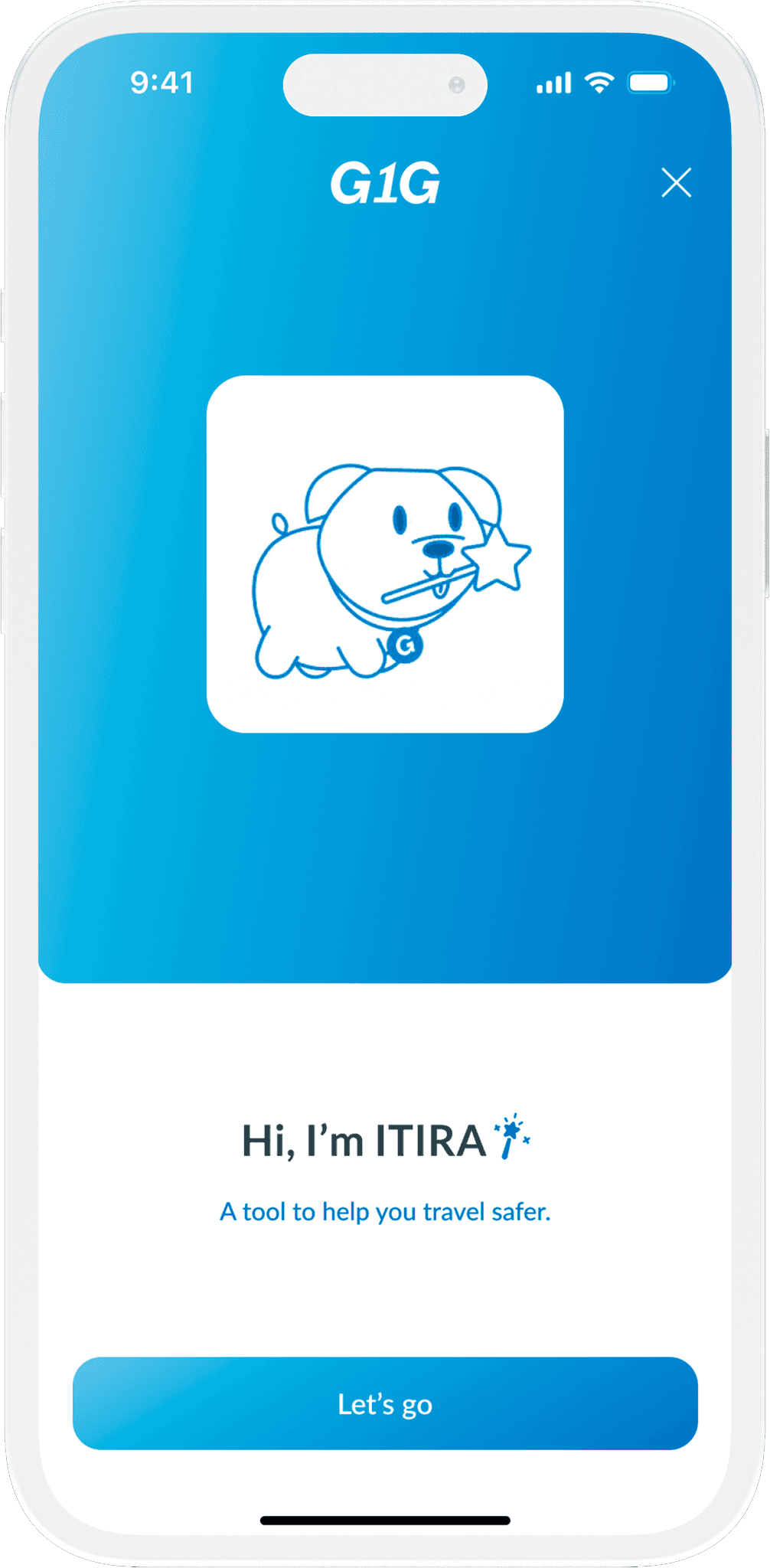
G1G Quoting Engine (ITIRA)
G1G ITIRA offers an innovative approach to understanding the purpose of a user's journey and addressing the issues they encounter while traveling, all while informing them about the safety of their destination before presenting the most suitable policy options.
Some screens like adding travelers info were creatively design to complete actions quickly and perform edits on them if needed seamlessly as well.
The scoring screen had over 15 design samples testing each and every possible scenario to find the one which not only complimented the brand but also complete its function as well.
We designed a streamlined, contemporary design, ensuring a user-friendly experience that increased user's efficiently to complete the entire process by 42%.
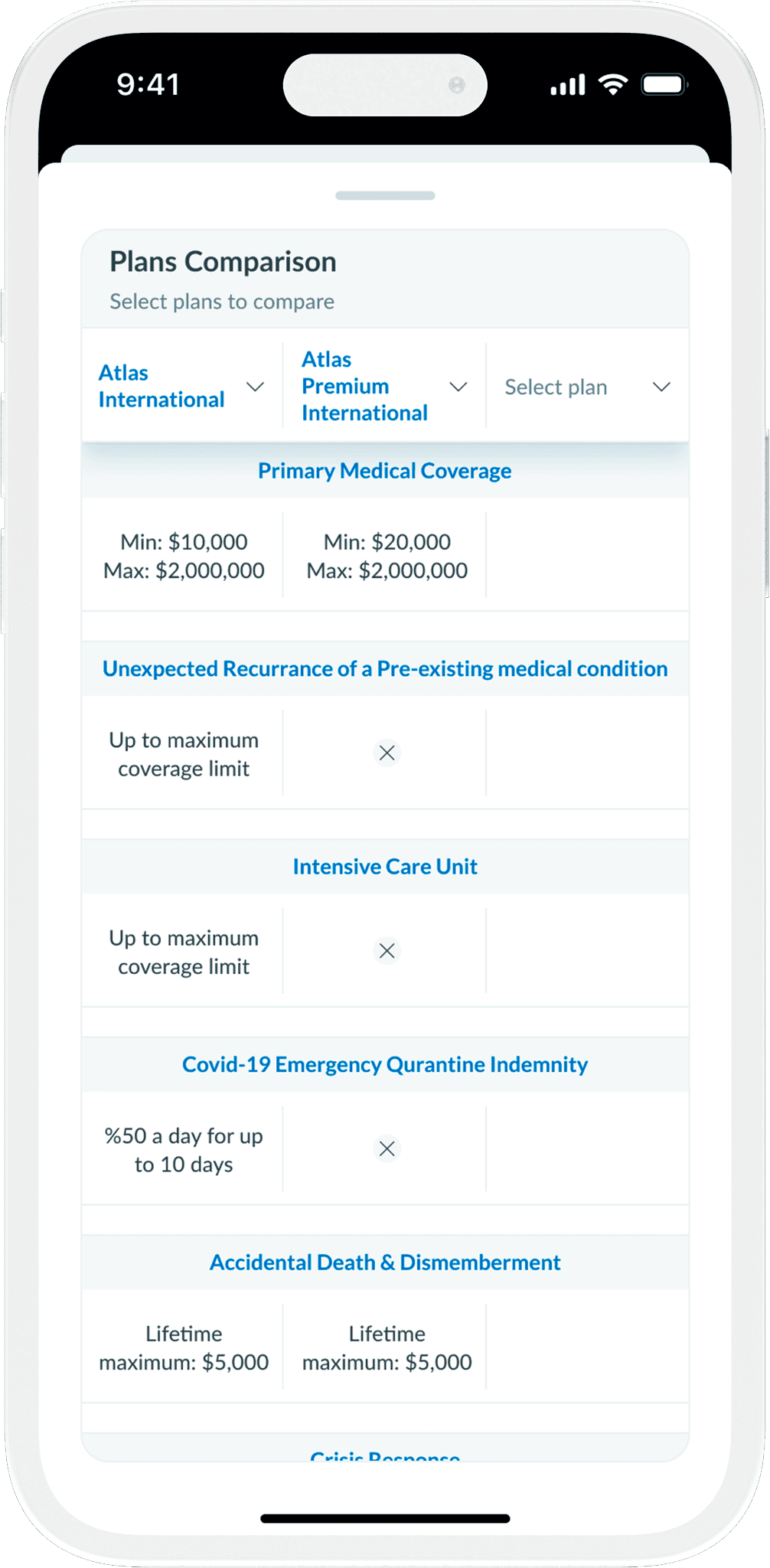
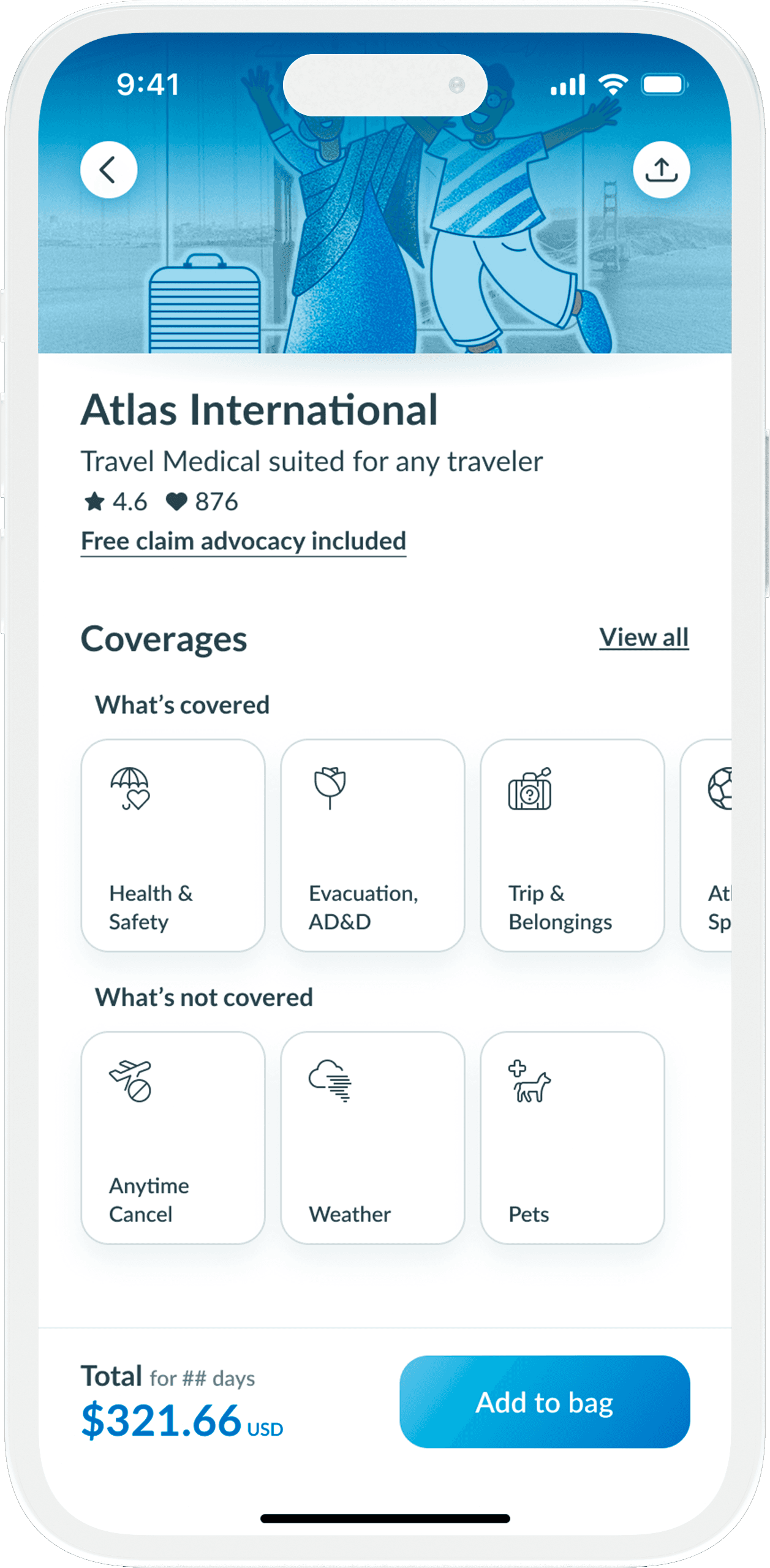
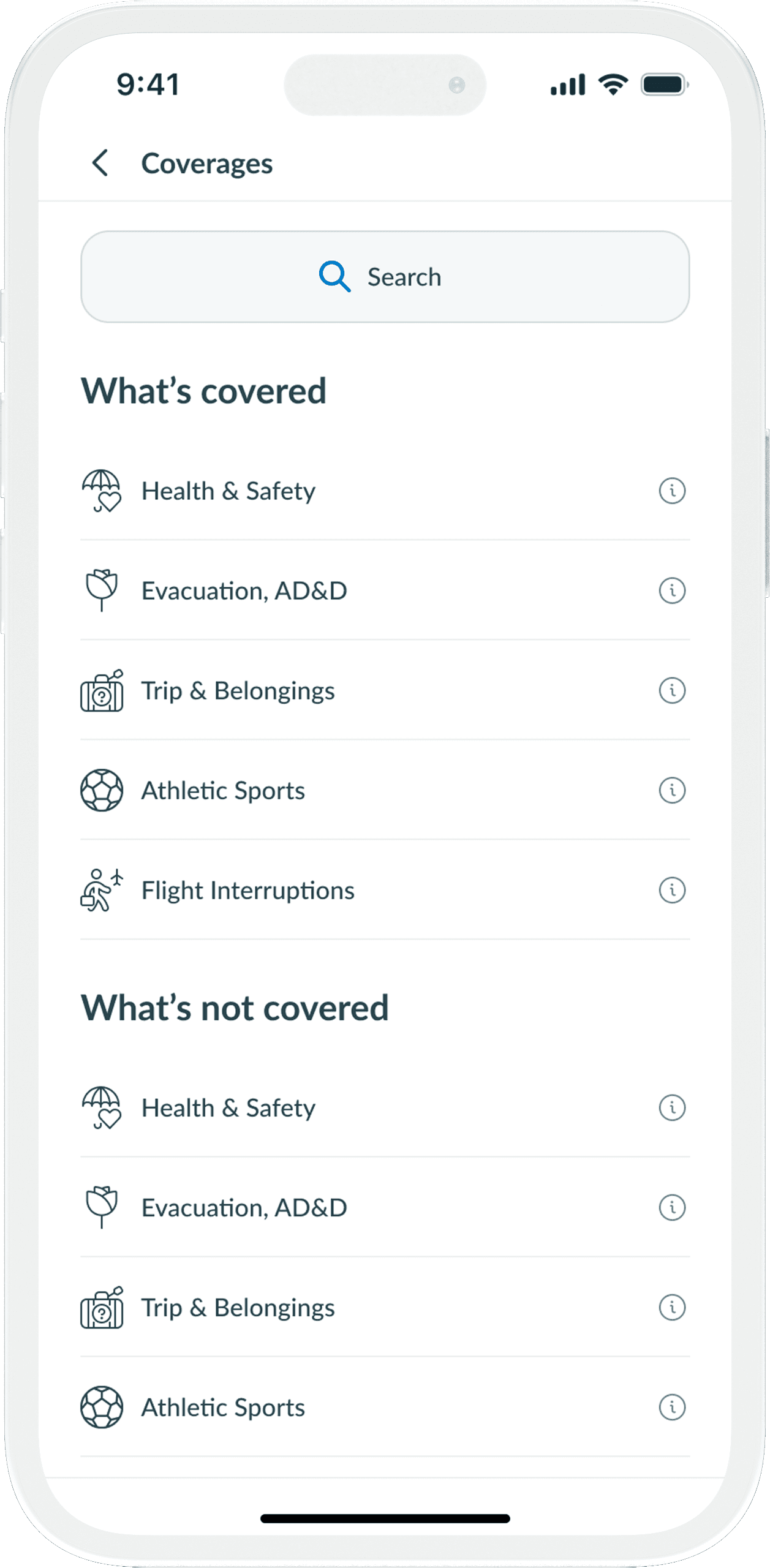
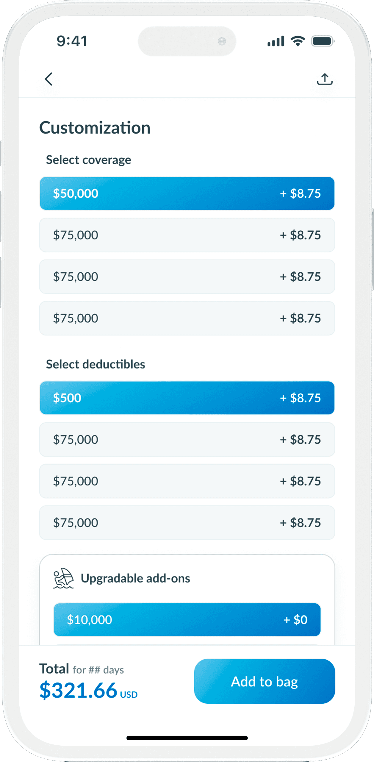
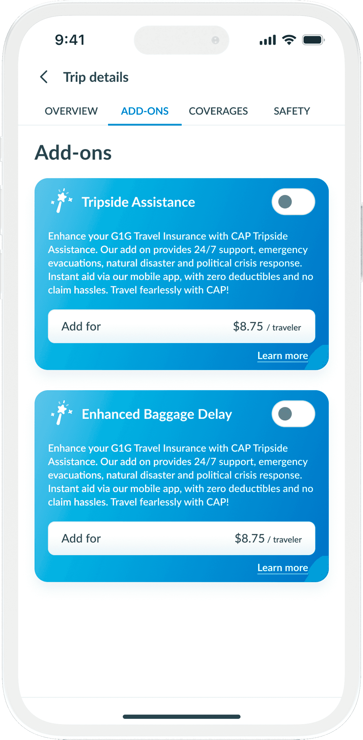
Policy Plan details
After finishing the ITIRA procedure, users are shown the most appropriate policies for their needs. They can effortlessly compare options and determine the best fit.
The policy detail screen provides clear insight into the coverage available under each plan. Incorporating add-ons is smoothly achieved using toggle switches. Users can customize their plan with ease while knowing how it changes their policy.
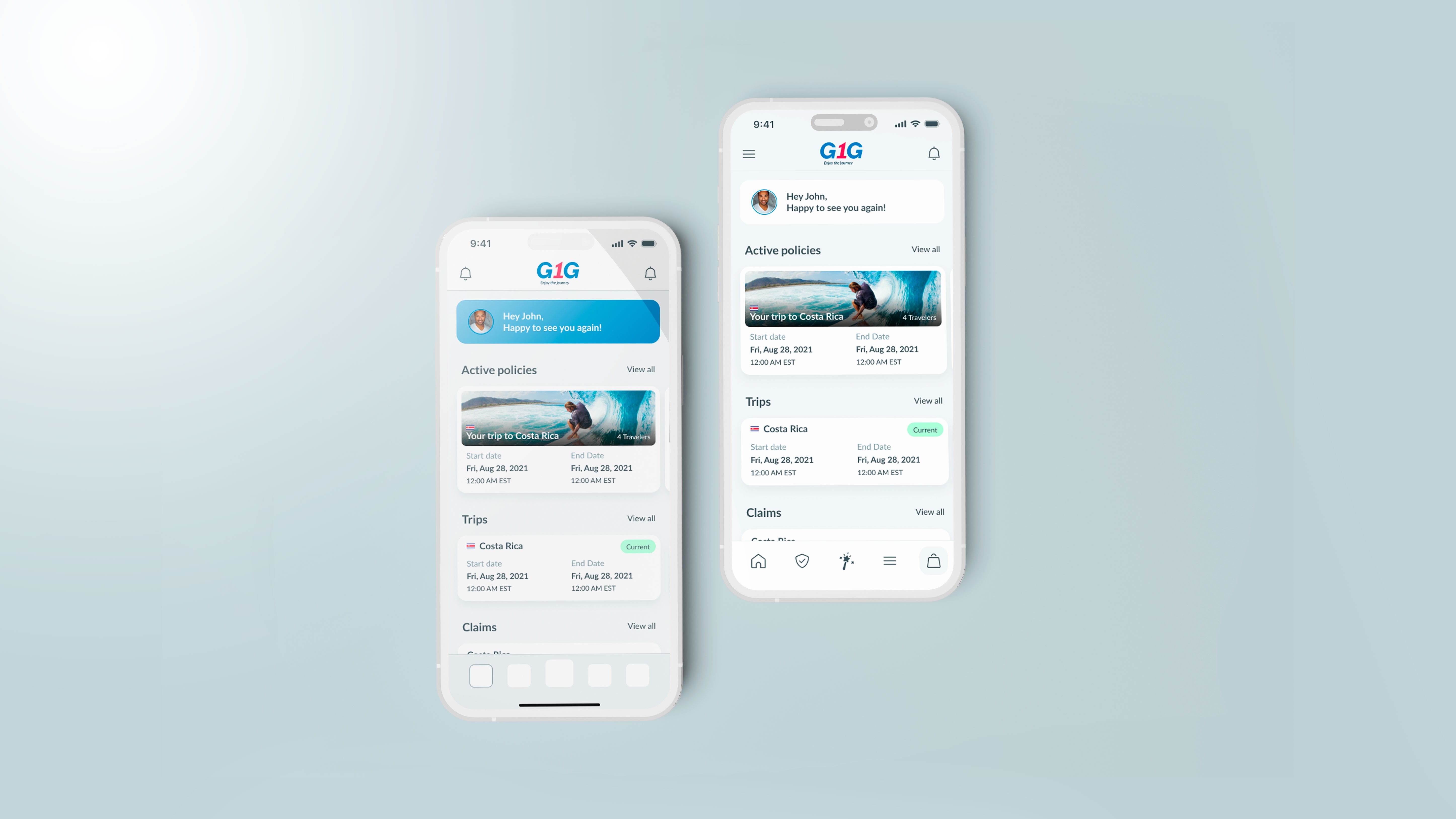
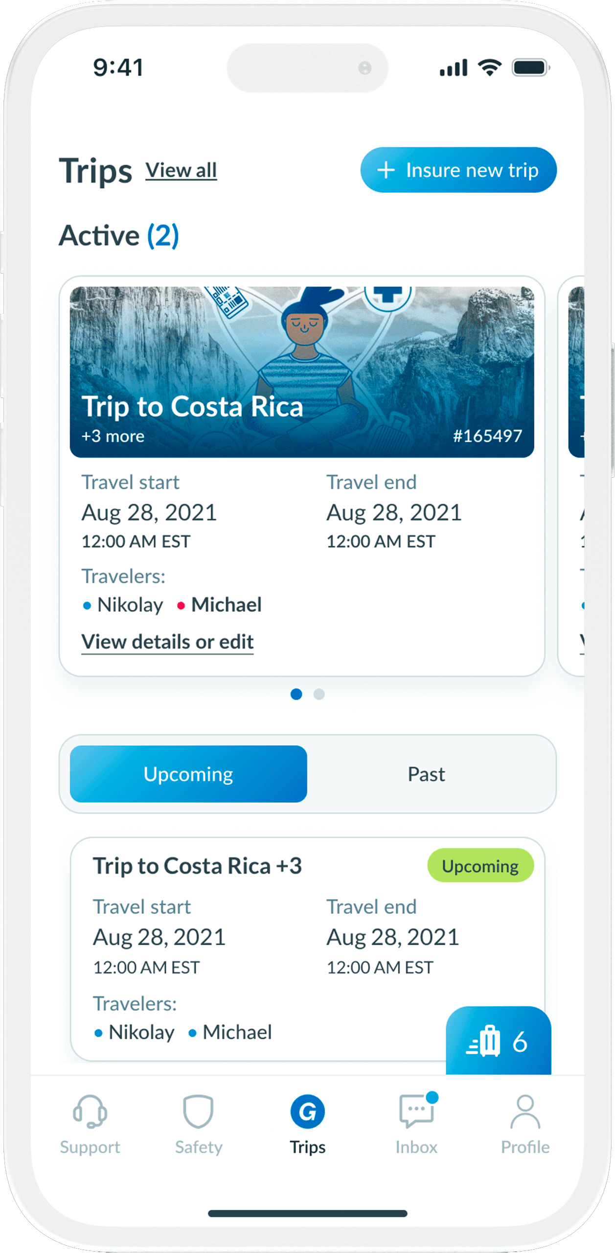
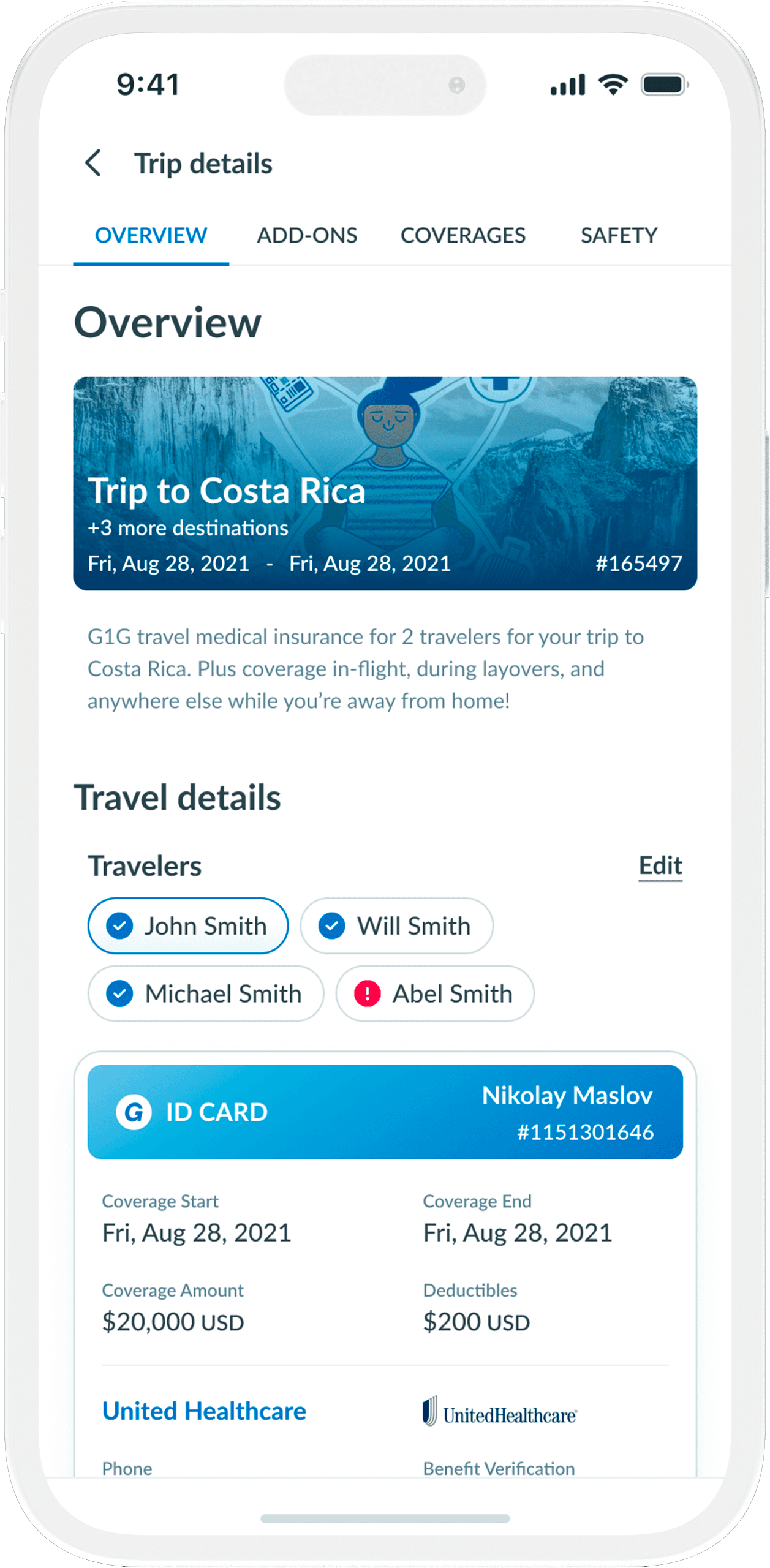
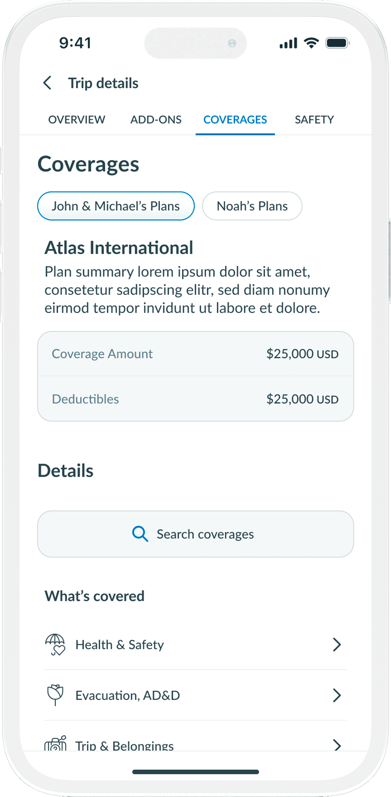
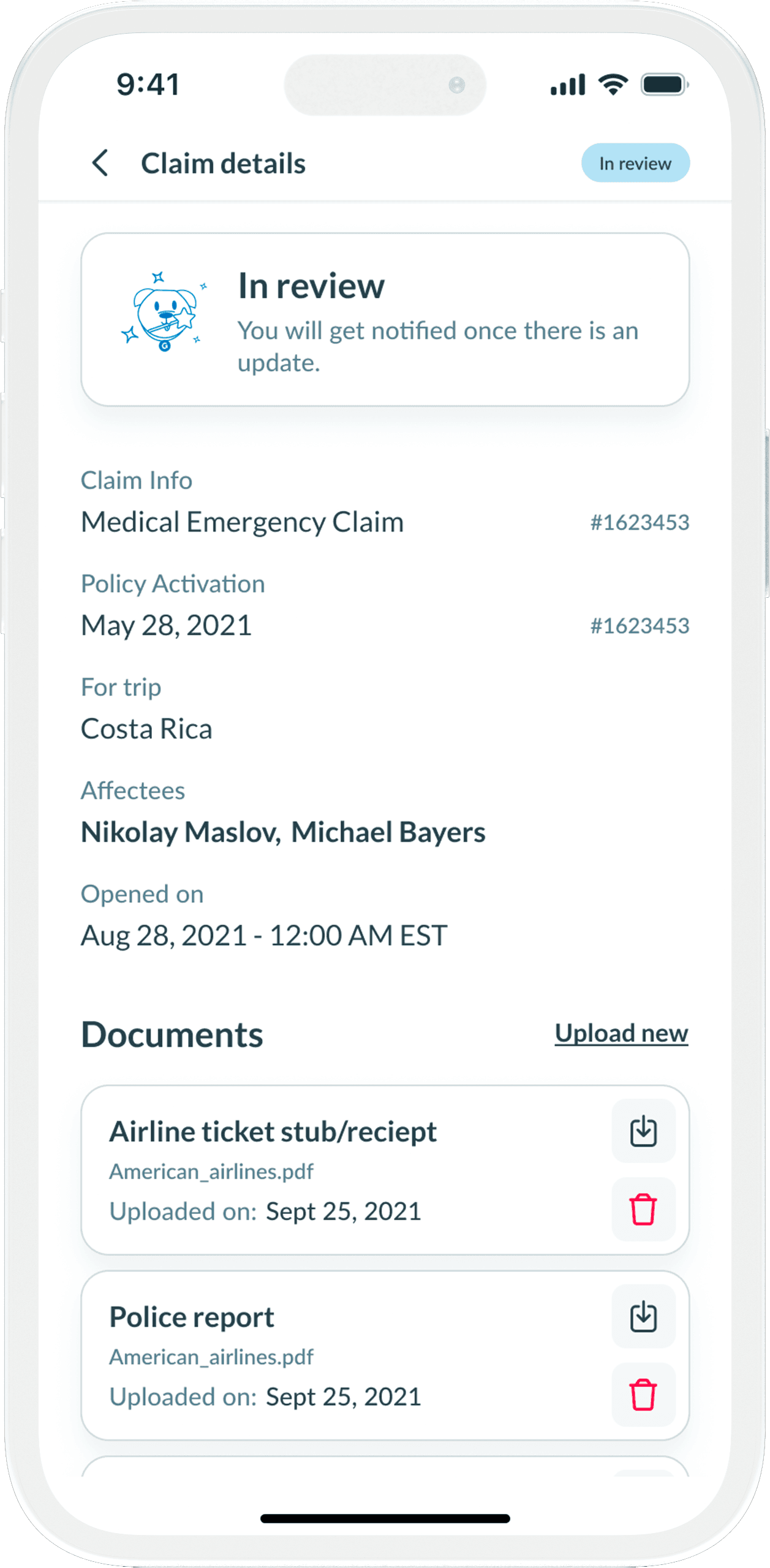
Dashboard and Trip Details
The user dashboard posed a challenging design task. We needed to create a dashboard that allowed users to navigate among their various journeys seamlessly.
Users should efficiently initiate multiple processes, such as modifying existing plans, submitting claims, and viewing statuses. It was essential to design the interface such that each component was easily discernible and recognized by the user.
Trip detail screen allowed user to quickly access all the information related to their policy, upgrade their policy or add new travelers within that policy.
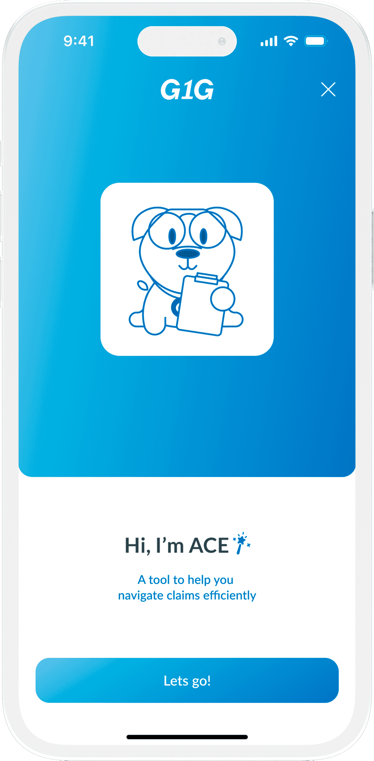
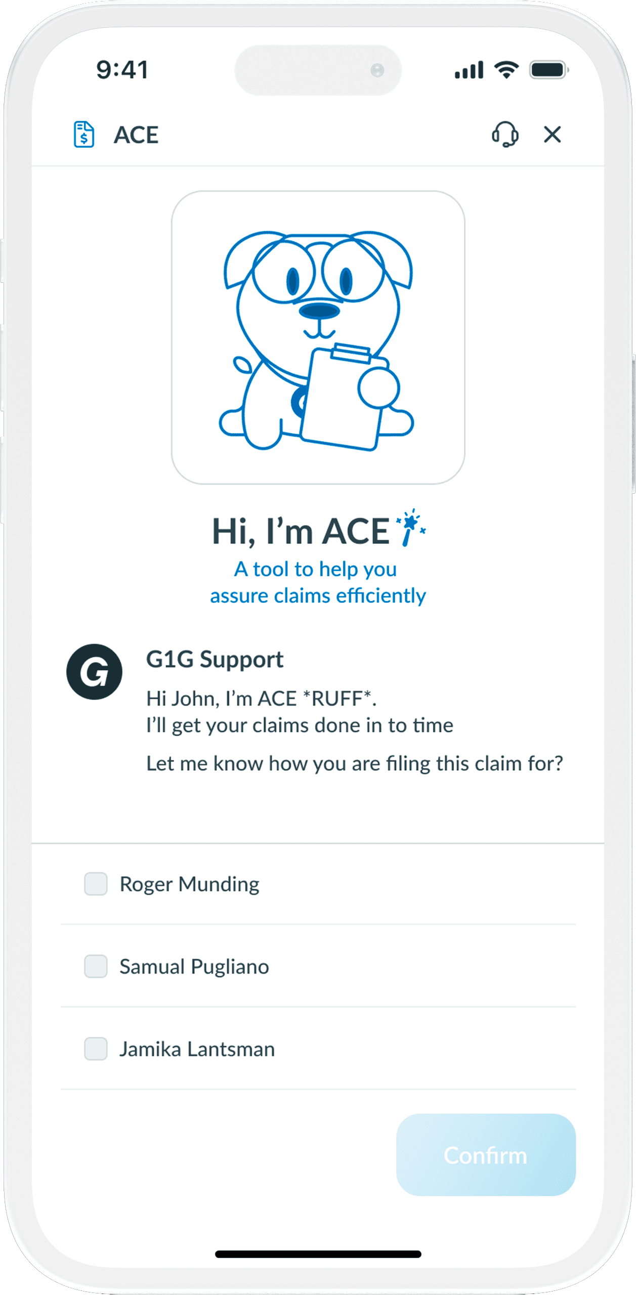
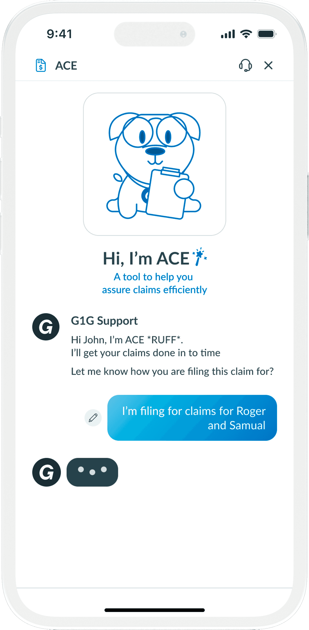
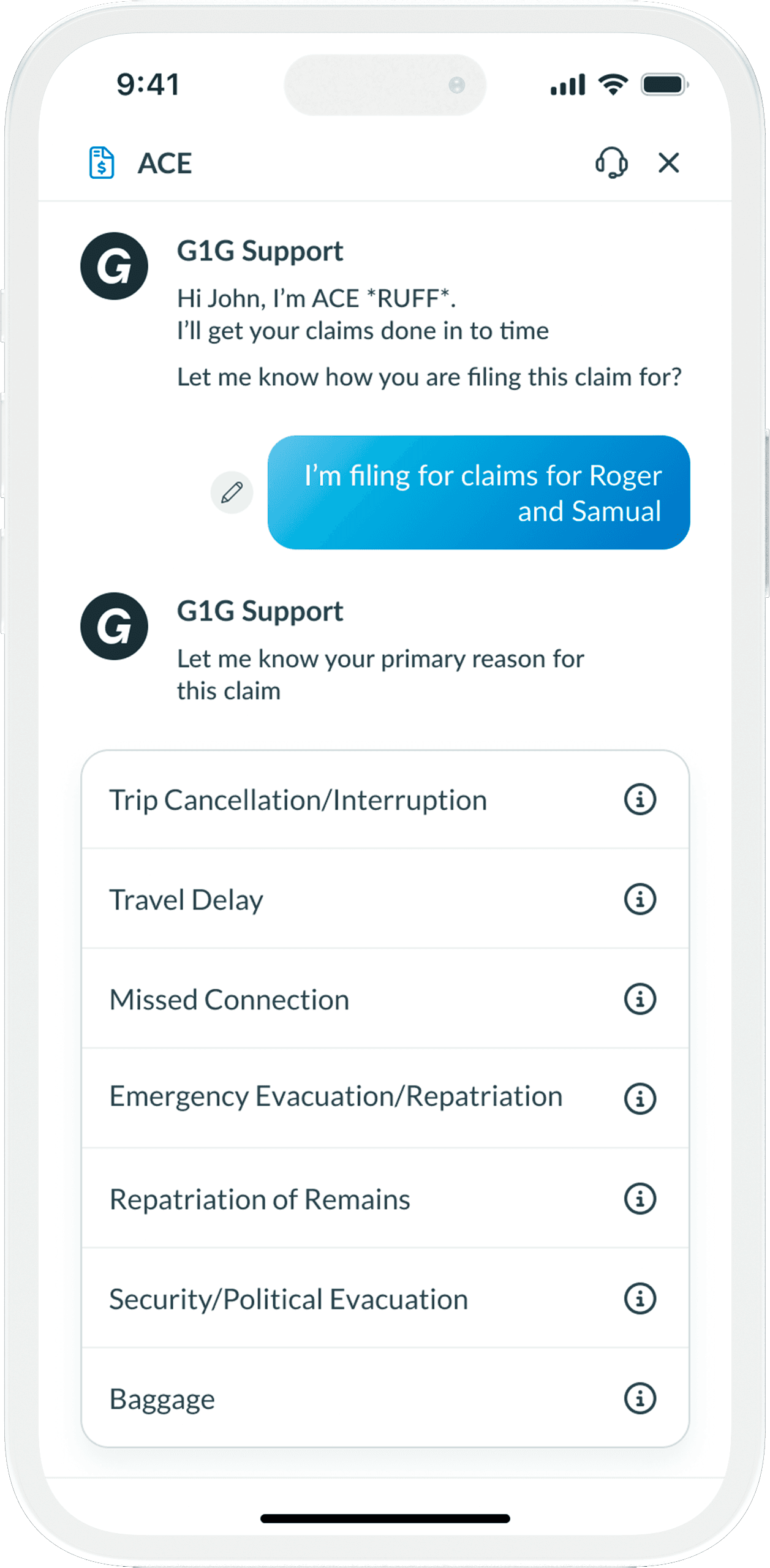
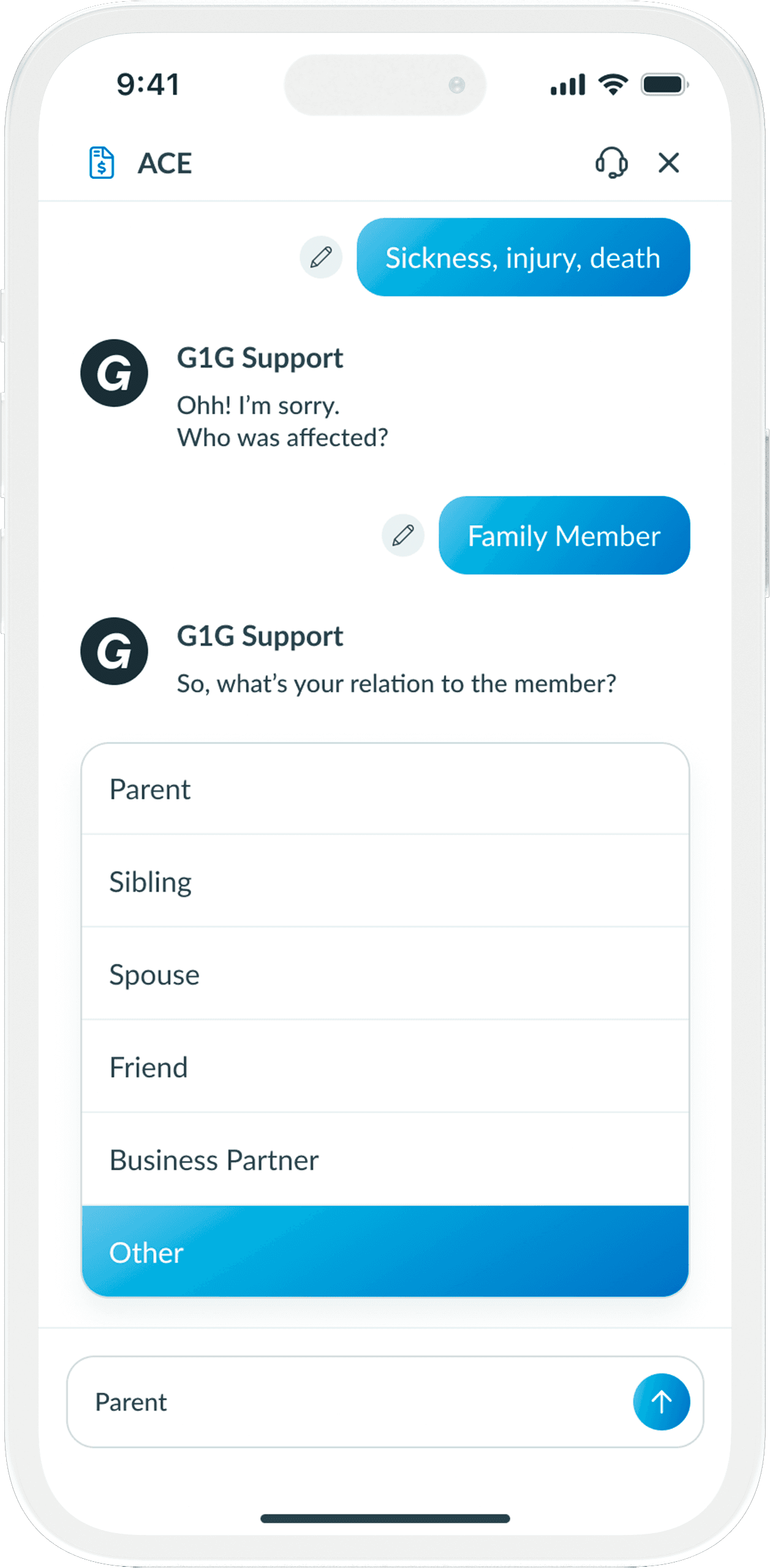
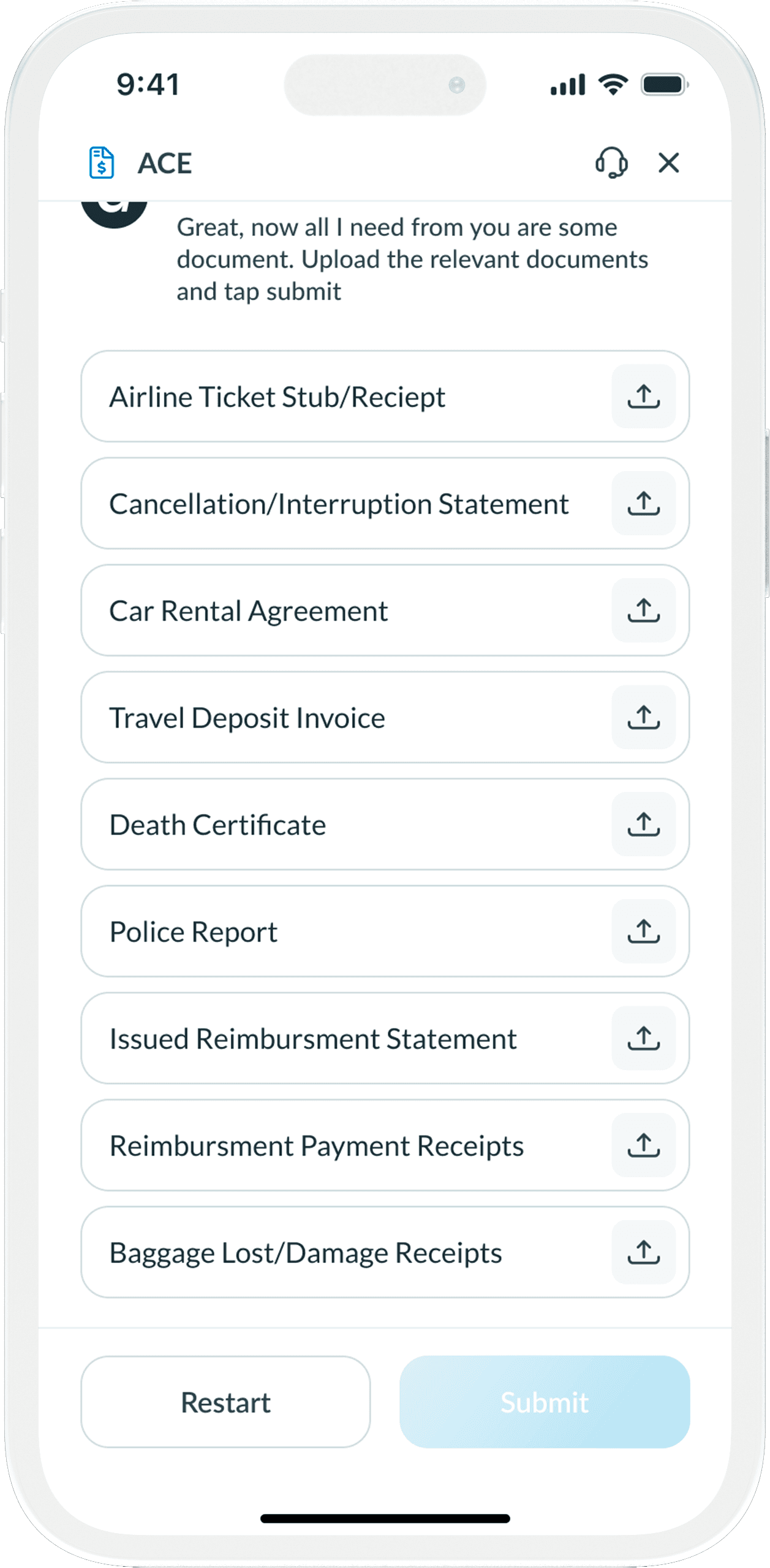
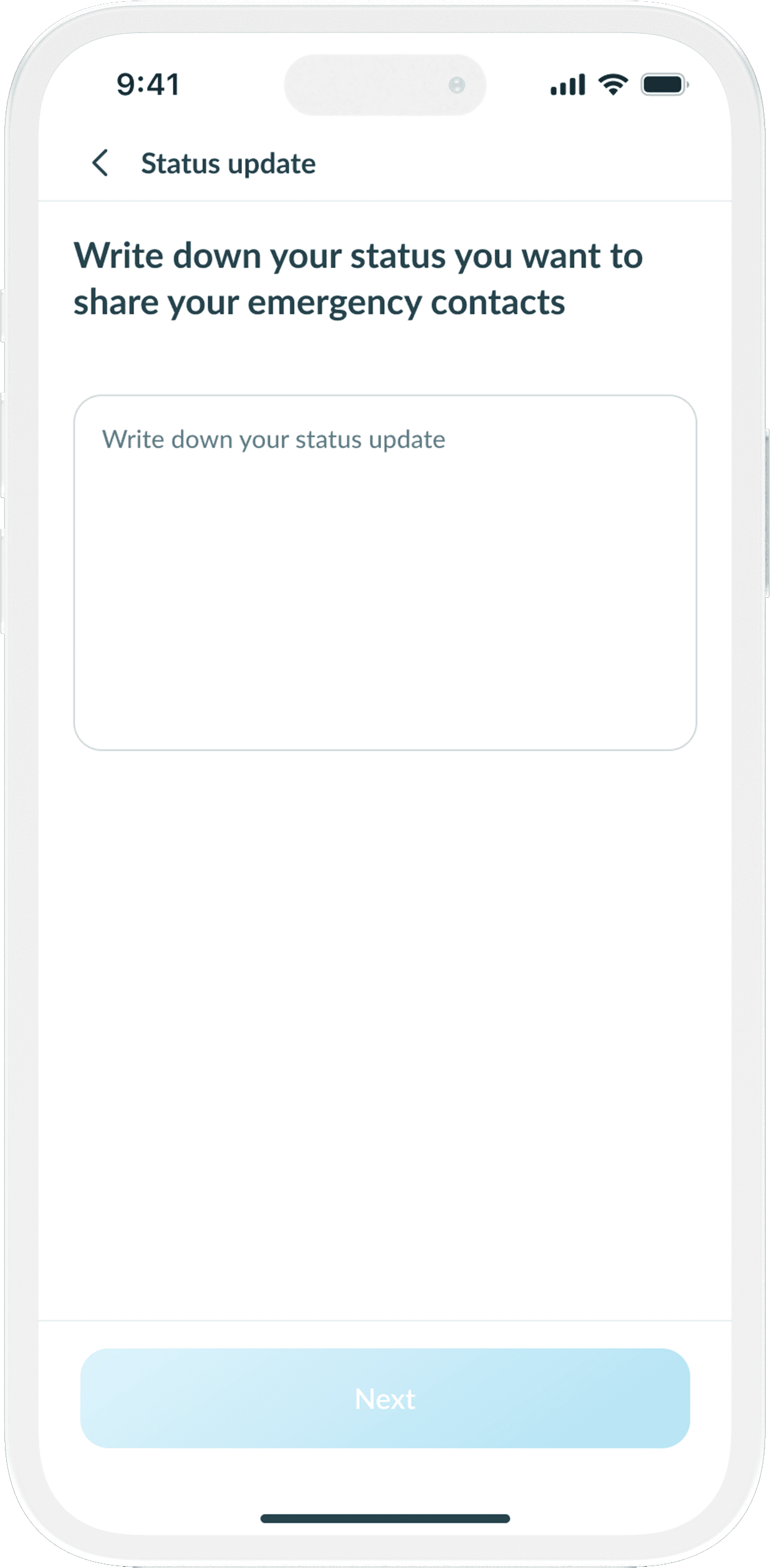
Claim Initiating Process (ACE)
Comparable to G1G ITIRA, our group elected to offer a related experience to users for the claim process, enhancing interactivity and comprehension. Traditionally, users must complete a form when filing claims, which can be discouraging.
We introduced G1G ACE, an interactive chatbot that empathizes with user frustrations and fosters trust by engaging them in conversation. This reduced the time required for submitting claims by 80%.
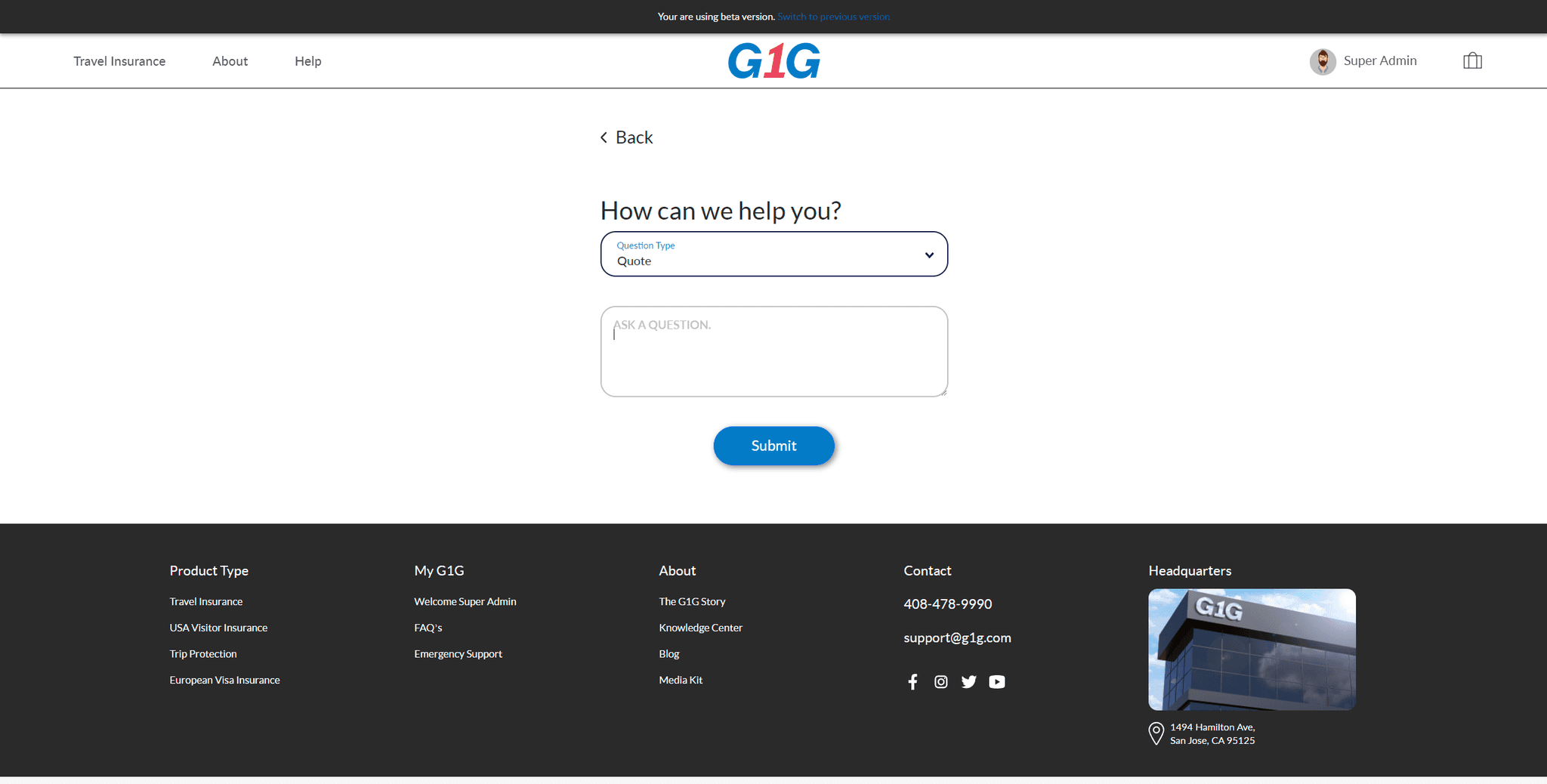
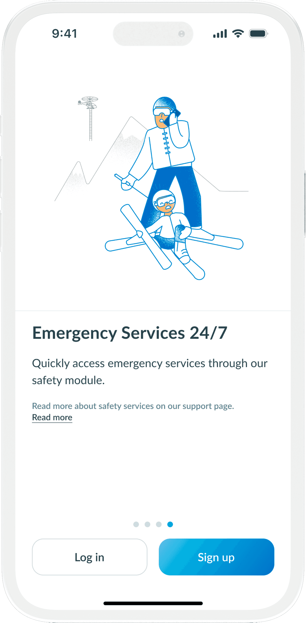
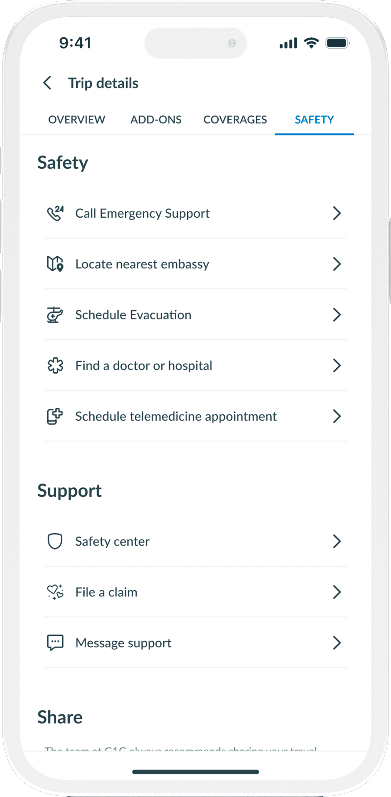
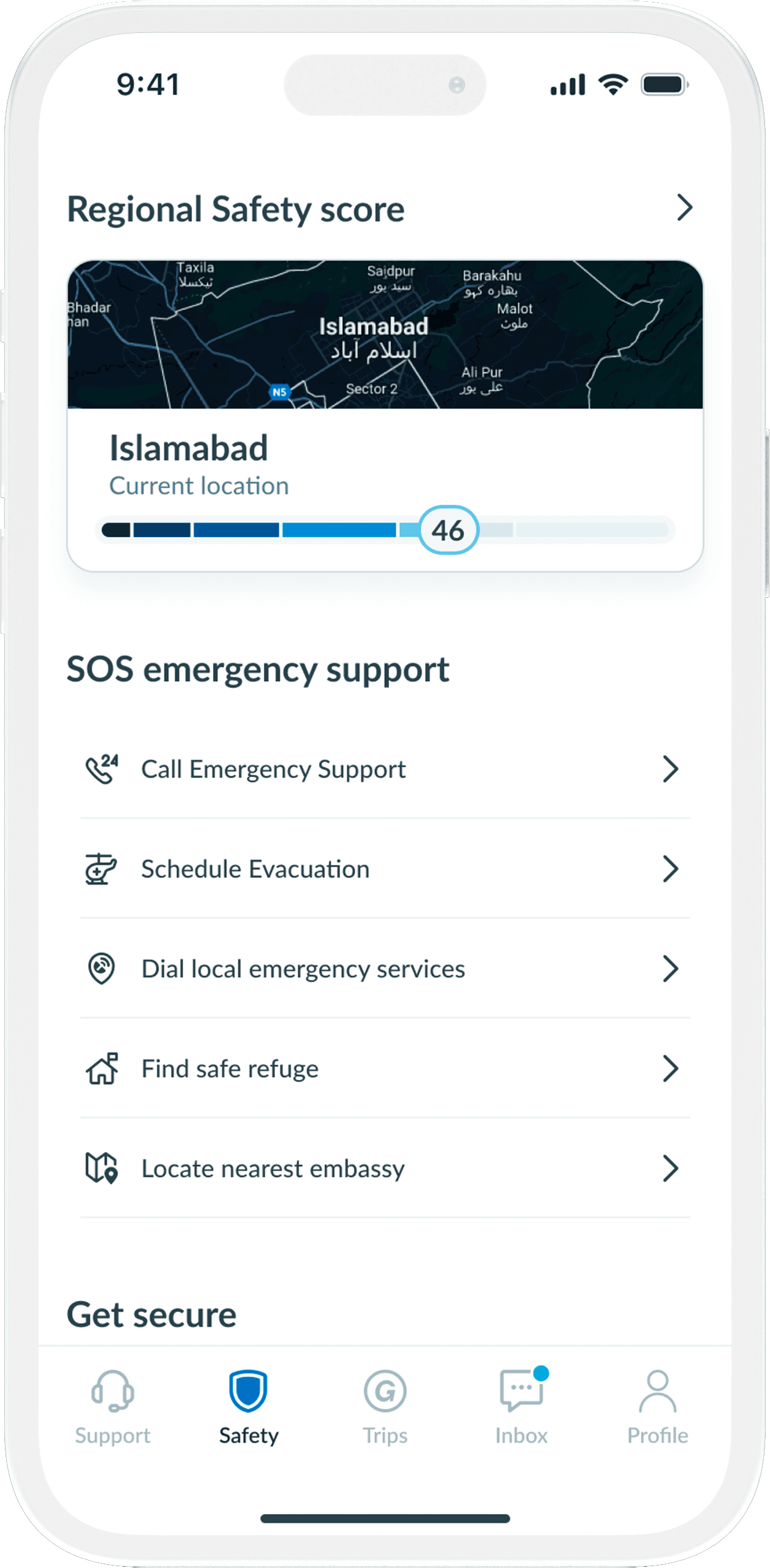
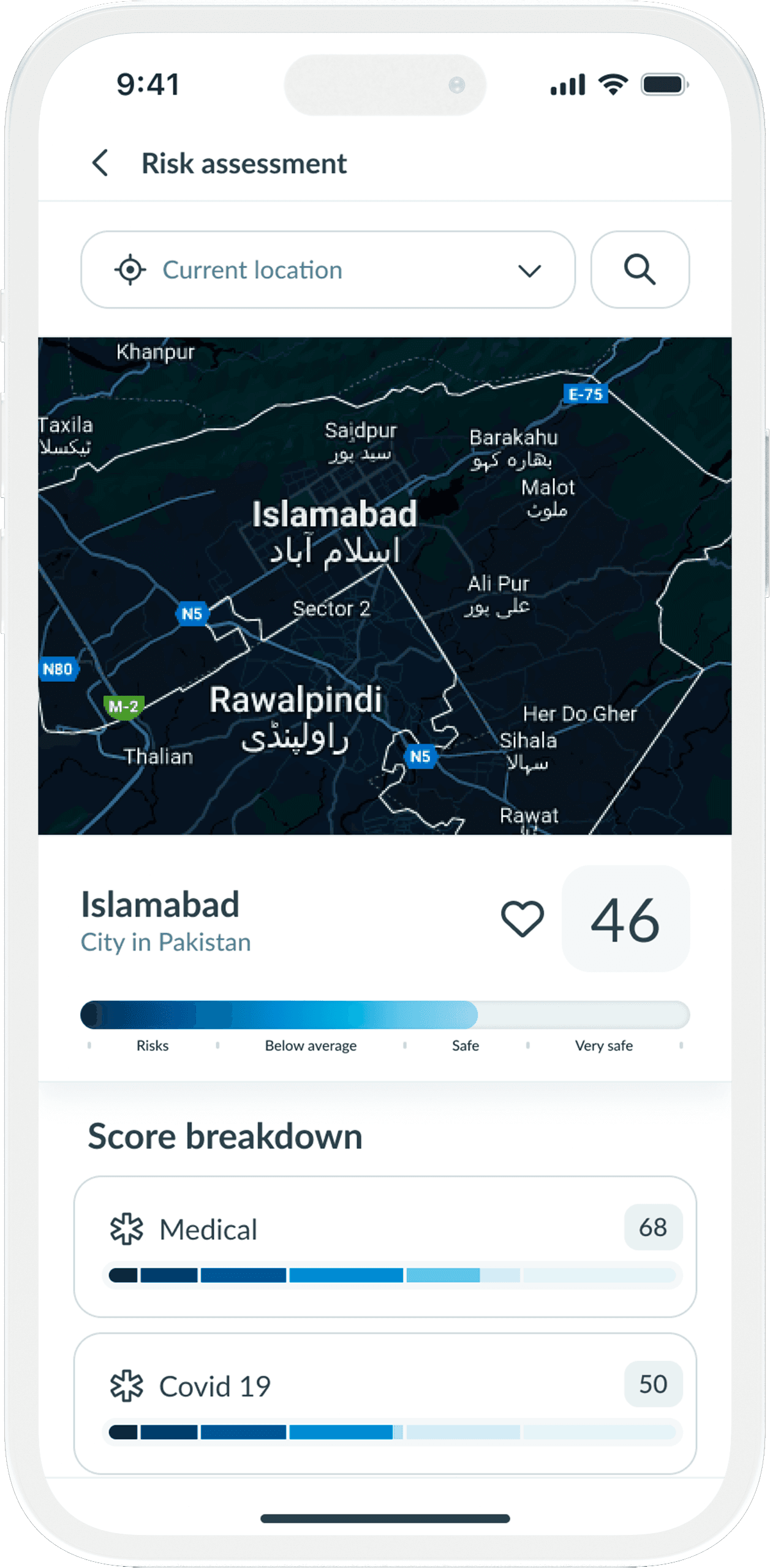
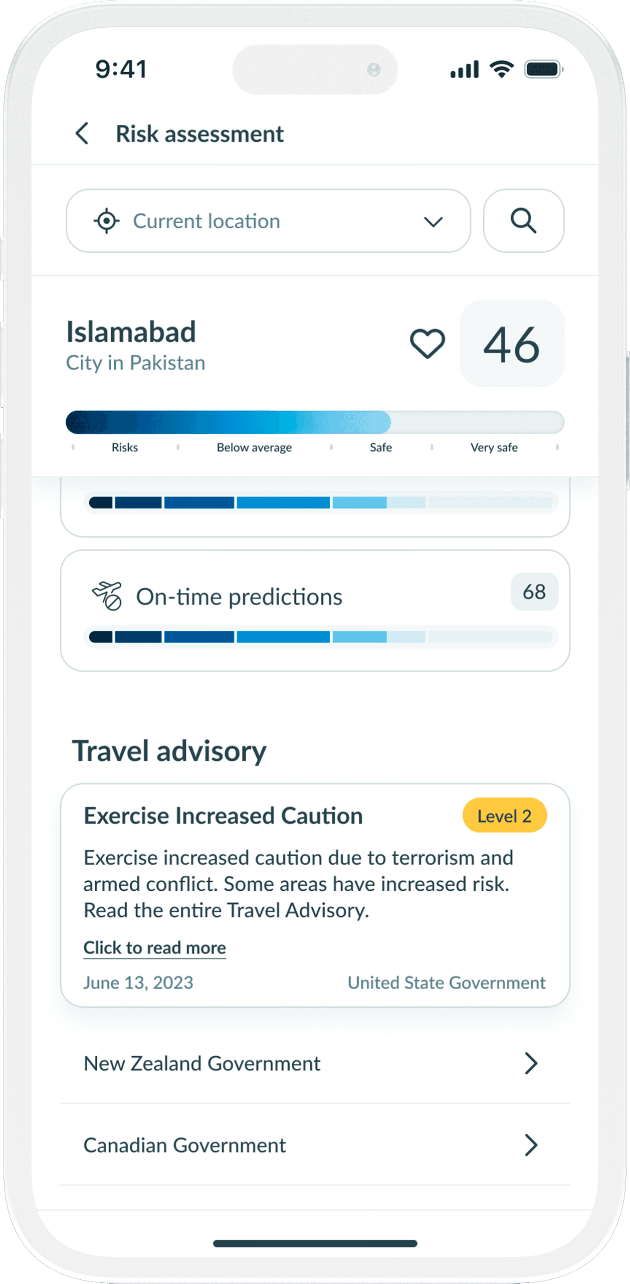
Safety and Emergency Services
A lot of the time, in travel insurance, user's have to resort to calling emergency numbers of their insurance provider for availing any emergency support. G1G eliminated middleman by providing options directly to user. G1G Travel Insurance puts a lot of emphasis on the safety of their customers.
The whole agenda of this application is to provide user's quick access to the safety features for their well being. Providing crucial information like user's current location safety score, policy emergency services, locating nearest embassy, or requesting emergency evacuation. This single feature increased user retention rate by 90%.
Figma Prototype
What we learned
Adapt to the changing consumer behaviour
During the challenging times of the pandemic, it was crucial for us to remain grounded and stay focused on our goals. However, we also had to be adaptable and consider changes to our product in order to align with the evolving behaviors and needs of our customers.
Products don’t exist in a vacuum
We achieved significant enhancements in user experience, which influenced our internal procedures. To guarantee effective execution, we understood the value of working closely with diverse groups, addressing their apprehensions, and advancing the resources they depend on. It wasn't solely about crafting a visually stunning app prototype; we aspired for an uninterrupted production encounter.
Thus, we carried out coordination efforts behind the curtains, such as reestablishing our brand directives, to assure a unified and balanced result.
Take it one phase at a time
We unearthed the significance of decomposing intricate plans into tinier, easier-to-handle segments. By taking this route, we streamlined the creation procedure and successfully tackled any glitches or concerns that surfaced in the interim. This strategy empowered us to confront obstacles progressively, enhancing the entire operation in terms of fluidity and efficacy.
Enlightened
It was fun journey to work on a project with such a big team where each member of the team had their own specific role to perform yet they never hesitate to help other members of the team even if it was out of their scope. By being consistently in touch with development team made me realize about how much effort our development team has to put to breath life into the designs. This also helped me understand what sort of limitation are their when trying to work in one eco system.
Thank you for reading through! Hope you enjoyed learning about my design and thought process. :)