Introduction
Euler Finance makes it possible for users to lend and borrow cryptocurrencies. What makes Euler Finance different from other DeFi lending protocols such as Aave or Compound is its use of risk-based asset tiers designed to protect the protocol from risks typically associated with decentralized permissionless lending, especially with respect to illiquid or volatile assets.
In short, Euler Finance is a decentralized, permissionless lending protocol custom-built to improve capital efficiency and reduce the risks associated with lending and borrowing volatile, long-tail crypto assets.
My Role
As a senior UI/UX designer in Quell x Code, I played the role of lead designer for Euler Finance. I collaborated with product designer of Euler, Jarar Malik.
I was tasked with redesigning their logo, UI UX, and visual identity. Since it was an all-rounder job, it required a lot of attention to detail and a retaining balance between corporate and bringing something new to the table.
Problem
In this case study we will discuss issues found related to the UI and UX study for Euler Finance.
No defined Journey
Unclear user experience leads to frustration in users which in turn increases the drop off rate. Considering this is a platform where users are going to invest from, they need an experience which is refined and clear.
Inconsistent Experience
Euler also offers lot's of services in comparison to their competitors. Not having a consistent experience in both the user interface and user experience increases technical debt, users are most likely lost in the application.
Scalablility
Euler Finance prioritizes protocol improvement by adding features and services. The absence of a well-defined component and design system discourages users from adopting new updates.
Defining these problems sets a playground. Now the ball is in my court to play.
Goal
A delightful, consistent consumer experience
To ensure a proper design system is in place to reduce technical debt, and give our consumers a better, consistent experience.
Defined journeys
The design must exhibit exceptional clarity, enabling users to seamlessly navigate the decentralized application (DApp) while effortlessly executing diverse actions.
Operational efficiency
To optimize internal operations, we will build scalable design components, which will help Euler with adding services and features.
Our users
Before we started designing, we deep dive into existing behavioral and purchase data of our users to understand them better. We also conducted a series of polling using Euler's official twitter account
We focused on identifying what is the job that our customers hire our product for.
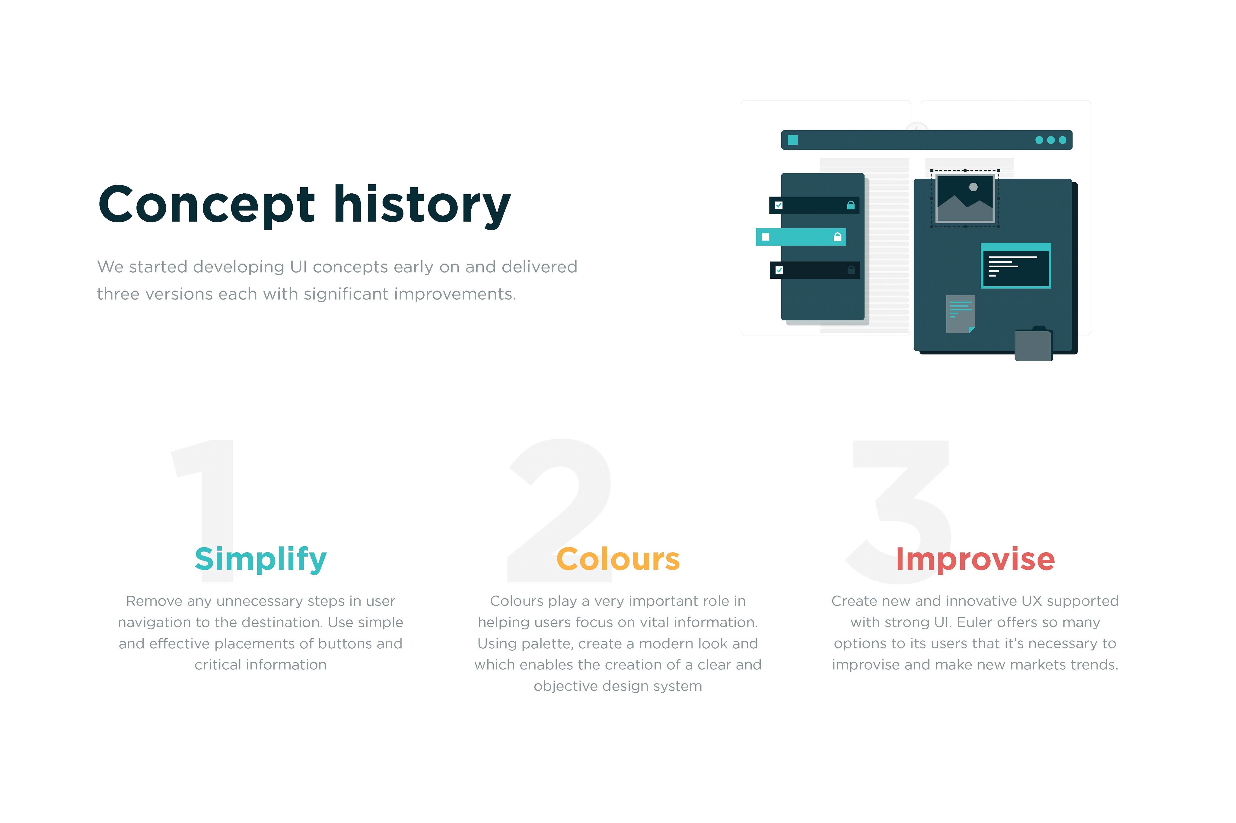
Process
Design Sprints
We conducted design sprints to facilitate collaboration cross-departments. Product Designers, Product Managers and Creatives contributed their fresh ideas in this sprint. The purpose of these sprints is to align everyone on the same goal—To improve our consumer experience by solving our user's problems today.
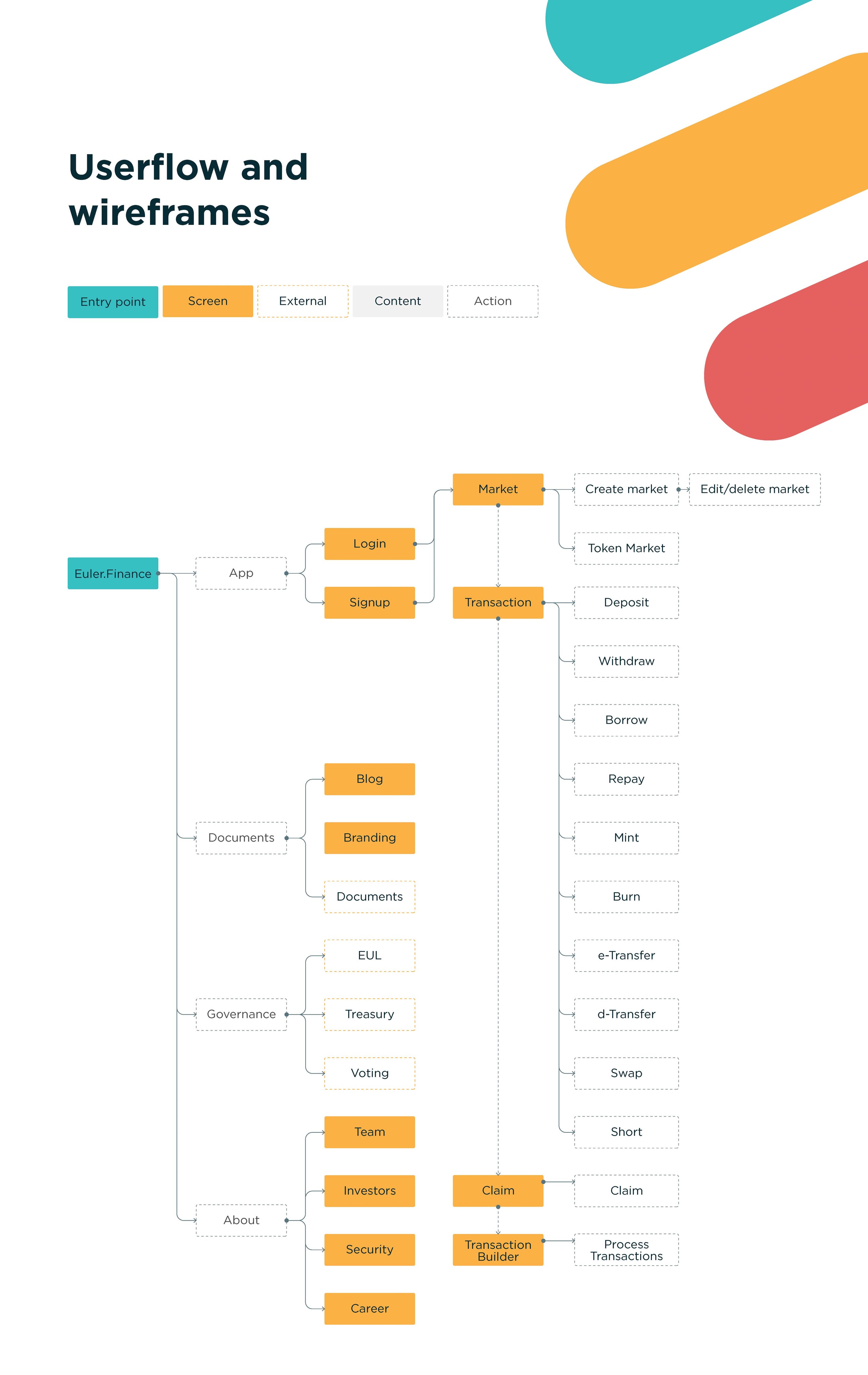
User flows
We mapped each archetype to their user journey on the app, with their respective success metrics.
Sketches
I sketched multiple user flows to visualize ideas quickly. My focus at this stage is to diverge first, converge later. Here are some early sketches of the Brand page.
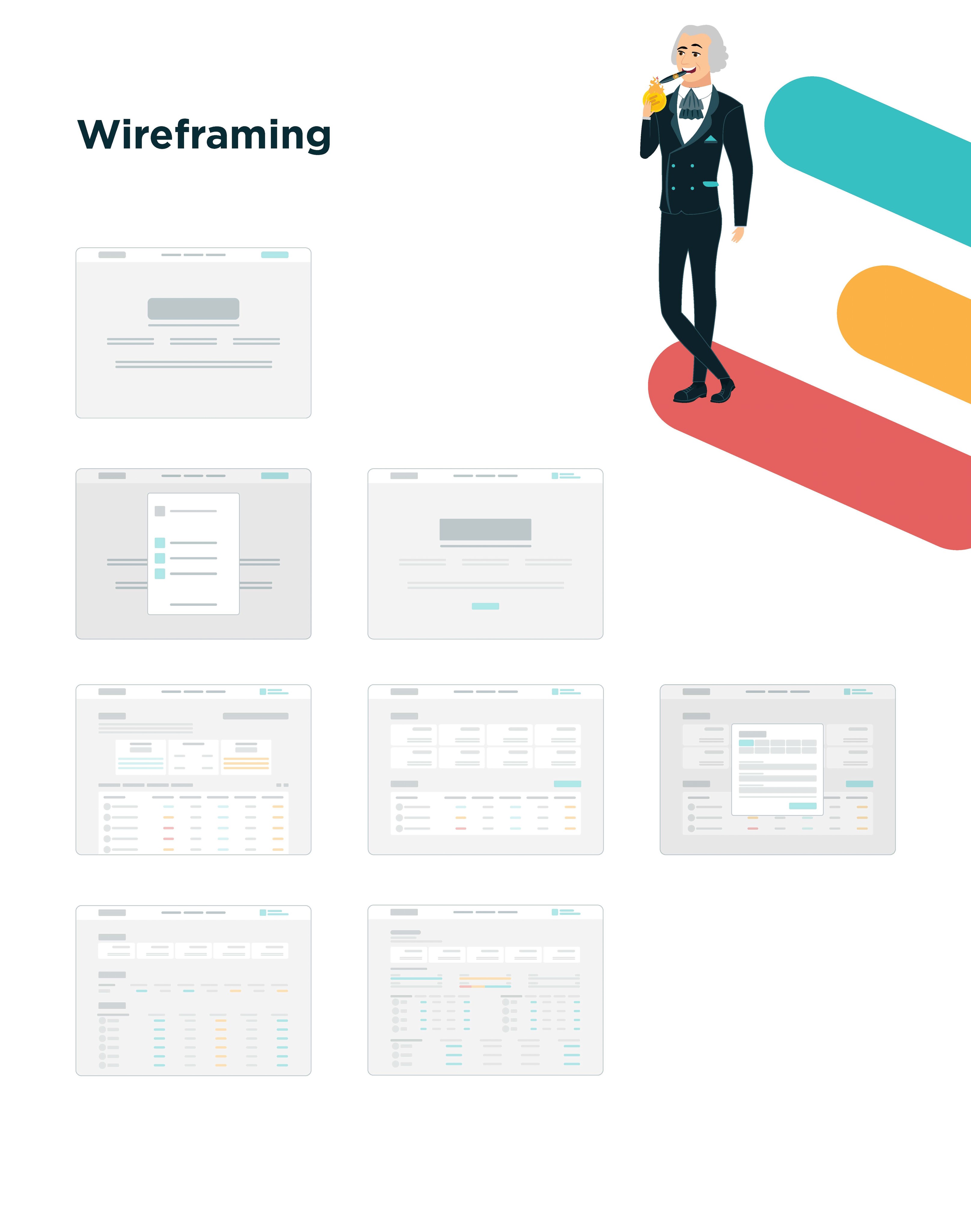
Wireframing
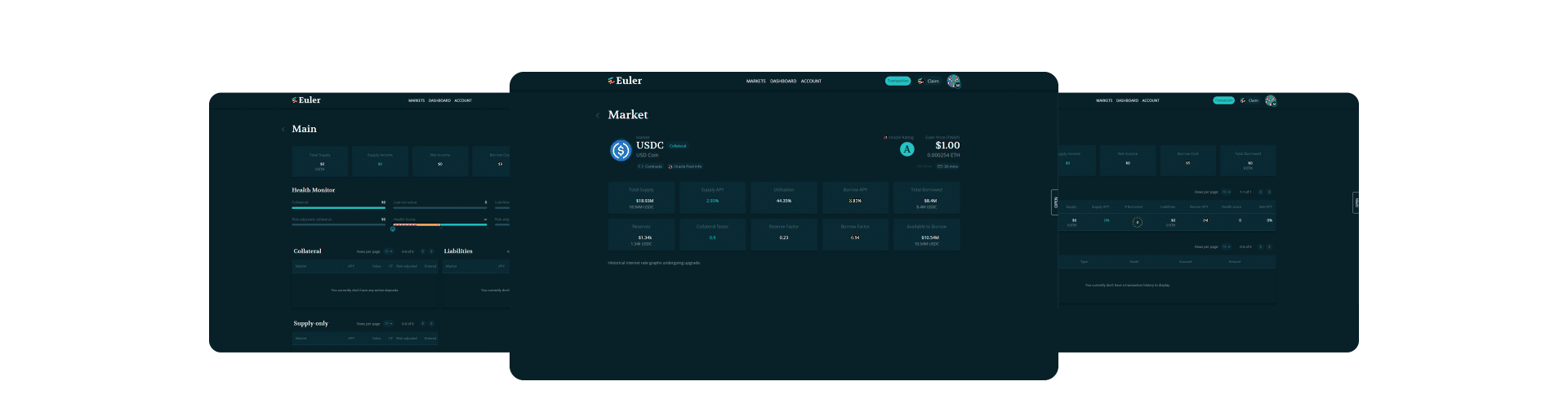
A sneak peek into my early wireframes, mid-fidelity designs and drafts. The designs have went through at least 15 iterations per screen. It is due to several reasons: Change in business direction, a pandemic, shift in product roadmap or simply to improve the user experience.
Early designs
A sneak peek into my early wireframes, mid-fidelity designs and drafts. The designs have went through at least 15 iterations per screen. It is due to several reasons: Change in business direction, a pandemic, shift in product roadmap or simply to improve the user experience.
We started by fixing and enhancing the design of the current website. At the beginning, I worked on improving their existing design to establish consistency in the website's visual elements and components.
Revamp
In the initial stages of the design process, it became evident that unlocking Euler Finance's true potential would necessitate a complete overhaul of the existing design system. From minute details to comprehensive user flows, a fresh start was required to fully realize the desired outcome.
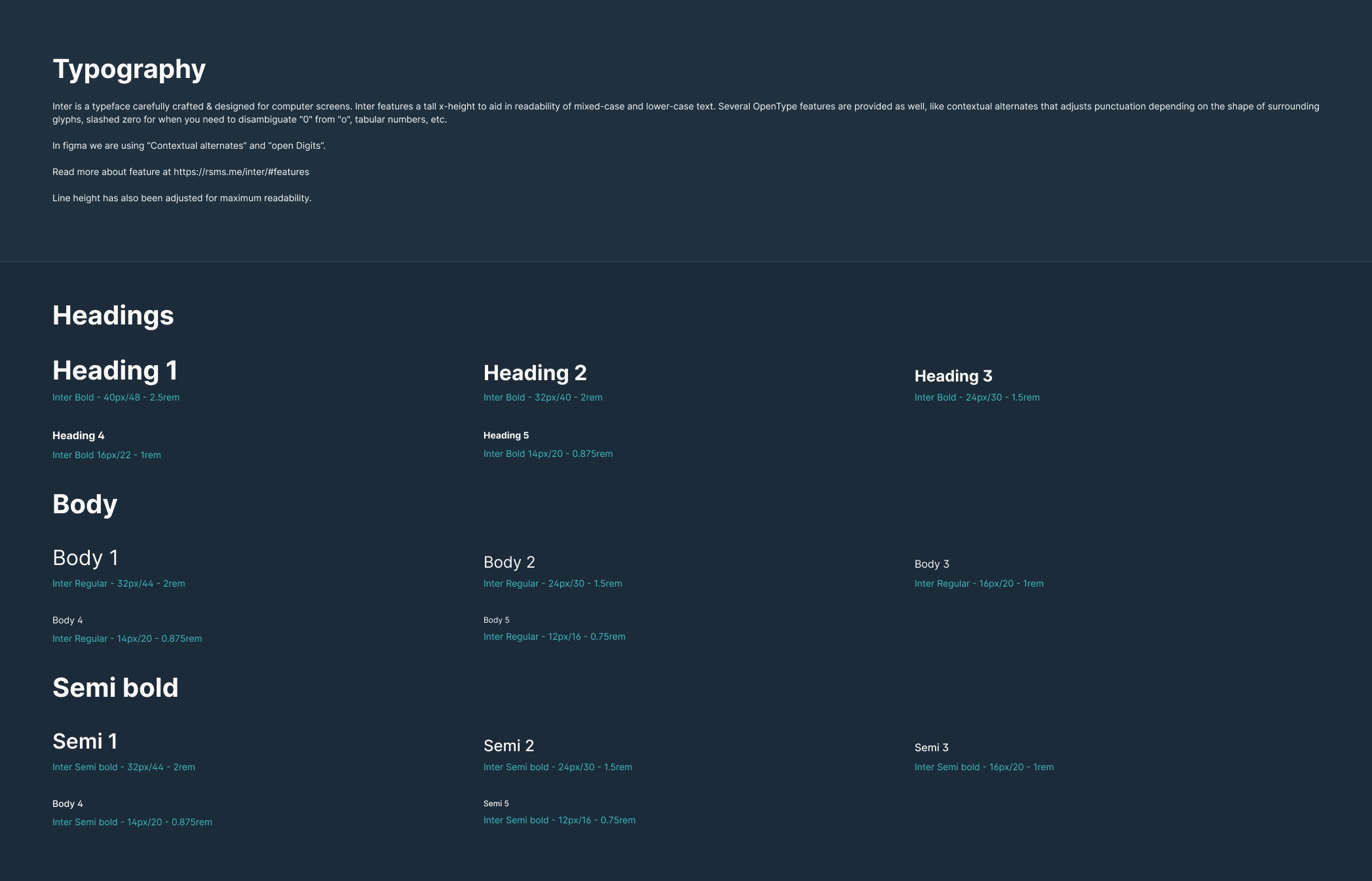
Typography
Euler Finance previously employed a dual-font system for typography, utilizing Volkhov for titles and Open Sans for the remaining components. However, there was a requirement for a unified, easily readable font. Given the substantial presence of numerical data, the chosen font needed to enhance both readability and overall aesthetics of the website.
After a lot of test and research, we decided to go with Inter as our primary and secondary font. Inter features a tall x-height to aid in readability of mixed-case and lower-case text. Several OpenType features are provided as well, like contextual alternates that adjusts punctuation depending on the shape of surrounding glyphs, slashed zero for when you need to disambiguate "0" from "o", tabular numbers, etc.
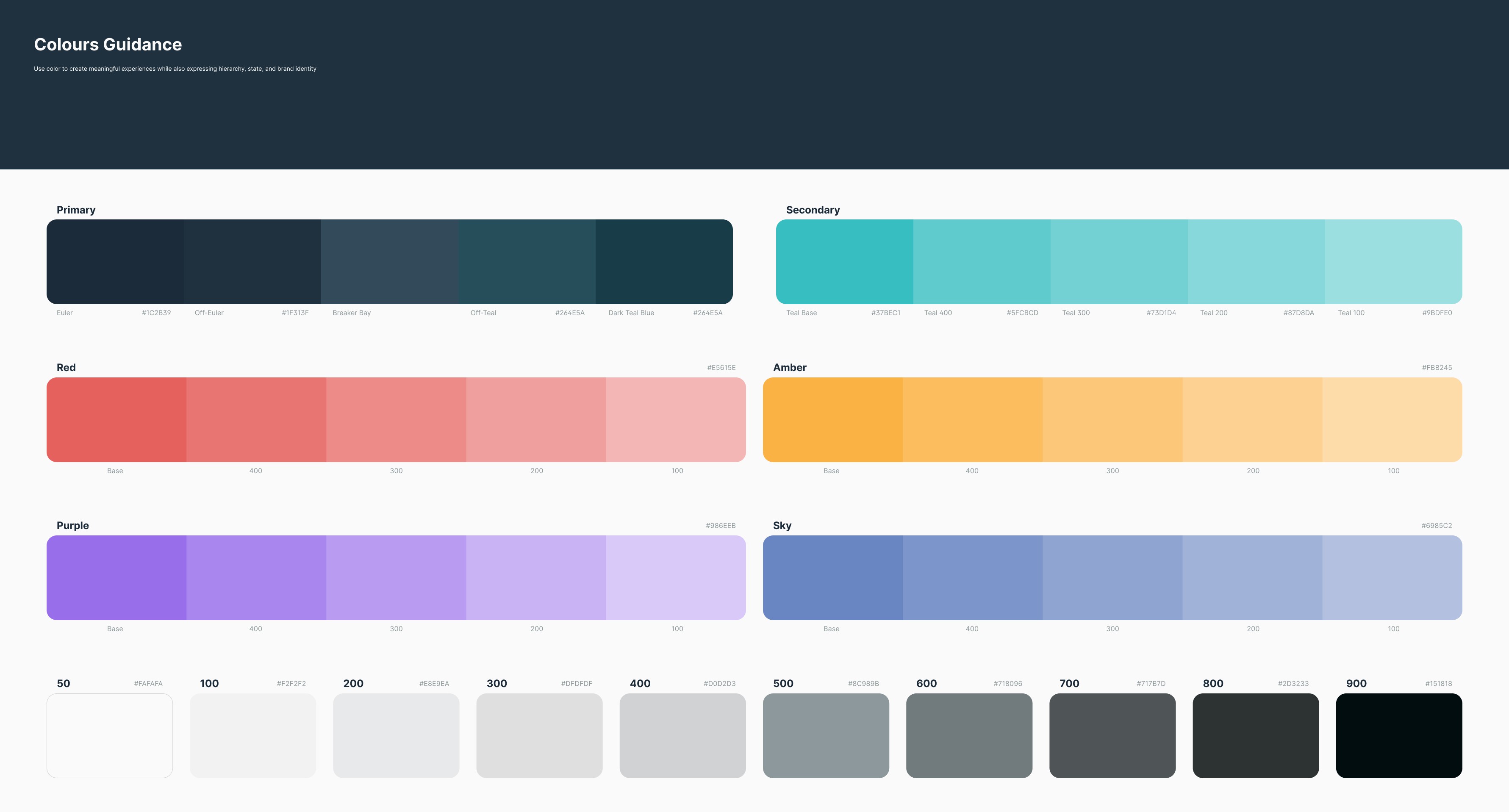
Color Guide
The previous color choice in our brand's visual identity was overly saturated, which inadvertently created an overall feeling of immaturity. Recognizing the need for a change, we embarked on a thorough reassessment of our brand's core essence. The aim was to develop a visual identity that truly reflected the values and aspirations of Euler Finance.
As part of the Euler Finance visual identity redesign, the color palette underwent a significant transformation. While our objective was to adopt a more professional appearance, we also wanted to preserve the vibrant and dynamic essence synonymous with the world of cryptocurrencies.
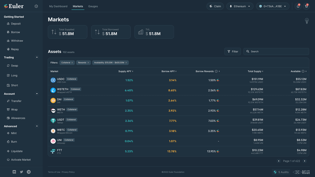
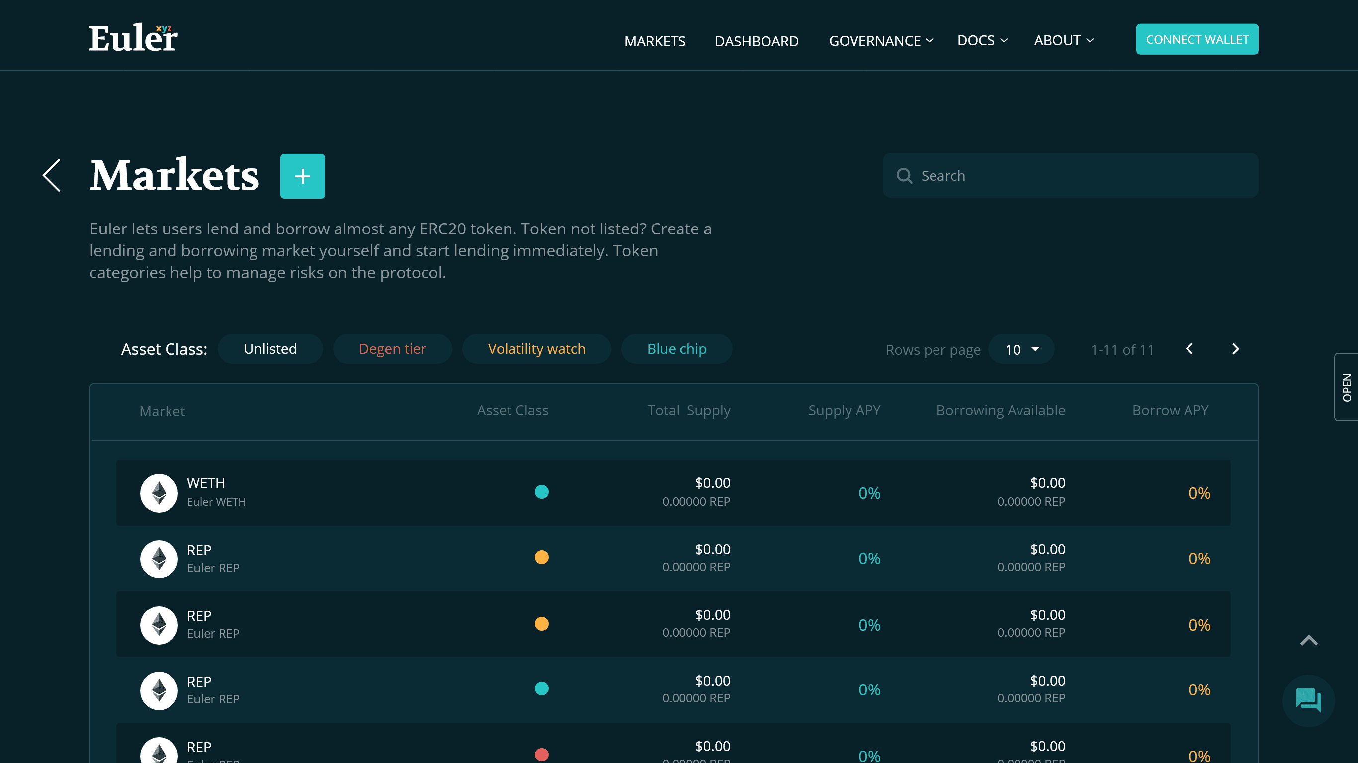
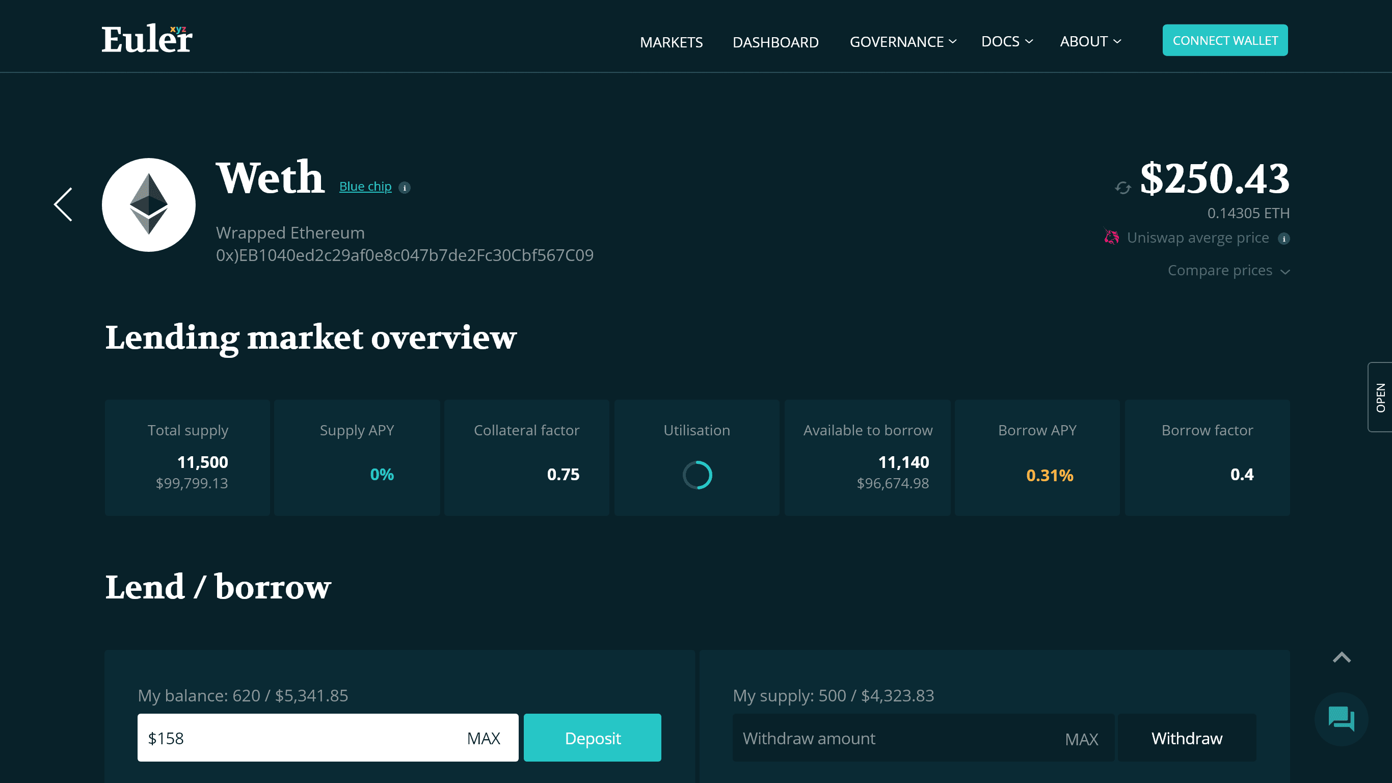
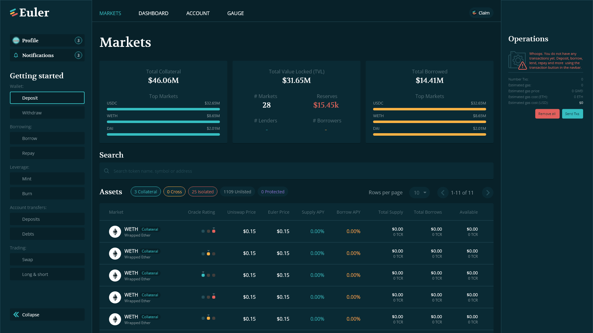
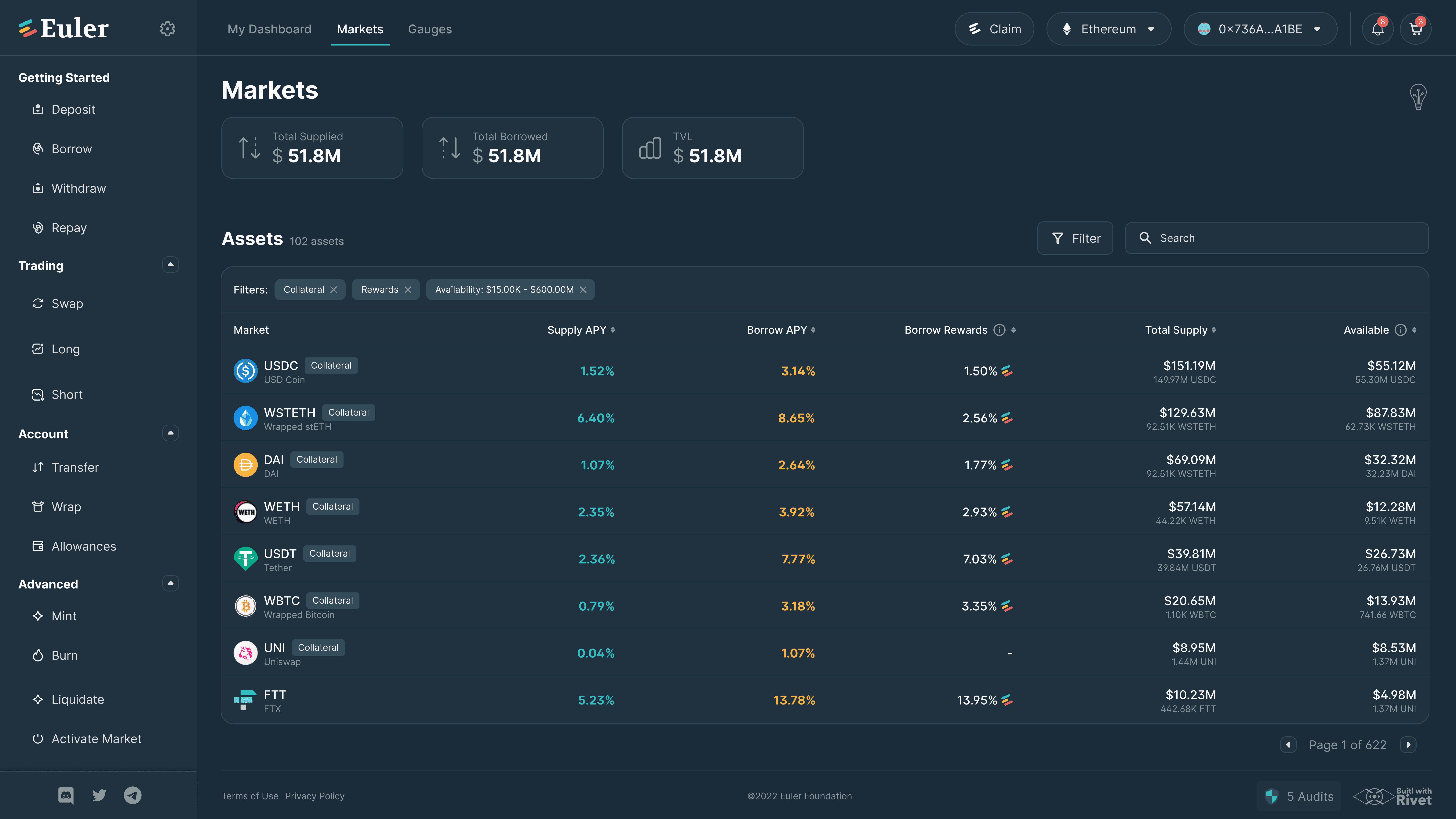
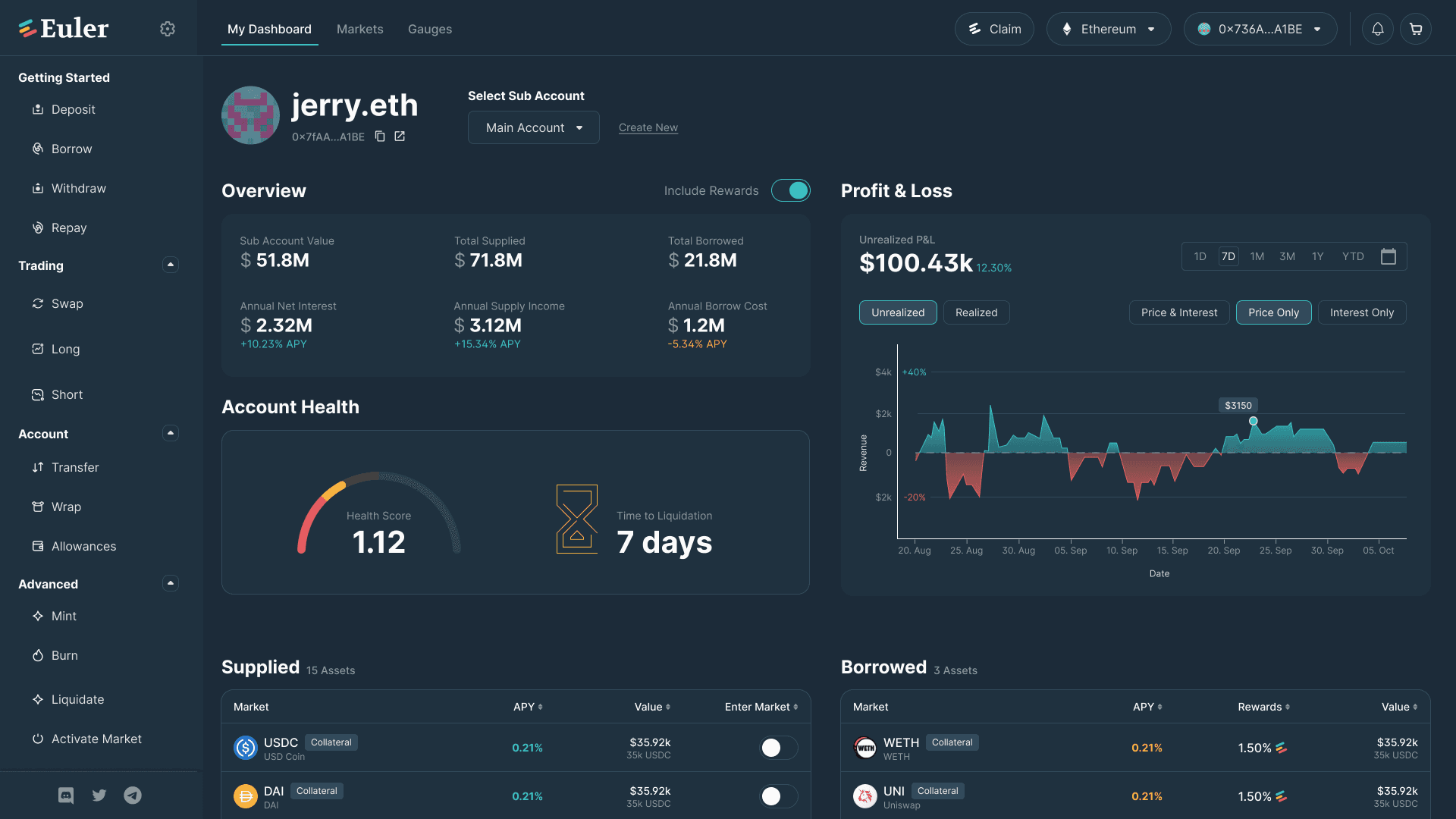
Dashboard design
All the issues that we faced during the early design phases, which was to keep the design and development cost as low as possible and play within the existing design boundaries could be solved using a dashboard design.
All the complex flows which Euler Finance had for its different services related to token market could be made simpler and refined. We went over 50 iterations for initial layout for dashboard design. The idea was to not stray too far away from the old design such that existing users find it hard to navigate through the new design
Final Design
Here's a detailed walkthrough of the revamped Euler Finance DAPP
All new look and feel
Before the redesign, the app was cluttered, it had a lack of focus on Euler Finance's core products. Now, Euler Finance has a fresh new modern look and a better experience. To improve our brand and product perception, we introduced new, scalable components, redesigned micro-interactions and repositioned the product.
Design System
Scalable design system that saves time, reduces technical debt over time. It solves the problem of inconsistent components and user experience.
With 200+ components with properly defined typography styles, icons and illustrations. Everything in the app is made up of these modular components—this gives a unified, consistent, robust UI.
The design system is never final. It evolves as we go along.
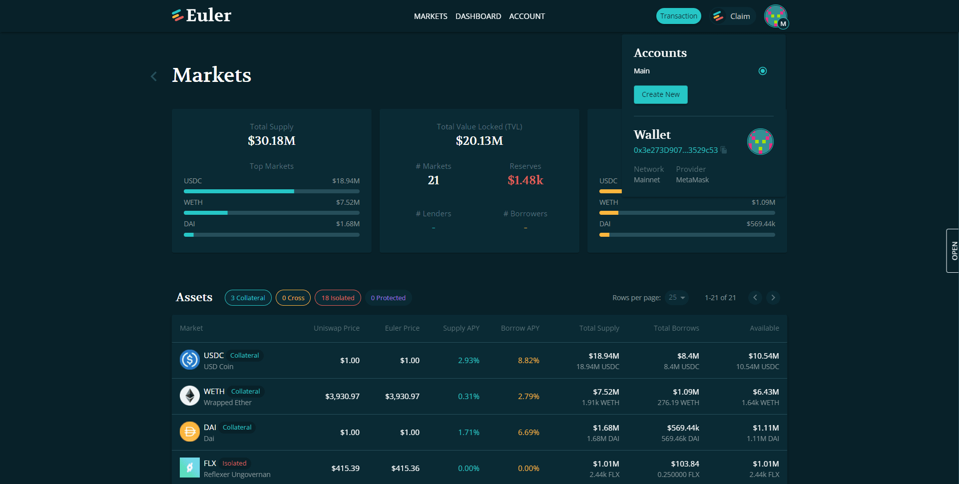
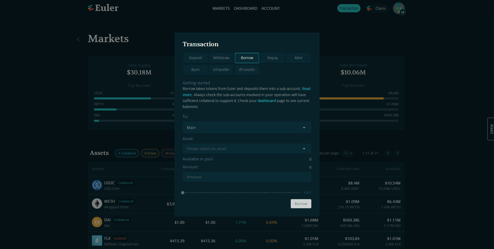
Everything at your fingertips
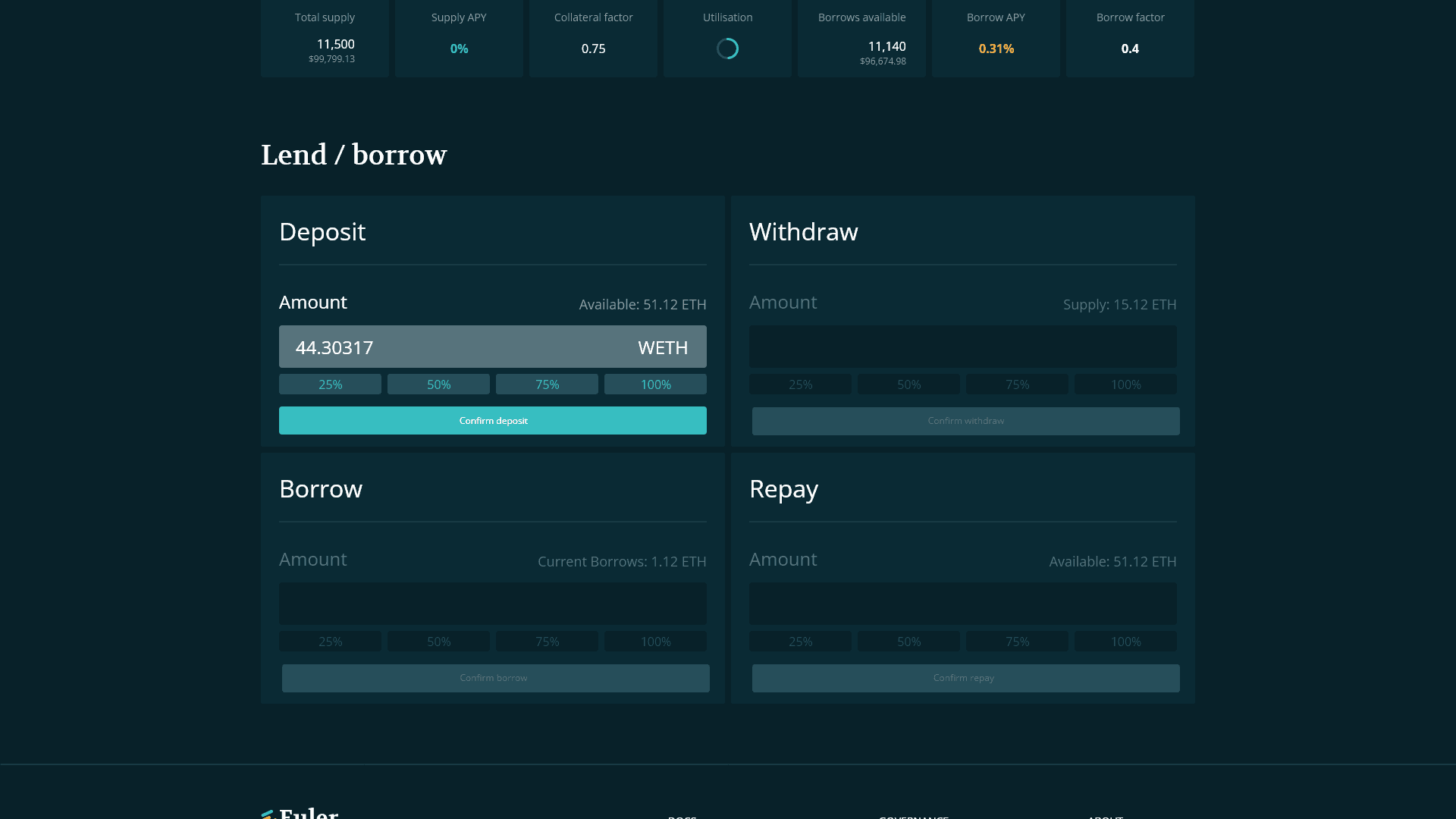
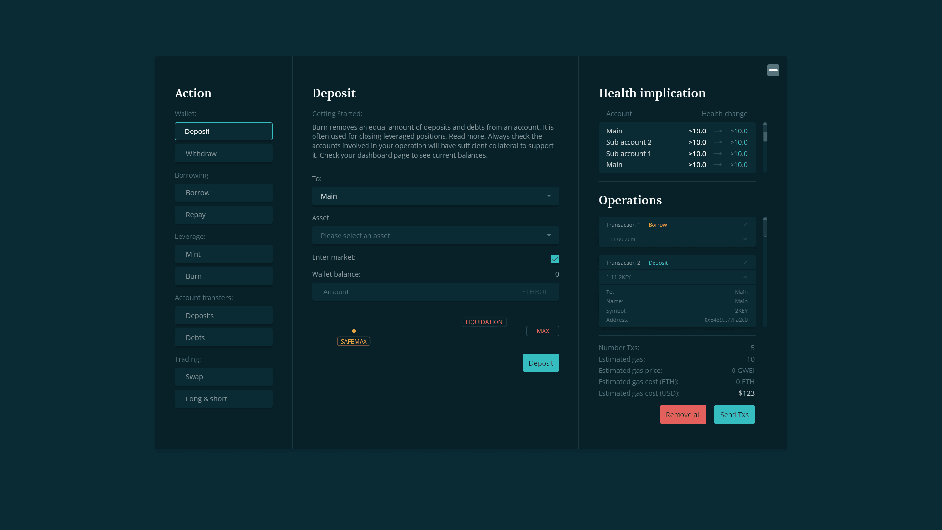
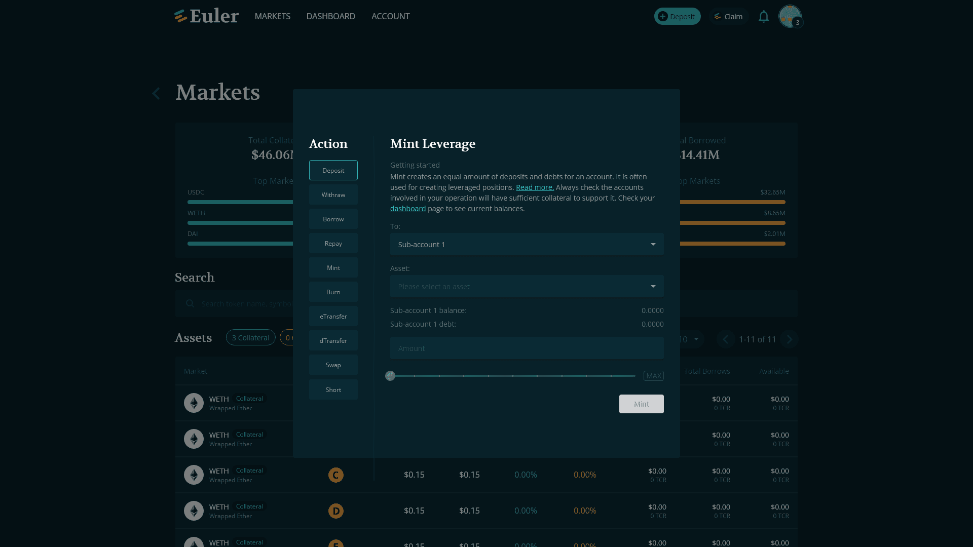
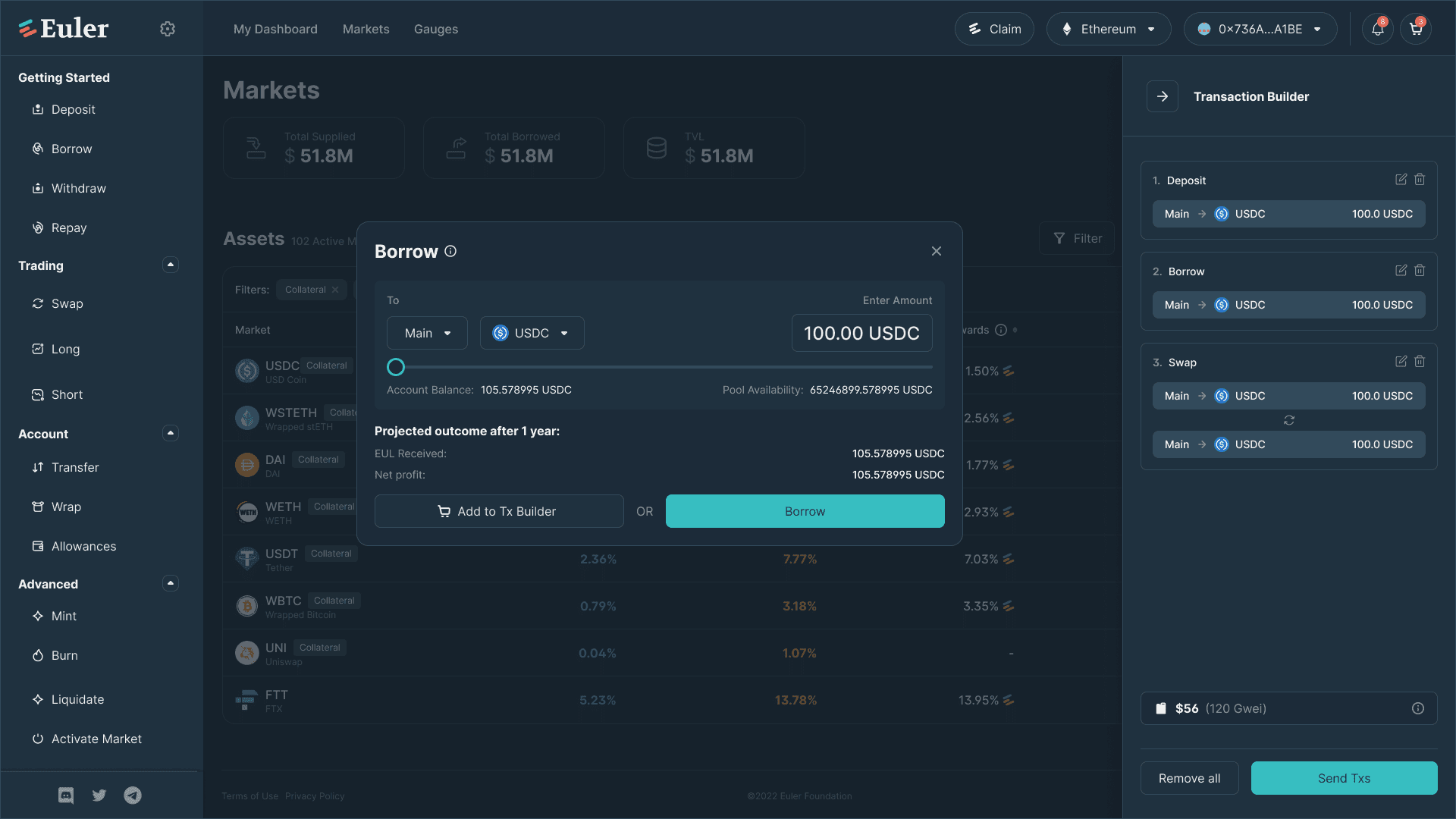
In response to the variety of transaction types available, we undertook a comprehensive redesign of both the transaction menu and the transaction builder, which serves as a cart for executing multiple transactions.
Users now have swift access to diverse transaction options via side navigation and can effortlessly add them to the transaction builder. The new design significantly enhances user understanding of the transaction process and facilitates the selection of appropriate tokens, ensuring a seamless experience.
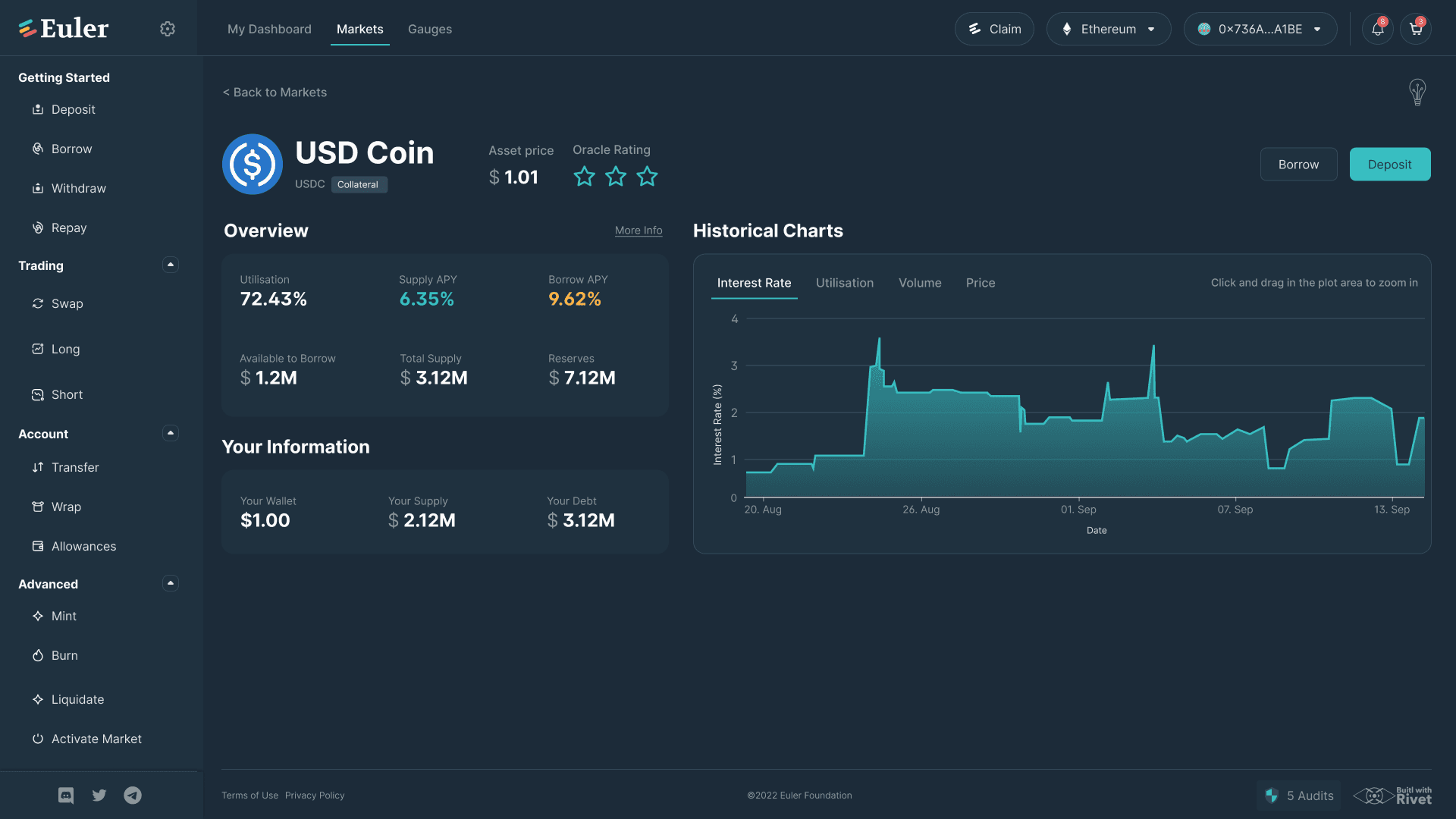
Comprehensive yet simple
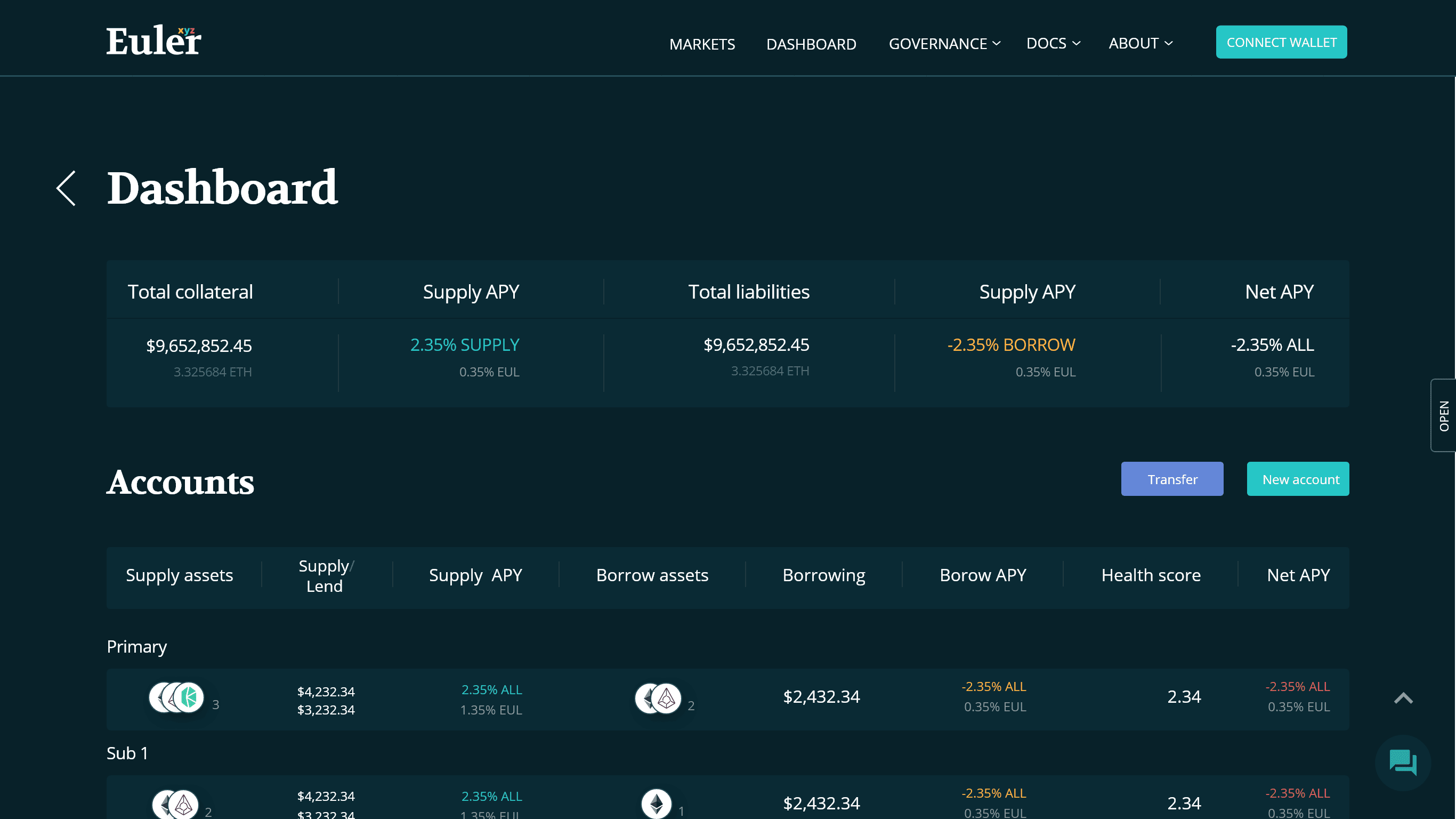
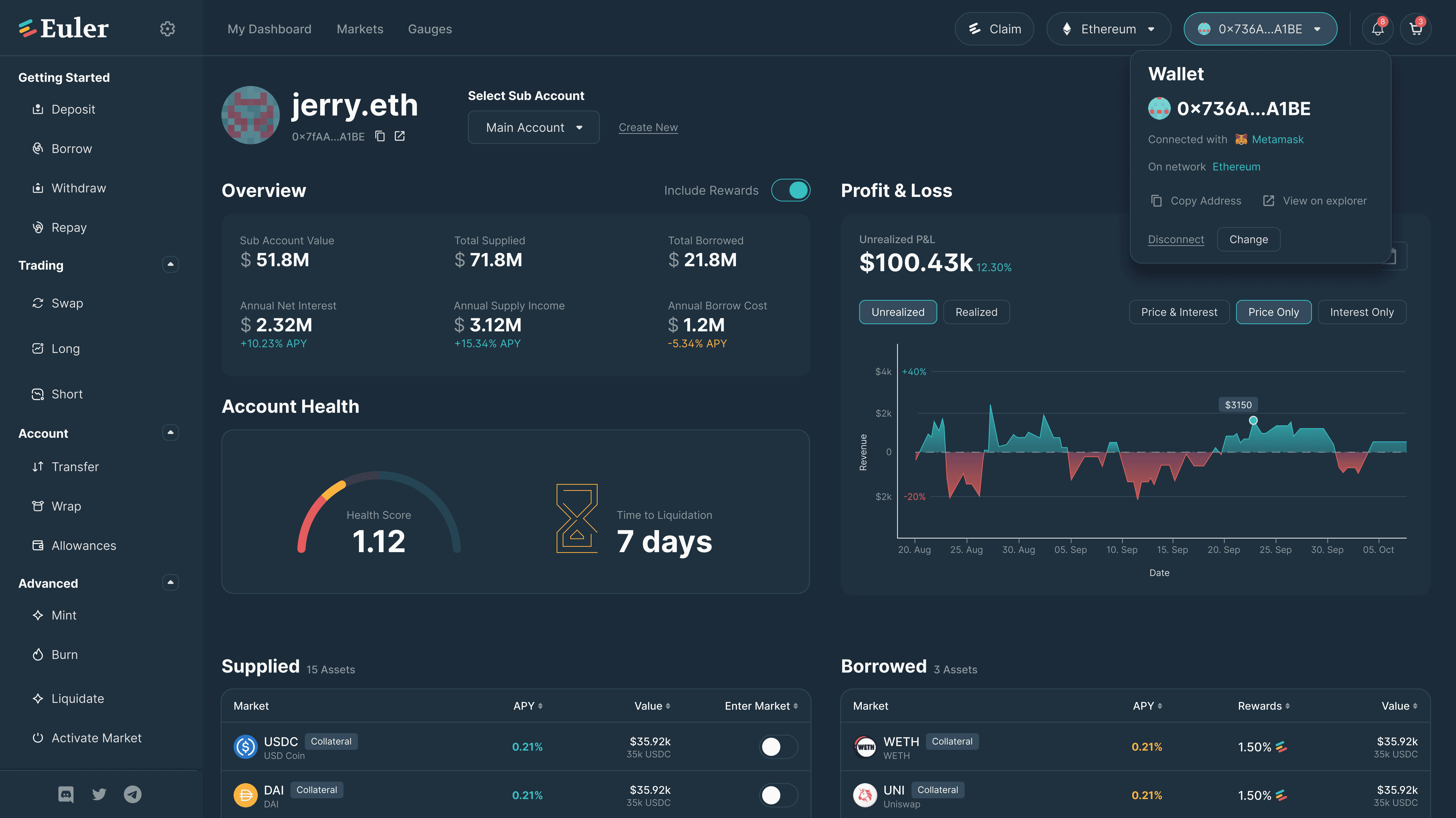
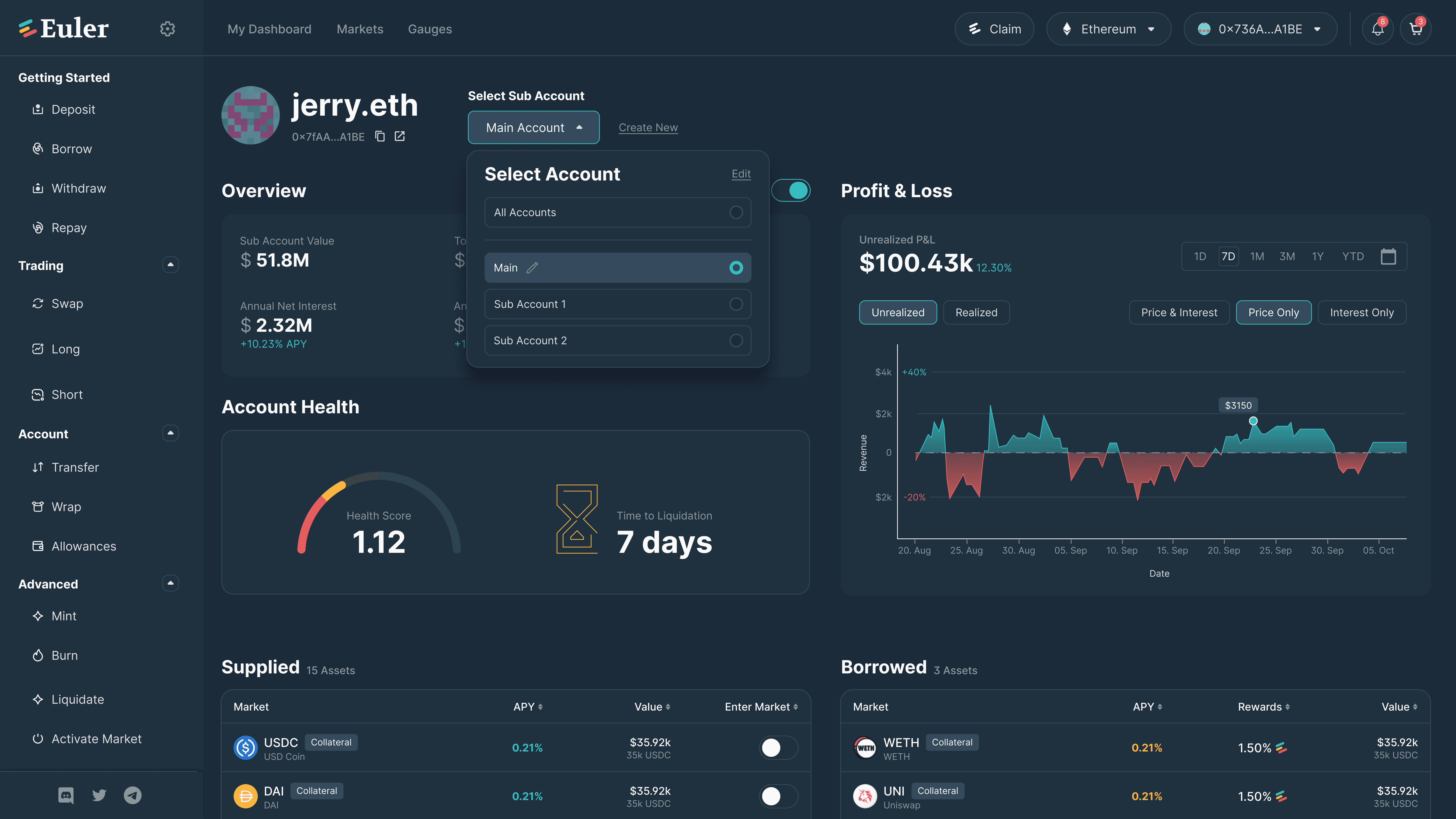
In addition to achieving a clear and polished overall design, our focus extended to providing users with a comprehensive overview of their accounts. To accomplish this, we meticulously designed both the user dashboard and wallet controls, ensuring that all relevant information is presented in a concise and easily understandable manner.
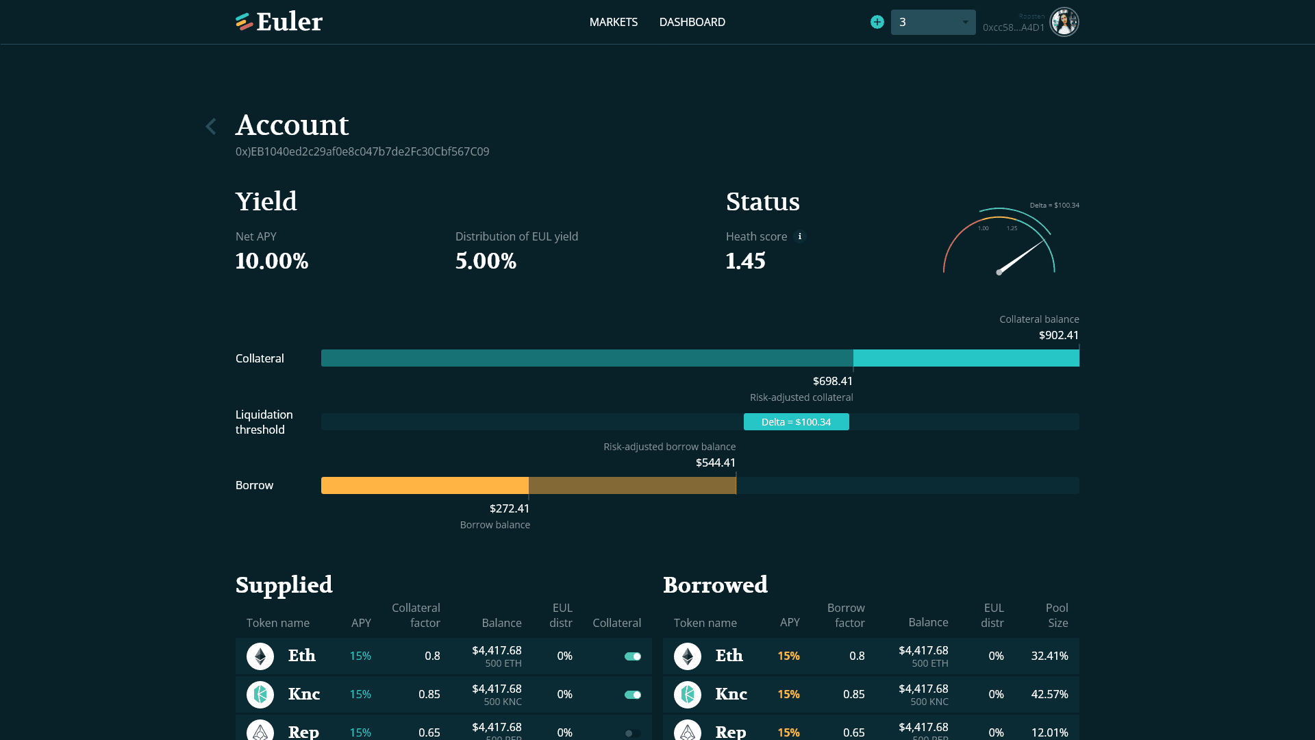
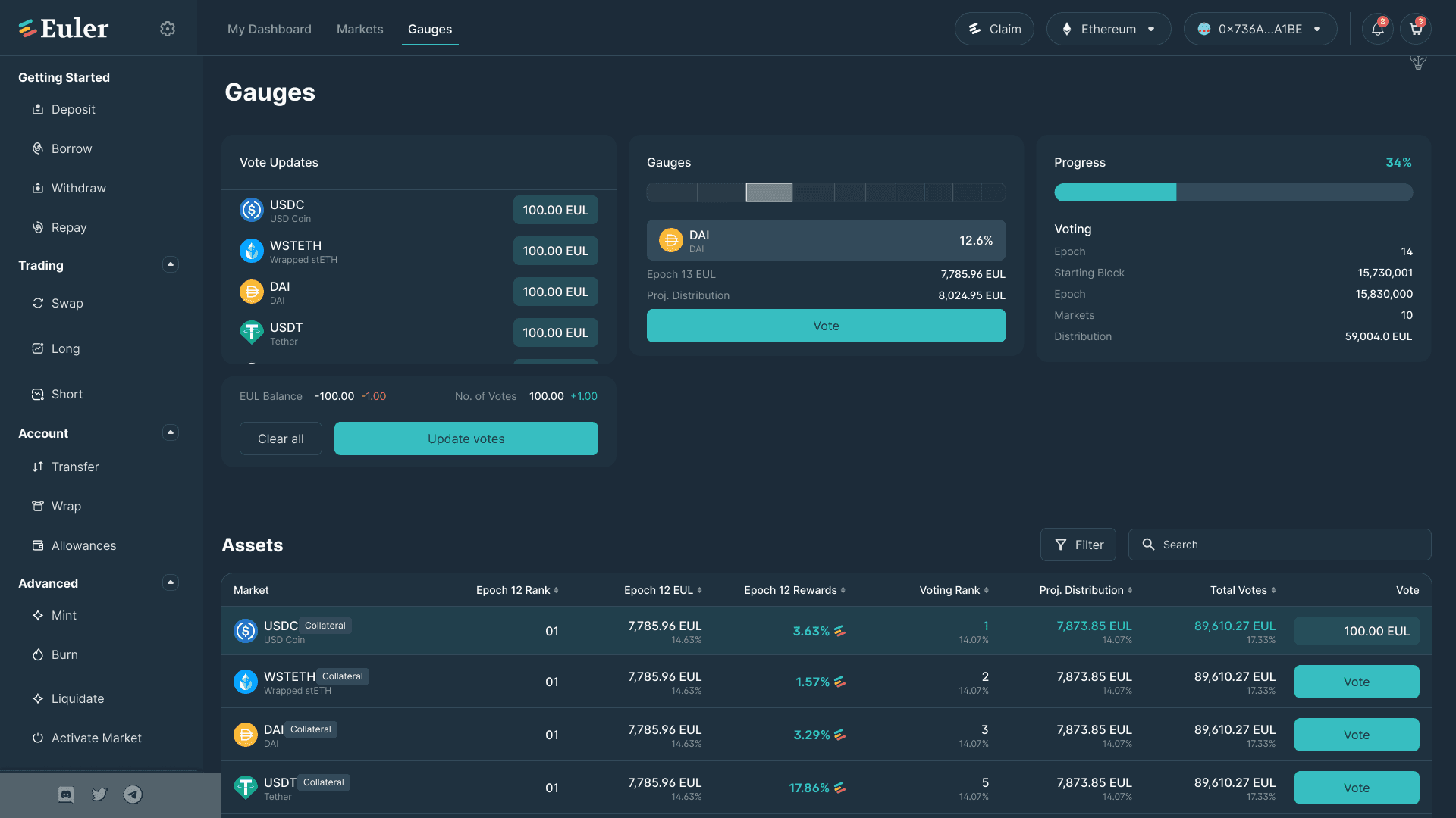
Prime experience
The Euler community helps to determine which markets receive an EUL distribution through the use of staking gauges. EUL token holders can visit the Gauge page on the app UI and stake their tokens against a particular market to indicate their preference for that market receiving an EUL distribution in future epochs.
Gauge page was designed so that the user can easily identify and differentiate between different token and their information such as Rank, Reward, Distribution etc.
Figma Prototype
What we learned
Adapt to the changing consumer behaviour
During the challenging times of the pandemic, it was crucial for us to remain grounded and stay focused on our goals. However, we also had to be adaptable and consider changes to our product in order to align with the evolving behaviors and needs of our customers.
Products don’t exist in a vacuum
We made significant improvements to the user experience, which had an impact on our internal processes. To ensure a successful implementation, we recognized the importance of collaborating with various teams, listening to their concerns, and evolving the tools they rely on. It wasn't just about creating a beautiful app prototype; we aimed for a seamless production experience.
Therefore, we conducted alignment initiatives behind the scenes, such as redefining our brand guidelines, to ensure a cohesive and harmonious outcome.
Take it one phase at a time
We discovered the value of breaking down complex designs into smaller, more manageable parts. By doing so, we simplified the development process and effectively addressed any bugs or issues that arose along the way. This approach allowed us to tackle challenges incrementally, making the overall process smoother and more efficient.
Proud
This has been my proudest contribution at QuellxCode. Couldn't have done so without the amazing team at QuellxCode and Euler Finance. Huge kudos to our heroes in the product engineering team, our QA team, and the data science team.
Thank you for reading through! Hope you enjoyed learning about my design and thought process. :)